Friday, 27 January 2017

Back To Robots

So, it's been a while since my last proper robot picture. That was done in mid-November for the Christmas card project. I'm used to doing a lot of my drawing in lectures, but Merry and Beth weren't too fond of me doing that, so there weren't any robots in December.

This time around I didn't struggle for ideas at all. There's so much going on in the world at the moment, so it felt good to try and channel some of my feelings towards that into this picture. You probably can't see much so far, but I'm doing a scene of robot protesters. The recent protests have been a beam of light in the bleakness, so I guess this is my way of saying I'm so proud of everyone who's keeping up at the moment.


Wednesday, 25 January 2017

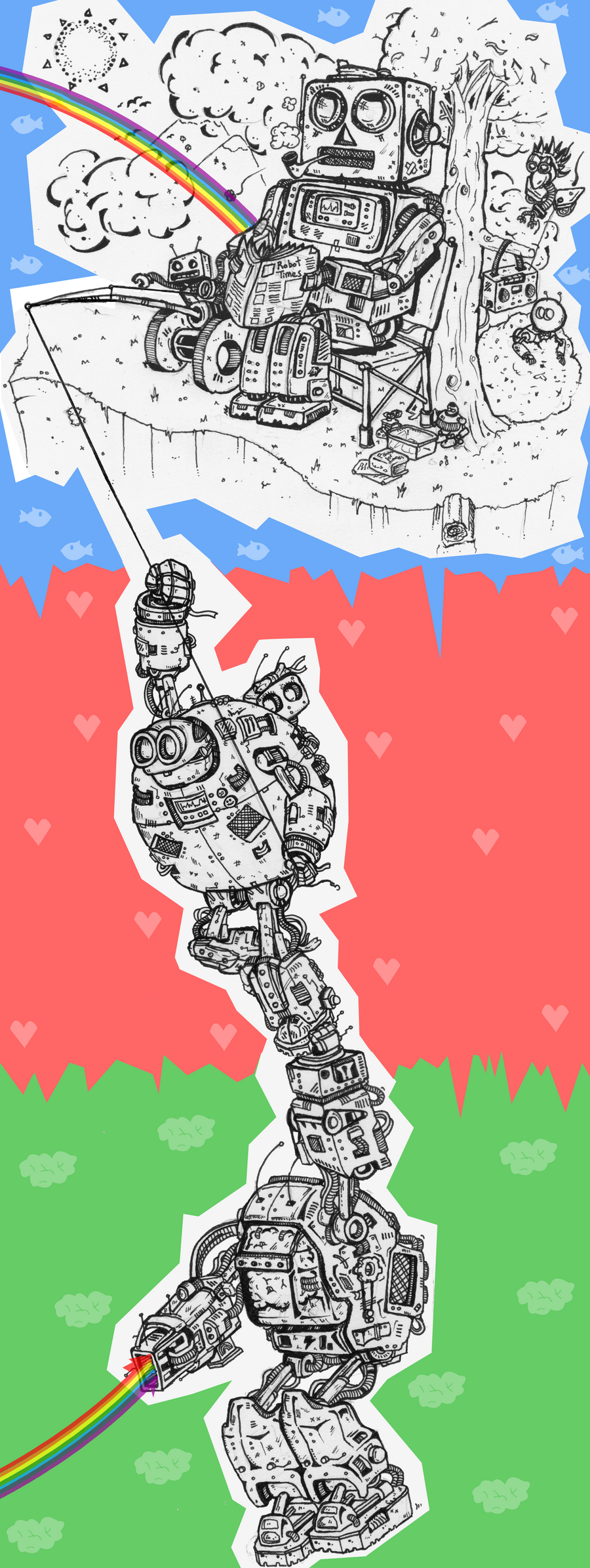
The Archive of Archive - A Tale Of Two Cities & The Road To Nowhere

One of my more unusual traits as an artist is my tendency to go back to previous pictures and work on them some more. I used to do this quite a lot, as many of my original drawings were done in pencil but as they grew older and began to fade I went over them in pen to preserve them. Sometimes I would later come back and add extra details, or shading, or even just fixing some line widths. I keep very few pictures sacred. I fell out of this habit for a while, as I was generally happy enough with my pictures that I never felt the need to tinker with them more.

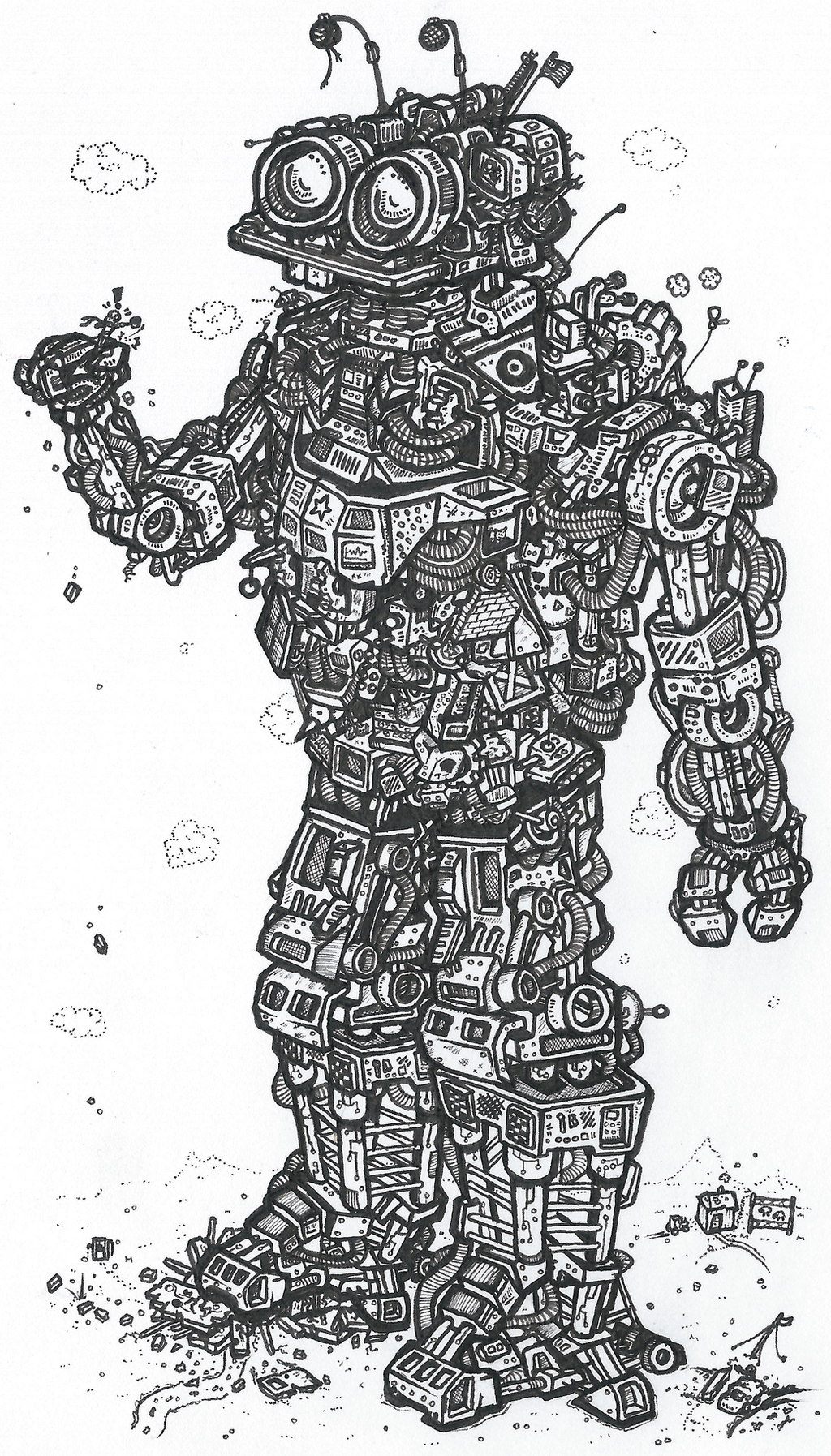
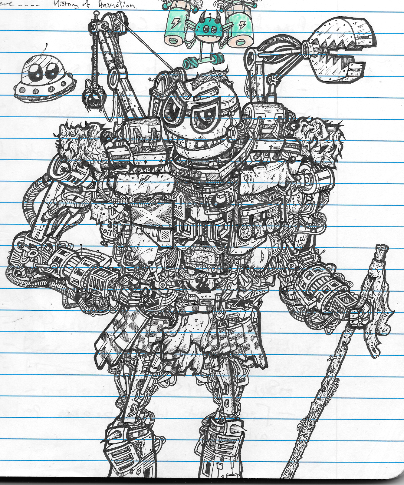
Recently I began doing this again but in a different manner. Rather than simply enhancing the original to create a better version of the same picture, I've been using digital techniques to add completely new purpose to existing art. Before the EPY began I did the biggest case of this so far. I drew a picture of a robot highlander at the start of last year, and whilst I really liked it, it didn't have a lot of potential as a picture to sell because it was kinda scary, and I ran out of paper before I got to its feet.

I had wanted to do a hillwalking robot for a long time, and with Langwathby Art Mart incoming, I decided that I would do a full retool of the highlander picture. Using my lightbox, I drew a new head, legs, walking stick, and backpack for the robot. I also removed the shoulder cranes and the original parts. Finally I added a detailed background to complete the effect. It now stands as one of my best pictures to date. I'm very happy with it.


This is a technique which really captures the way I work. I enjoy digging up elements from my past to use as inspiration, especially in my art. I like that it shows that I've been having good ideas for a long time, but just not the talent to put them to use effectively.

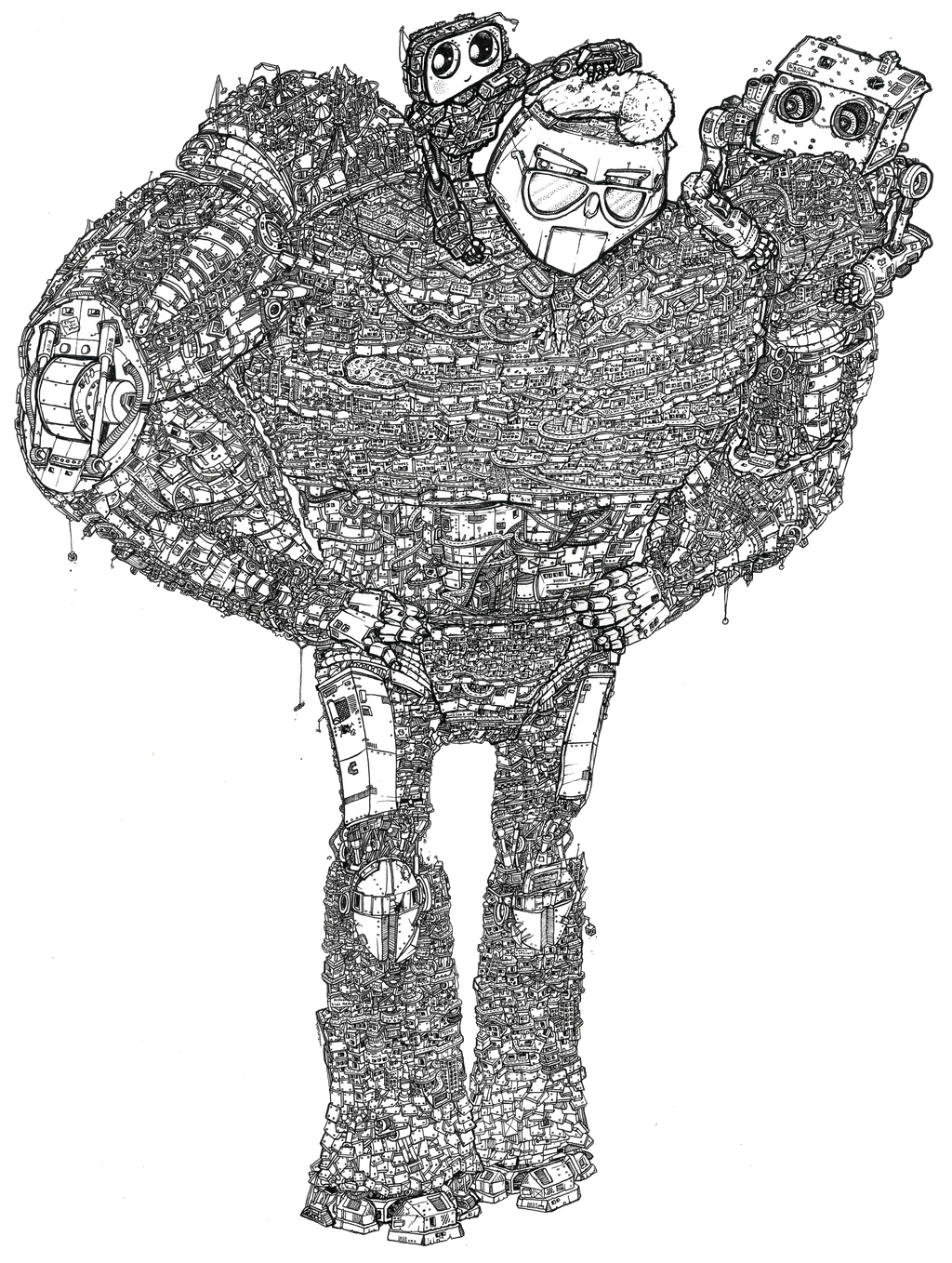
The next picture I used this for was another attempt to freshen up my portfolio for prints. I have a solid collection of A4 and A3 pictures, as well as a gigantic A1 print, but in the A2 size I feel a little underrepresented. The only one I have is beginning to show its age, and looks a little out of place on its own. The Road To Nowhere filled that category, but I wanted another to properly have representation at that size, especially now I'm thinking of phasing out my A4 collection. So I took one of those A4 pictures and built a new picture around it.

That picture was Christina, one of the citybot pictures. She was always an awkward bot in the family, simply due to being drawn far smaller than the others. I examined her pose and worked out that she would work well as pleasantly surprised. Rather than retooling parts of her, I added a second 'bot presenting her with flowers, along with a detailed background. I tried to showcase the scale of the 'bots here, as that was one of the faults of the original Christina picture.

A am happy with the finished picture but I feel that it only works at a large size. The background to picture ratio is a bit too far off but generally I'm fine with it. It still makes an excellent addition to the A2 print collection.


The Archive of Archive - Music Shop


One of the places I visited during my card selling phase was a music shop across from where I work. They're quite a popular spot and I had seen them selling cards before so I payed them a visit. They liked my work but just wanted music-related cards which, y'know, makes a lot of sense. They also agreed to take on some prints. All of this would have been great had I not only got one music-based picture. And I didn't even like the one I had.

I had been considering doing a new guitar robot for a while so I saw this as the perfect opportunity to make an updated one. I shifted the focus to a more low-key setting and swapped the electric guitar out for an acoustic one to add some differences to the first guitar picture.

The main difference here is in the robot design itself. Whilst my first one was a very basic robot design, I wanted to push things a bit more in that regard. I also wanted to do another female robot. Although my 'standard' design is fairly androgynous, a lot of the other designs I use tend to have a much more male physicality to them. With this and the next picture I did I wanted to try and offset this (and it's something I'll strive to do a lot more from here on out in my art). I wanted to go for a 'hipster' aesthetic for the robot here, so I gave her some dreads with an undercut alongside trying to factor in some more subtle cues in the robot detailing. I then capped off the deign with a pair of big boots, because I love drawing robots in shoes for some reason.

I gave the picture a full background as well, which is something I have been doing more often in my artwork recently. I went for a backstreet city setting, which gave me the chance to draw some slightly different stuff.

The Archive of Archive - Cumbria

One of the biggest factors that has determined the progress of August has been me living in Cumbria. Due to situations not entirely going in my favour, I ended up staying back home for the first month of the project. During the welcome week I had laid the groundwork of things to be doing for the time ahead, as well as sorting out communication with Beth and Merry.

Things did turn out a little differently to how I expected though. Work at home was far more intense than I'd expected, with the summer workload proving a lot to deal with. I worked in a school uniform shop, so this is by far the busiest time of year for them. Trying to get work done after a day of that was proving more difficult than expected.

The next minor issue came from the fact that the three members of the group were somewhat fragmented. Merry was keen to wait for Beth before commencing work on the Captive North project, so the first few weeks for archive were filled in mostly with web designing work. With my position in Cumbria proving less useful in this regard, I began to focus my time towards other directions.

One of my more popular outputs is my robot artwork. It's what most people know me for. Over the last few years I've flirted with ways of monetizing my art, and usually settled for prints, which I've sold at art fairs and in local cafes and shops to a decent degree of success. So with this extra inclination to be doing enterprising work, I decided to branch out a little and produced a series of greeting cards with my artwork on. Thanks to my artwork being black-and-white, I managed to get them printed really cheaply, and in the following week tracked down envelopes and plastic sleeves at good prices too.

I've had some mixed successes so far with the cards. I've sold some alongside my latest couple of exhibitions, and also sold small numbers to local businesses as well as some further afield in the Lake District. But most importantly I've sold a batch to a local Hallmark branch. Out of all of these, this stands the strongest chance of bringing in more work, especially if they pass the word along. I just have to hope they sell now.

It hasn't been a perfect road though. I have to admit that production ended up being fairly rushed and as such didn't have the chance to do as much picture editing as I would have liked, resulting in a few cards where the artwork doesn't fill the space as well as I would like. I also made an assumption that the regular size of cards would be A5, rather than the actual slightly smaller size they are, resulting in some customers reporting poor sales due to them not fitting in card racks.

If I progress this venture beyond the current batch of stock, I would like to spend a bit more time progressing the cards before I print them. I would like to add some hand-drawn typography to them, as well as fixing the designs. Time-permitting, I would also like to do some more card-appropriate cards, with birthday and Christmas themes. I'm proud of the progress I've made, and it's been an interesting chance to dip my toes into unknown territory, but it's also shown me a lot about where I need to go from here to enjoy more than a modest success.

The Archive of Archive - Animated Logo

One of the first thing we discussed as a group was that we wanted an animated version of our logo to put in our work. As I had an idea about what I wanted from it, I got the job of building it. I was slightly inspired by mechanical gubbins and of parts moving into place. I wanted a slightly mechanical feel to it. So I sat down in After Effects and came up with this.


In the long run I'd like to add some shadows to it (and possibly the logo itself), and I feel it would benefit from some sound effects, but I'm really happy with how this looks.

The Archive of Archive - Motion Graphics Showreel

For Merry's interview, we decided we wanted to have a group showreel to demonstrate our skills. Sadly we didn't have on yet. So one night after the session in the Doyyec, I put one together. It was fairly similar to many of my other showreels in that it employed fast electronic music, but it ended up being a lot harder to put together because I had to put in a balanced amount of everyone's work. It also suffered a little due to time constraints and a slight lack of communication. Merry would have liked some slightly different clips in, and the font I had chosen wasn't reinstalled when Beth fixed the scaling issues, but I'm happy enough with the general effect. Also we've been having some trouble with the Archive Vimeo page but soon we'll have everything moved over.

The Archive of Archive - Welcome Week Part 2 - Archive Business

As well as the planned welcome week activities, Archive got up to a lot of other stuff along the way. One of the main events was an interview with multimedia video company Captive North, The original plan was for Merry and I to attend the interview together, but the enterprise team decided it would be better if only one of us were to go. So Merry headed off without me and I held the fort back in Huddersfield.

Thankfully I have been led to believe that the interview went rather well, and we got a test job. Sadly this was an unpaid one, but it's for a charity, so presumably they won't be making any money out of it either. So that's okay. By the end of the week we had begun to throw together a handful of ideas for the project, and scanned the leaflet it was to be based on so that we all had a copy.

The other big piece of news was a paid design brief from Marcus, another student from the centre. He wanted a 3 part animation series with 30 seconds in each clip. So we had that too and that was pretty cool. He had worked with Ink before, so we also knew what he was looking for from them. All in all, things were going well.

Additionally over the week, we did a few other jobs. We began looking into website designs, finalised our logo, animated said logo, and made a new showreel. We also did a whole bunch of planning and looking into prices. sadly we lost Beth halfway through the week but Merry and I continued doing planning, and got plenty of stuff done.

The Archive of Archive - Welcome Week Part 1 - Scheduled Content

As a latecomer to the enterprise scheme, I was a little nervous about welcome week. Would everyone be super-duper neat and polished businesspeople with years of experience behind their backs? Would everyone be wearing suits? Would there be lunch provided? Lots of scary questions. But in the end it turned out fairly nicely. Rather than breaking down the week chronologically, I'll instead talk about the distinct sections. It's easier to remember and record things that way.

The biggest chunk of the scheduled week was spent with the instructors discussing how the year would work. It was broken into a series of shorter talks (assumedly because most of the chairs in the corner were pretty uncomfortable) about the various elements of the scheme. Whilst filled with useful information about the year and beyond, there's not a whole heap to report on here as everyone's experience would be the same pretty much, except perhaps the lucky people who got the comfy seats.

A couple of these talks featured guest speakers from previous EPY businesses. These were seriously useful and gave a proper insight into what would be coming, in a slightly more informal and memorable manner. They discussed scary topics like the fragility of partnerships but also talked about sillier things like making strange flavours of vodka. It was a lot of fun. Afterwards we also got the chance to talk with Ink, another graphic design and animation company from last year, who offered us a huge heap of incredibly useful advice. Like seriously, thanks guys. You're the best. 

Plus we got to try a little bit of the fancy alcohol.

In the slightly more unusual end of things, we did a visit to a local pipe-cleaner factory. The only one in Britain apparently. Admittedly not what I was expecting to be doing this week. On the plus side, the factory was a fairly interesting place. Sadly we didn't learn a huge amount from the talking that happened along the way as we were all wearing earplugs. It was hard to make things out. After the tour we were told all about the many uses of pipecleaners, and continued the week's unofficial theme of businesses evolving over time. It was interesting. But perhaps the most interesting stuff was to be found by just looking around the factory. It was full of interesting stuff. In particular the martial arts classes upstairs were an unusual thing for a factory to have. But the most memorable part of the entire trip was seeing the board of people who had worked at the factory for 'forty years of unbroken service' to the factory. That stirred up a lot of strange feelings in me. It's both heartbreaking and heartwarming at the same time. I didn't even know that was possible.

A couple of days later, Mr. Pipecleaner returned for a mini-project where we had to come up with new uses for pipecleaners. It was...interesting. As an idea presentation session it hit all the right notes. Everyone worked hard and the presentations were well arranged and strong. But my main problem lay with the pipecleaners themselves. Despite a few cool ideas, the brief just felt like it was dead before it arrived. Pipecleaners are just too limiting. Almost every winning idea could be summed up as 'cleaning something different'. Admittedly it's hard to come up with extra uses for pipecleaners (so massive kudos to Team Sex Toy in that regard), but I feel the more unusual ideas should have had more credit than simply 'clean some things'. 

Preceding that was a pair of workshops about organisation and creativity. The former was the better of the two, and whilst it flirted with many ideas I'd come across before, it managed to throw a couple of brand new ones into the mixing pot that I'd never heard of before. I'll definetely be using some of those in the years to come. Following that was the far weaker creativity one. Admittedly creativity is a hard topic to work around but I don't feel it managed to explore very much useful stuff at all. The main positives to be gleaned were the 'everyone can be creative' beats from the beginning as that's an important one to remember, as well as a couple of brief points about idea generation before the workshop wandered off elsewhere.

As for the rest, we had a few smaller exercises mostly based around getting to know one another. Pretty simple stuff but incredibly useful at the same time.


To wrap up the scheduled welcome week discussion, I have to say I did enjoy it. It was certainly an information-heavy affair, but that's hard to avoid. My main advice for next week would be to spread it over three days and have slightly longer days with a couple of the less useful workshops cut out. I feel by the end of the week most of us just wanted to get on with it. But all in all, rather good.

Designed By Archive

For the first half of the 2016-2017 university year, I have been creating work on my placement year as part of Designed By Archive, an animation company comprised of myself, Beth Brewster, and Merry Eady. We stuck at it for the first term, admittedly with some high points and low points, but we did alright. However, as the January term began, tensions began to rise within the group. I'd been doing a few projects on the side, and been enjoying those far more than Archive, and enjoyed the lack of restraint that comes from working by myself. Meanwhile Beth and Merry had found that their personalities and mine were clashing a bit too much for their tastes, and they wanted me to take a step back.

So for the time being I'm working for Archive for two days a week, and working for myself for the rest of the time. Depending on how things go, this'll probably change, but for now, this is how it works.

The next few posts will be excerpts from the original blog I set up for my time at Designed By Archive. After that will likely be some posts detailing the work I completed from the Designed By Archive blog. And from there on out, it'll probably be all about the work I'm doing by myself. See you on the other side!

Sunday, 15 May 2016

Colouring the Arm

Despite having finished the complete robot print a while back and having displayed it in the Collide exhibition, I still wasn't quite happy with the finished picture. Something wasn't quite right. It took me a long time to come to terms with it.

I think I was expecting the picture to be a big joining of lots of different shapes, colours, and styles, like a pile of dirty laundry. But it wasn't quite looking like that. It took me a while to realise it, but instead of being a mash-up of different parts, it's instead become interesting for a totally different way. Apart from one limb, he's an incredibly cohesive bot. It took me so long to realise what needed to be done to make it work. It just needed the detail fineliner arm to fit in more.

I'm no stranger to colouring my robot artwork. Initially all of my drawings were coloured, mostly in pencil crayon. But starting with A Certain Romance, this stopped being the norm, and I  stuck with black and white art and focused on the detail. I've since had a few attempts at colouring my art, using the the gradiented technique I used on the first batch of New Captain Cool art. I had a little success with that but I never felt like it fitted my style. When I did the batch of Citybots that accompanied Bigger Chris, I had to find a technique that would do them justice. I decided to dial things back a bit. I set up a really limited colour palette of shades of brown with some greys and reds. There were about seven colours in all. I then used these as block colours, observing lighting and shading but also adding details and embelishing in the other colours. This worked well.

I had no doubts about using that technique for this arm. The usual robot colour scheme had partially inspired the colours of this bot, and I already had the vector arm to give me a colour guide. This made things fairly simple. I gave the robot a quick coverage of the basic colours of the other arm, adjusting for the new shading layout. Afterwards I used the more minor colours to add detail to the arm, simply by adding colour to individual sections across the robot. I then repeated this with the other detail colours. I took note of the area colours as well with this. The brown area mostly uses the beige detail colours whilst the dark green sections make far more use of the blues. It helps to keep the sections distinct. To finish I used the magic wand tool to clean up the edges, then re-added it to the C4D model. I also had the chance to make a few stylistic tweaks, making the arm slightly bigger as well as the head so it fitted onto the pipes on the torso. I then rendered it out at 800 dpi to account for the broken camera of the C4D file. For the finished robot I had to flip the image (as C4D flips it back) and I also increased the brightness as it looks too dark when the colours are combined with the high-density detailing. I prefer the dark one for the limb on it's own though. I feel it's a little more characterful.

Now the arm's been coloured the picture works so much better. It's got a symetrical colour layout and the only B&W parts are the waist and thighs. I'm proud of this one.


Saturday, 14 May 2016

Changes (Lecture Greatest Hits & Discussion)

Another thing I enjoy about Allison's lectures is the way they detail the art world as it changes. She does a really excellent job of painting the transitions between movements and how one movements shifts into another. It's also fascinating hearing how much the movements can borrow from each other whilst seemingly want nothing to do with their predecessors. It's sometimes quite amusing.

It's also been a nice way of ushering in the change in my work. My style has shifted all over the place, and there was a time I'd be worried about that. About losing my current style altogether. But as time's gone on I've stopped thinking of this as a negative. I mean sure my style changes. My method of drawing people is completely different from this time last year. Even my robot drawing style has shifted into completely new territory and I'm so happy about all of these. It's taught me that change is necessary and should be appreciated.

It's also made me think about what I would like to change about other things, including the course. And as (I'm really hoping) this will be read by tutors this feels like a good place to say some of these things.

The biggest gripe I've not mentioned here so far is my concerns with the grade weighting of the course. Not to sound patronising or rude, but it looks at the moment like they picked three focuses and gave them all equal gradings without too much thought about the work that goes in. I'll elaborate a little. For our studio we're expected to work for around eight hours on a tuesday. Tracy has also expressed that she wants us working about twice that again at home over the week. The equates to somewhere in the region of twenty hours on studio work in a week. 

By contrast, we spend a scheduled four hours a week on production, with the expectation to fill a couple more with expanded studies. Even by doubling the production time, this gives us a number of eight hours. Something's feeling a little bit off here. This figures also reflected in the attention tutors place on our studio projects. There's nary a mention of production from any of our tutors all year. It's reflected as a really small part of our year. So why is it weighted the same as studio work? The part of the course we spend hundreds of hours on just to scrape a pass. It's such a strange way of working and feels somewhat unrefined and poorly thought out.

I still feel like theory deserves its place in the grading system at about the same value it is now. there's a lot of work that's thrown into that section and theory always tends to have a slightly amplified weighting due to its nature in most courses and disciplines.

So that's a lot of big talk. So what would I propose here? If the workload stays the same and I feel it should. The balance here feels quite appropriate. Admittedly I would love more production workshops but I can't see that happening in the current schedule. So I would propose a new weighting:

50% - Studio Work
20% - Production
30% - Theory

I feel this is a far more appropriate weighting of the units and is far more respectful of the workload required for the units. The studio work now carries the emphasis it should for such a huge part of our year whilst production is dropped to a far smaller part. Production is a massively useful part of this course and most of the time is the most rewarding session of the week. But I don't feel it needs to have a high weighting as it's all for our benefit. It's about learning new skills rather than creating polished outcomes. As I've mentioned in the last Discussion, it puts emphasis on the wrong things which seems to be a key flaw of this course.

Out of all of the points I have made about the course and the way it is run, this is the one I truly stand by the most as I feel that if this were addressed most of the other issues would fix themselves. As a result the context would be delivered resulting in less strain on the contextual portfolio allowing it to be delivered in the current way without as much pressure. It would even hopefully fix the weak parts of production, as those sessions would be more geared towards the method than the outcome, which is one of the key problems it faces.


To conclude, I'm aware this is a huge shift, but I feel it would greatly benefit the course and make things a lot clearer for students, and help make the aims of the production aspect of the course far clearer.

Context (Lecture Greatest Hits & Discussion)

One of my favourite parts of Allison's lectures is the way she introduces each artist and explains their backgrounds and aims in the industry. It's a really nice way of adding a whole lot of value to an artist's work. It's such an important thing when you're studying individuals, as it allows the viewer a glimpse into the context and reasoning behind pieces that might otherwise be ignored.

It's really made me think about the 'why' in all of my pieces. Where all the ideas come from, why I did things the way I did, what's to blame. It's a whole lot of really useful stuff to think about because it adds a great deal more to the projects. It's that neat connection between research and the final piece that's often overlooked.

Recently this has proved to be a huge dividing point between me and the values of this course. Recently it has begun to feel like context has been dragged apart from the work it's connected to. Whilst the contextual portfolio is still thankfully a thing, even that has begun to be dismantled from its original purpose. The first time I really noticed this was the visual appendix. Each design I made for that project was heavily based around research into other superheroes and real world outfits and cultures. I wanted each costume to be well reasoned and to have a function in the list rather than just a collection of useless lines and meaningless icons.  The word give context to the art and add so much more value to it. Needless to say I was dissapointed when I discovered the visual appendix was meant to be completely contextless. All of that reasoning, all of that background, all that inspiration. All washed away. Whilst I understand the vague reasoning here, and that the pictures are supposed to come first, the harsh word limit has only hurt peoples projects. Students now have to rely on tutors understanding their work right off the bat. As Allison has instilled on us from the start of the year, that's not how things work. That's not how art is effective.

As I understand things so far, the contextual portfolio still performs in its original function as a blog the tutors will look through, and I'm happy about that. But if that is no longer the case then something is deeply wrong at the core of this course. The presentation idea is a decent way of showcasing the core of what's going on but unless the blog is also looked at the entire notion of the contextual portfolio falls flat on its face. At this point the contextual portfolio has to do a lot of the heavy lifting for the studio work as well as its own regular function. If it's not read then it feels like a really important part of the creative process is being abandoned

To wrap this up, I feel like context is becoming increasingly

Lecture Greatest Hits: Crash

Another lecture I gained a lot from was Spencer's lecture on Crash, and about all the different covers and methods of advertising it. It was one of those strange lectures that didn't really interest me at the time but I keep coming back to the ideas from it. Every now and then I pick up on something and think 'wow that's been advertised terribly'. It's a thought I've had before but that lecture made me pick up on it a lot more often.

It was a really useful lecture in terms of opening my eyes to things. I'm a lot more critical of things like film trailers and posters doing a bad job of expressing the content of films, and sometimes advertising to the wrong kind of audiences. But it's also made me more greatful of the better advertising campaigns out there. Films like Deadpool have done an incredible job of communicating with their target audience in some really unconventional ways. On the negative side, I already scrutinise things too much and this has just added adverts and trailers onto that list. Oh well.

Friday, 13 May 2016

CV

I could've sworn I've talked about this before. No? Never mind here we go. It's time to talk about the mini-project that turned into almost as big a deal as the YCN brief.

The CV was a tough task for me. I'm not the most graphically-minded guy so putting together a set of graphics that make me not look like a cigarette in someone's perfect birthday cake was going to take a lot of effort.

My first attempt was the very obvious 'go into InDesign and try and make something' approach. It didn't get too far before I realised I actually needed an idea to make it look effective rather than just blind optimism. What I had made until then was a fairly nice-looking setup in retrospect. The orange looks really nice and the type is a long way from awful. I can imagine the round formatting being awkward later on though. I might use it for if I make a fore regular CV at some point.


So I thought for all of five seconds and decided I wanted to have it look like a machine to try and capture that robot spirit I'm known for. So I jumped back into InDesign and tried to put it together. I did quite a bit of it before deciding that this wasn't working out, and that it was going to be far too much work.


I also entertained the thought of drawing one by hand but I didn't like the idea of having such a constrained CV that I wouldn't be able to tweak much.

So in a move crazier than Spencer's lecture schedule, I decided to jump headfirst in and build a CV in Cinema 4D. Yes I'm a madman. Of course. From my perspective at the start, I wanted a CV I could easily edit that would really capture the robot spirit of my hand artwork. And I wanted to have fun making it. C4D was also a good idea in that it taught me a bit more about the software.

Somewhere along that line I forgot that Cinema 4D takes a really long time. But ignoring that, building this thing was a blast. Plus I learned a massive amount. I wouldn't have been able to make the torso nearly as good if it weren't for this.

I put together the first take based on my plans for the InDesign version. It's mostly based around a set of monitors with a ring I initially envisioned as a car speedo tracking my skill levels in each piece of software. I also added some sidebars about my history and education and such. It's a pretty simplistic build bit I like the glow effects I've used and there are some really cool ideas in there. I stuck with this design for a while too. I mean I never sent it to anyone but I still totally kept it. It was only when I was about to message people that I took another look at it that I decided it needed one more take.


For the third case I came in with a far clearer plan in mind which would economise on space far better and put the important stuff at the forefront. I also took the chance to tone down on some of the less useful information. Sadly this meant losing the really madcap camera angles but I think it's a worthy sacrifice. I was able to keep a lot of the elements I liked from the previous design. The glowy screens are back and look even better now. I've kept the awesome spotlight backdrop. But the big change was essentially basing the entire design around the speedometer idea, and placing the rest of the text inside that console. I'm so glad I did this. Other changes include separating the skill graphs into clear segments so they're easier to differentiate as well as making the skill levels more defined. The metal texture was also updated to the one from the robot torso, and I added the lighting pods from that thing as well, because sharing is caring.

The final big change that was half the reason for the update, was the incorporation of some of my actual artwork into it, which was the single biggest weakness of the last one. It did a really bad job of showcasing what I can do as an artist and I wasn't really ok with that. So now it shows my artwork in the panel where it shows which medium I'm talking about.


So to conclude, the CV process was mind-bogglingly mad but it's wound me up with a really unique looking CV and kicked my C4D skills up a notch. I'm pretty happy with this.

Lecture Greatest Hits: CV Talk

One of Pete's fairly early was about placements and CVs and how to be noticed. Without a doubt it's probably the most real-world-useful lecture we've had, even compared to Pete's other lectures. Blimey he's had some good ones.

So Pete was talking about CVs and how to be noticed when employers receive a huge pile of the things every year. A few interesting pieces of advice were given. The first was to keep it succinct and focus on what the employer wants to see. The second: make it stand out from the crowd. That part's pretty hard in the world of very design-heavy CVs. The sheer range of beautiful ones I've seen from this course alone is jaw-dropping. And the third main point was about how they're delivered. Ideally give them in person, then post, then email, was his advice.

As Huddersfield Uni is placement-crazy, I had put together a CV halfway through this year to go placement-hunting with. I'll make a full post about this in a minute. But yeah, genuine thanks to Pete for pointing a lot of this stuff out. Super useful stuff.

Lecture Greatest Hits: Gender in Animation

So to kick-off this mini sseries about the lecture programme, I think it's best to start with the most important in terms of effect on this year's work. And that's Spencer's Term 2 talk about the gender divide an animation. For starters, it was probably my favourite lecture of the year. It was balanced, respectful, and really put the point across well. He should be proud of that one.

And secondly I like it because it gave me the inclination to do my essay on gender in comics. At the point the lecture arrived, I was really struggling in terms of essay ideas, as my first one crashed and burned and I needed a replacement. I'd been thinking for a while and nothing was coming. Like, I knew I wanted to something about comics but I just couldn't think of anything worth writing. Then this lecture came bouncing right out of the blue like most of Spencer's lectures do and suddenly I had a really good essay topic.

The lecture gave me a couple of topic ideas too if I recall correctly. I can't remember exactly though. It's been quite a while since that lecture.

The Lecture Programme

Before I delve into this year's lectures in a bit more detail, I figured I'd have a little chat about them as a whole.

Compared to last year, the lectures were at another level. In itself that's really not much of a statement, as I was a long way from impressed with last year's batch. This year however was another story. All three lecture sections did their jobs well. They all had their genuinely interesting moments. Some more often admittedly, but all of them were good.

Allison's lectures dealt with the fairly general topic of art practice, and continued from last year's section. As the best of last year, these have continued to be interesting, detailing some really interesting elements of the art world. Despite not broadening my outlook on art as much as was possibly intended, the lectures have opened my eyes to several new artists. In particular her lectures on photography were surprisingly fascinating, even though I'm not the biggest fan of the medium. It's just so interesting to hear how these people work and their motives and context around it. And that really capitalises the parts of her lectures I appreciate the most: how she portrays the artists as real people. The way she introduces each artist before the work is fantastic and adds a lot of flavour to their work. It really helps to sell work that's sometimes not all that impressive at first look.

Next up is Pete. His lectures were a whole lot of something new. And really appreciated. Pete tackled the business side of things and these are probably the most useful lectures we've had here. They detail how to actually survive in the art world which is something SERIOUSLY useful, epecially with the way the industry is at the moment. I have learned so many really important things from these lectures. He's told us more about placements than anybody else, including the best ways to get them. he's responsible for my insane CV ideas too. Well, for giving me them at least. His lectures have been hugely effective at giving me a bit of a confidence boost about the industry. It's still a terrifying thought to go out into the art world but at least I know more about what to expect now.

And finally comes Spencer. The big curveball of the lecture programme, Spencer zigzags from topic to topic over the weeks and it might get annoying if most of them weren't fairly interesting. And quite a lot of fun too. Especially towards the end of the year, the lectures started going in some really odd directions. A lot of them ended up being really good though. Like, I think most of his best lectures came from around then. There was the awesome one on the gender imbalance in animation. And the one about all the covers of Crash. There have been some good 'uns.

Sooo...onto some of the best bits...beecause I really do need something to put into the PDF slides.

Captain Cool!

A good while before I decided to be more work on Captain Cool in the Visual Appendix project (or before I even knew that such a thing existed), I drew Captain Cool in his original outfit. I wanted to have another go at drawing people as I'd fallen a little out of practice and was still trying to find a drawing style that worked. It also marked the first time in a long while that I'd tried to do a decent job of drawing the old character design. Usually I would draw him as a silly cartoon version instead as that's all the character was to me until recently. And whilst it's not the best person I've drawn by a long shot, it's really interesting from a style perspective as it shows a bridge between my old drawing style and my new one that debuted is the Visual Appendix. Plus it's Captain cool and I love that guy.


Research And Inspiration - Gestalt

Gestalt was a strange unit research-wise. Being a unit with no commercial nature at all, there wasn't a market to research in the slightest. And being as unique as it is, there's nothing quite like it, as a whole at least.

The idea itself came from a combination of a discussion with Tracy, and with some of my previous work. Tracy was the first person to agree that there wasn't enough basis to make a whole unit based around a single picture done in my robot style. So I instantly thought back to my back-catalog and remembered that I've done a few pictures in chunks. So I decided to combine the nature of two of my previous pieces here. The first was a picture I did for school, where I repeated the same pattern but used a different technique for each. The second was a picture I did for a robot contest where I had to make three pictures that formed one. Each one worked on its own but became something greater when combined. That was something I liked.


Design-wise I wanted to make a departure from the more over-designed big bots I was used to so I looked back to some of my more traditional robots. My soulbot style was out the question as it was too skinny, and wouldn't give me anything to work with. None of my other existing ideas worked either so I had to come up with something new. The final design used elements found in quite a few old pictures as well as an injection of something new. It was going to have to be humanoid and accessable but charming at the same time. Bucky was a good place to start here. I also used The Highlander as a key reference as it was the best indicator of where my style's currently at.


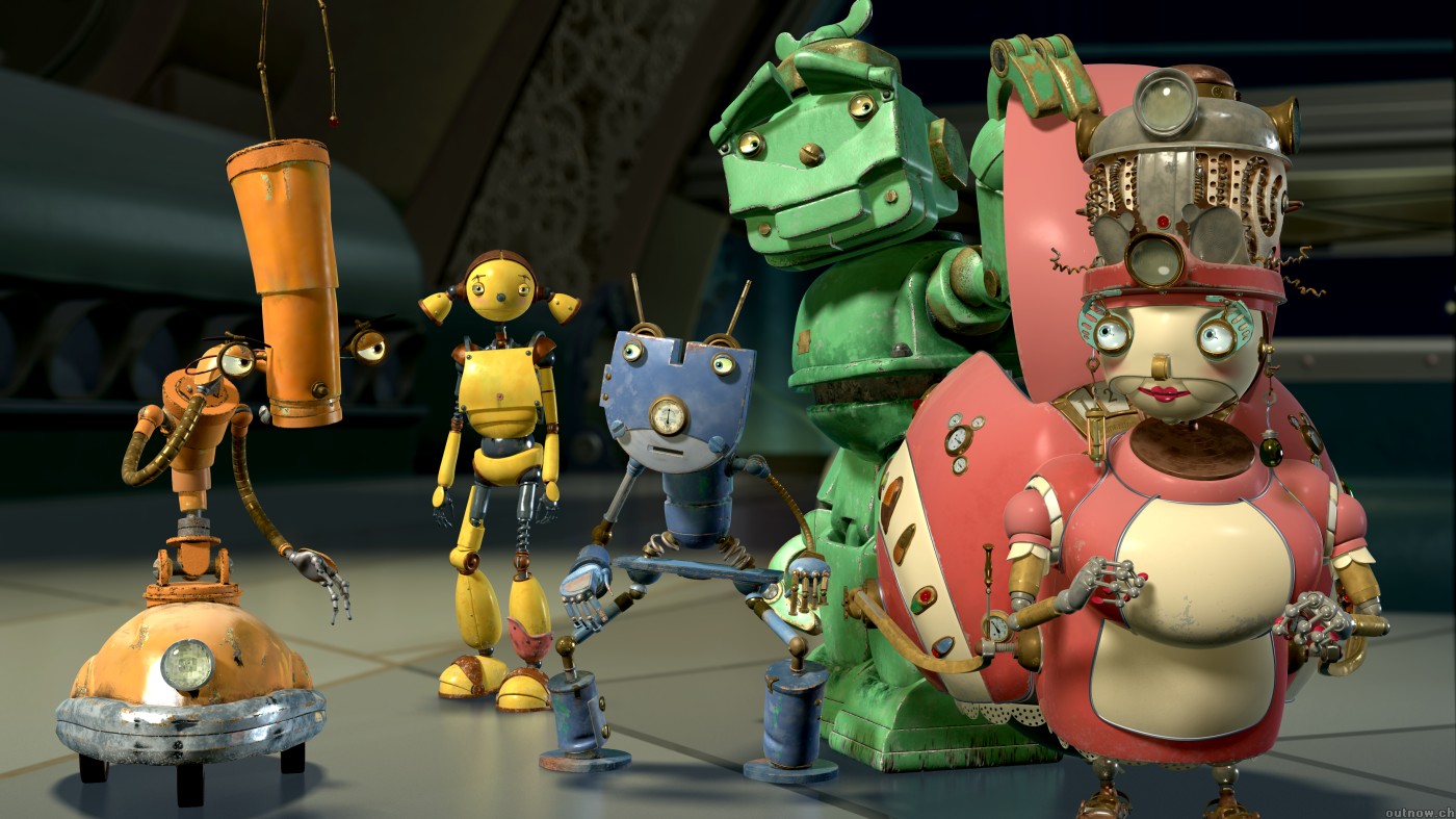
For the cinema 4D chest I didn't immediately find inspiration anywhere. I just dived straight in there and started building. But as I worked and came up with ideas, the animated film Robots began to spring to mind very often, It became especially important as I began to toy around with physics engines to do some slight animation work with him. The madcap contraptions of Wallace and Gromit were also helpful when creating the feel for it.

For the Robotic Fineliner arm my main inspiration was of course, myself. This was the big glory-hog project and this is the most show-offy part in it. Of course I'm my own inspiration here. The key inspirations were the (at the time) half-drawn dragon and my citybots, as I felt like it needed to be very detailed. Bigger Chris proved to be a useful guide as a fairly similar approach was used here, essentially using my robot technique as overcomplicated colouring for half the project. This arm allowed me to continue that pictures ideas, especially the more advanced way I've been trying to use detail recently. Whilst the detail is mostly used to create form for the robots, it's also very useful as a way to throw attention around a picture. Here I tried to condense it to create points of interest and accentuate the key shapes, whilst glossing over others. I'm loving this effect and I got to use it to finish off the dragon too.


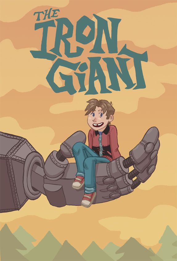
The vector arm was a nightmare. Inspired by the confidence from my second project, I thought it would be easy. I was so very wrong. As well as Home Sweet Home, I had to look to other places for inspiration, as the arm was looking too blank to call finished. The first idea I found was in one of my favourite character designs of all time: Glados from Portal. The way she's so inhuman in design yet still shows a degree of femininity is genius. But what i was interested in here was the way each section was broken up with lots of cabling. It's nothing new in my pictures but I really loved the way it was used here. I also borrowed a few tips from The Iron Giant for the hands, particularly Kayla Miller's fantastic poster design, trying to make them inviting rather than terrifying, as I feared the fineliner hands were.


I don't imagine I'd have started trying out my fineliner rendering had it not been for the work of Kei Zama. She's a Japanese artist known for her incredible ink rendering. She does a lot of Transformers art but isn't officially tied to them or anything. She just loves robots. I was also inspired by traditional pointillism techniques (which I actually used on the glass) and these helped to form my basic knowledge of how to shade with the medium.


I've skipped over the pencil thighs as pencil's such a done-to-death technique it's basically impossible to be inspired whilst using it. The next part to be made was the collage. Despite being loosely inspired by my own previous work in that medium, I also wanted to bring something new in. Despite having a lot of ideas plotted out, my main inspiration came from my material. I had to work with what I had. Thankfully this included a whole host of Which magazines as well as a few photography and music ones. This gave me pretty much everything I had. To get started I also made a couple of mood boards as I hadn't done any for this unit yet. I kinda regret this. Whilst they were a nice confidence boost, they used up a few too many of the best pictures from the magazines. Probably should have done these after.


The final part of the robot was the comic leg. The array of inspirations here is so incredible. It's essentially inspired by every comic I've ever read. predominantly it's superhero comics though, as those are big-budget enough to have both a penciller and an inker. It's also really impressive how much difference there is between finishes here. The main inspiration I'll use here comes from Olivier Coipel. He's one of the best Marvel-employed artists around and whilst his work has it's roots in traditional comic, art, the meticulous quality here is incredible.


I've already mentioned the influence of Transformers Devastator in the final setup of this robot but I feel like there are a few more ideas in here. The idea for the desert came from the incredible PS3 game Journey, and all the mysterious shreds of culture lying around in the sand. There's something really interesting about sand, and it also felt like it fitted the colours incredibly well. I'm just annoyed I spent a week making a 3D workshop first!


Research and Inspiration - Home Sweet Home

The project required a great deal of research before I could even get it off the ground. Being a competition brief for a large company, you have to get your facts right. So before any animation started, I dived once again into the metaphorical swimming pool of research.

My first stop was looking into HSBC as a business. I couldn't advertise them until I knew what they were all about. Thankfully the packs included in the project told me a good amount about the company before I even began to trawl their website. Thankfully, unlike some companies in the brief, HSBC hadn't misled anyone with their booklet and backed up all the claims they had made. I also looked for elements in the brand and ethos I could explore for my campaign. Their excellent customer satisfaction ratings and personal approach were the main thing I jumped on and tried to figure out how to weaponise it as an advertising campaign.


I also looked into other advertising campaigns both from HSBC and other banks. And sadly HSBC is a bit behind the curve advertising-wise. The main frontrunner I found was Lloyds TSB and their previous fantastic 3D animated approach that they used until recently. It hits most of the right notes of heart and charm and really gives of the impression of trustworthy-ness and working on a personal scale. It's just a fantastic campaign and works very well.


For the art of this unit Multiplex gave me the confidence to push my vector art to a high standard. It's a webcomic made entirely in vectors and manages to have some really nice looking art despite being done in such a clean, nearly emotionless style. If anything that was my aim for this project: bringing emotion to the emotionless. I'm so pleased I stuck with it as I managed to make a really charming animation using the medium.


I also did a whole lot of research into dogs for the project. I've never been great at drawing them so I wanted some good references. I also had no idea what breed of dog I wanted. So in Jonny tradition I put together a collage of dog ideas. These things really help when I'm struggling with ideas as it allows me to take my mind off the work for an hour or so and puts together a great board of references. I tend to do one or two of these for each project and it really helps.


In the end I went for a golden retriever, mostly inspired by the behavior of Jasper, my cousin's dog, who is excellent at demolishing anything not above table-height. Jasper is such a cutie too.


I put together a second mood board for the biscuits. I was having trouble deciding which biscuits to use so I figured this would help. And it defintely did. Just a few minutes after I made this I had created a set of biscuit sketches and moved into illustrator.


The perspective with the hands and the camera is a direct result of me watching too many Youtube reviews. Most of them use a hands-only-on-camera setup and that translated nicely to a video like this. It allowed me to keep focus on what was happening on the table whilst still keeping some human influence. I'm really happy with this decision. The key inspiration here is Stuart Ashen, who does a huge amount with the format.


For the game I had to do another round of research into smartphone games and tie-ins. The research into tie-in games was quickly abandoned because most I found were really poor, so I looked for far better games to use as inspiration, as I figured that the poor quality was likely a result of a lack of care rather than the medium. As predicted, most of the more successful games are puzzle games as they have the most longevity to them and benefit most from the smartphone as a platform.


Working with biscuits, I figured something akin to Tetris would work well. But rather than simply making a clone of the arcade classic, I began to inject some new ideas into its veins. I pulled the building society theme into it by using a full house pattern, and began to build features around this. Using Bones I also made the dog relevant and created the scoring system based around Crumbs, a spare word I had from when I made my biscuit typography.