Showing posts with label Production. Show all posts

Friday, 13 May 2016

CV

I could've sworn I've talked about this before. No? Never mind here we go. It's time to talk about the mini-project that turned into almost as big a deal as the YCN brief.

The CV was a tough task for me. I'm not the most graphically-minded guy so putting together a set of graphics that make me not look like a cigarette in someone's perfect birthday cake was going to take a lot of effort.

My first attempt was the very obvious 'go into InDesign and try and make something' approach. It didn't get too far before I realised I actually needed an idea to make it look effective rather than just blind optimism. What I had made until then was a fairly nice-looking setup in retrospect. The orange looks really nice and the type is a long way from awful. I can imagine the round formatting being awkward later on though. I might use it for if I make a fore regular CV at some point.


So I thought for all of five seconds and decided I wanted to have it look like a machine to try and capture that robot spirit I'm known for. So I jumped back into InDesign and tried to put it together. I did quite a bit of it before deciding that this wasn't working out, and that it was going to be far too much work.


I also entertained the thought of drawing one by hand but I didn't like the idea of having such a constrained CV that I wouldn't be able to tweak much.

So in a move crazier than Spencer's lecture schedule, I decided to jump headfirst in and build a CV in Cinema 4D. Yes I'm a madman. Of course. From my perspective at the start, I wanted a CV I could easily edit that would really capture the robot spirit of my hand artwork. And I wanted to have fun making it. C4D was also a good idea in that it taught me a bit more about the software.

Somewhere along that line I forgot that Cinema 4D takes a really long time. But ignoring that, building this thing was a blast. Plus I learned a massive amount. I wouldn't have been able to make the torso nearly as good if it weren't for this.

I put together the first take based on my plans for the InDesign version. It's mostly based around a set of monitors with a ring I initially envisioned as a car speedo tracking my skill levels in each piece of software. I also added some sidebars about my history and education and such. It's a pretty simplistic build bit I like the glow effects I've used and there are some really cool ideas in there. I stuck with this design for a while too. I mean I never sent it to anyone but I still totally kept it. It was only when I was about to message people that I took another look at it that I decided it needed one more take.


For the third case I came in with a far clearer plan in mind which would economise on space far better and put the important stuff at the forefront. I also took the chance to tone down on some of the less useful information. Sadly this meant losing the really madcap camera angles but I think it's a worthy sacrifice. I was able to keep a lot of the elements I liked from the previous design. The glowy screens are back and look even better now. I've kept the awesome spotlight backdrop. But the big change was essentially basing the entire design around the speedometer idea, and placing the rest of the text inside that console. I'm so glad I did this. Other changes include separating the skill graphs into clear segments so they're easier to differentiate as well as making the skill levels more defined. The metal texture was also updated to the one from the robot torso, and I added the lighting pods from that thing as well, because sharing is caring.

The final big change that was half the reason for the update, was the incorporation of some of my actual artwork into it, which was the single biggest weakness of the last one. It did a really bad job of showcasing what I can do as an artist and I wasn't really ok with that. So now it shows my artwork in the panel where it shows which medium I'm talking about.


So to conclude, the CV process was mind-bogglingly mad but it's wound me up with a really unique looking CV and kicked my C4D skills up a notch. I'm pretty happy with this.

Monday, 22 February 2016

Workshop Week Cinema 4D

During workshop week, we had a session with Jay about using Cinema 4D for motion graphics. It was a really interesting one and I learned a lot of useful things. The key idea was about the potential for cinema 4d to create fantastic looking 3D graphics. He also taught us about hair materials and sweep nurbs, and a few other things I had forgotten until then. One of the outputs was a spinning sphere made from dots. I fashioned mine to look like earth, because why not? I think a little more clarity wouldn't have hurt the final outcome, but it still looks rather nice.

UPDATE: I fixed the clarity. It looks really nice now.


Boiling Workshoop

It's another After Effects workshop. This one was about Boiling and the Stroke tool. We had to draw the same picture 2 or 3 times so it looks like it's changing every frame when it's really just cycling through the same frames. We also learned about using the Wiggler for the same purpose but with paths. It's pretty cool stuff.


Sunday, 21 February 2016

Lip Sync Workshop

Following designing characters with Jay, we were taught how to lip sync them to audio. The technique we used in class was a pretty simple one; the sort that saturday morning cartoons and the likes would use. The main advantage to this is that you only need to draw a small number of mouth shapes that allow the speaker to say virtually anything.


Character Modelling


Recently, we finally got a chance to model our characters in Cinema 4D. I get the feeling it was something that most of the class had been eagerly awaiting. In practice however, it was a lot trickier than expected, as it needed to all be constructed from a single shape. I also made life rather difficult for myself by using my own character design rather than one of Jay's. In the first lesson, this posed a huge problem, as I couldn't follow what everyone else was doing. I was very temped to rebuild the model at a later date but I held out hope that i could fix it. Thankfully, I learned a lot about Cinema 4D whilst building the robot torso, and the second lecture I knocked it out of the park. I managed to finish on time whilst fixing last week's problems and making my character's unique features stay included.
The model was built very roughly as it appears above, but a subdivision surface makes it look like it does on the right by converting the angles to curves. It's a really nice effect. Also, only one half of the model was actually made, and the other was flipped over using the symmetry too. Cinema 4D is crazy. But super useful.

After finishing the second lesson with what you see on the right I decided I would texture it up to see what it would look like, and more importantly, so I could show it for Formative. I simply sliced up the original model then applied a different texture to each piece. I also made the hair and mouth using the hair tool, and the glasses and lapels with basic polygons.


Typography Part Three

The second batch of typography lectures started off with the most utterly pointless workshop ever. All we had to do was come up with an idea for some typography made out of objects. Seriously, had we recieved an email a week before the lesson we could have everything ready and we wouldn't have had to lose more workshop time with this nonsense. It's just silly and really irks me. What's the point of a workshop if we don't make anything, or even get taught anything.

The second workshop of the batch started as the first should have, with everyone having brought in stuff to make text out of. I went with biscuits in order to tie it into my second project and make some neat titles for it. I bought a pack of assorted McVities biscuits as well as a pack of various different types of custard creams. This proved to be a decent enough selection to make some really nice typography. As well as the titles, I decided I would also make the HSBC logo out of them which can be used in my unit two animation. The results are below.


Typography Part Two

As the third week of Nick's Typography workshop dawned. I worried about whether it would be the same as the last workshop: draw the same thing but bigger. I figured it wouldn't be, as it's a bit of a cop-out and would be quite frankly a bit disappointing. I hoped I was just being pessimistic. I was wrong.
After another four hours of my life were dropped down the drain, I left the studio with another set of paper cutouts of letters, even larger than the last. It was probably the least I'd ever produced from a workshop (until three weeks time). And then the rain came and they were utterly destroyed. I wasn't happy.

After a while, when I was producing my CV and was looking for work to include, I stumbled across the I Am Too Tall typography, and decided it might look nice in the portfolio, so I coloured them up. I decided against including them later, but they do look good coloured.


This also reminded me that I would need something else to go with that project, seeing as my last batch of cutouts were ruined. At the time, I was doing a lot of Cinema 4D work, so I thought that I could try making them on that. I started by cutting off the shadows from the original art, then filled everything with black, then inverted it. This formed the template for the vectorizer tool.

 Putting the letters together was trickier that I expected, as the original art had half of each letter cut off. All those extra details were constructed by slicing, flipping, and hacking apart the originals on Photoshop. I originally tried to do this on C4D but it turned into a nightmare.

Finally I used each letter with the vectorizer tool, then extruded them as physical objects. I then created a basic setup with a large plane for the floor and a sky box with a sun, which I tweaked to find the right lighting setup for me. I then set up a camera that would slide along the floor whilst keeping the top of each letter out of sight. Afterwards I used some nice preset textures which I edited a little before rendering it. I really like the final animation. It might not be physical but I find it tied off the project better than the original cutouts and it's pobably the definite version of the concept.


3D in After Effects

For our post recent workshop with Sara, we learned how to use 3D techniques with After Effects. It's something I've been wanting to know for a while but was always a little too busy to learn. It's really interesting stuff. For simple stuff that resembles paper, it's so much easier than Cinema 4D to work with. For the workshop I decided I would re-use some of the artwork I made for Unit Two as it's a lot nicer looking than anything I would be able to make before the lesson. I do like the effect and I might try and find a way to integrate it into unit two.


Snow Dinosaurs


This was made during Workshop Week for Sara's christmas card workshop. At the time of making it was the most advanced After Effects piece I had made. It's designed to loop, but vimeo doesn't do that. You'll just have to imagine the looping. Eventually it was also projected onto the side of the Creative Arts building alongside the other animations from the class. 


Rotoscoping

First up - a disclaimer: I wasn't in the rotoscoping workshop due to Manchester Animation Festival, so I just kinda gave it a shot on my own.

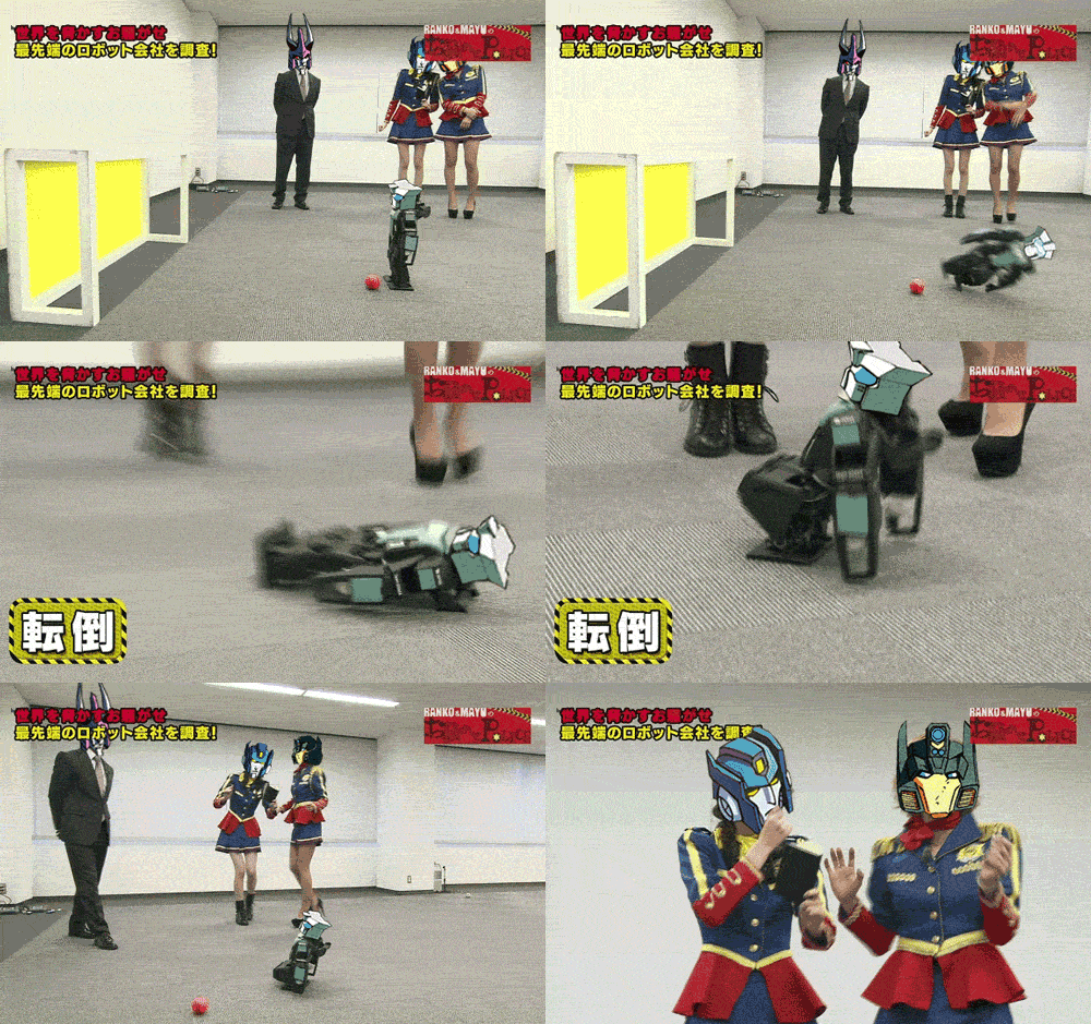
For the source material I racked my brain for something that would work for this and also be quite fun. I settled on one of my favourite GIFs on the internet, a Transformers: More Than meets The Eye parody of a football robot falling over on a Japanese TV show.


Despite having a relatively low frame rate, it was surprisingly difficult to rotoscope. I suspect that was in part from having to figure everything out myself rather than being able to run off for help like I could in a workshop. Secondly is that the GIF was a rather tricky choice. Tailgate falls on and off the canvas repeatedly and changes angles a lot. Plus the camera is moving and zooming left, right, and center. But in the end I'm happy with how it turned out. It's quite a lot of fun.


Football Robots (Rotoscoping Practice) from Jonny Clementson on Vimeo.