Sunday, 26 April 2015
Pixel Party
Pixel Party 64 from Jonny Clementson on Vimeo.
So,,,controversy time!!
Once every few weeks we have a 'physical session' with John Kelly. We've dona a couple of vaguely interesting things there but it's mostly been really pointless as I've done all of this kind of thing before, and it feels like I could be putting that time to better use. And once the sessions shifted towards typography I decided to take the leap and do something different, instead putting the tricks learned during the aftereffects session with Sara to good use. With it being an animation course I figured you'd be fine with this. I mean, I hope you're fine with this. If not, well, oh dear.
Either way i wanted to put all my aftereffects lessons into something that would show off what I'd learned but unlike my main coursework animation work wouldn't require excessive artwork to create. So here I created some very basic Mario-homaging pixel art then put to use what I'd learned, and experimented a bit more on the way.
The way I look at this I think it was a far better use of my time than doing more typography work which quite frankly isn't terribly useful. Either way...enjoy!
...or get angry at me...whichever works!

Saturday, 25 April 2015
Inspiration and Explanations: Unit Three
Feels a bit wierd writing about this one. With the last two units they've been finished for a long while. This one's still being made. On the plus side all the business with artists is already done.
Things were a bit different with this one. I found my key idea pretty early on. I was finding it hard to find something that captured modernist lifestyles and thoughts, so I was going to have to do something that treated things a bit closer to their face value rather than the deeper values. I wish it didn't have to be this way but I feel a level of contempt towards modernist art, and the more I delve into their beliefs and methods the more I get annoyed. So...face value it is.
I'd been exploring the same sort of ideas for a while, of showing the progression of art styles through some sort of medium. Some ideas were more tongue-in-cheek than others, and the sillier and angrier the ideas came, the less I cared for the project. But one day when I was out for a walk in the woods back home in Cumbria I came across the idea of something far simpler and almost pretty.
I decided to have the whole thing set in a room overlooking a garden, with a couple who decide to paint a bird in the garden. As it progresses other artists arrive and show them other styles to paint in. With each artist the bird changes to reflect the new style. That was the basic premise. The animation would start with Romanticism, then shift to Realism with an industrialist painter, then Modernism with a upstarty revolutionary, then Post-Modernism with an art critic, then Pop Art with a young hipster-type. Almost like Chinese Whispers, but with art. It's hardly a perfect idea but it's the best I can manage.
Research-wise I decided it would be best to approach each genre separately to get a feel for them before drawing the bird designs. The bird itself isn't a real design, rather something loosely based on a robin. I just wanted something fluffy and cute and fairly expressive. But so- onto the artists.
Romanticism


Romanticism-era art's key feature is that it tends to add extra flair and extravagance to the subject. Scenes get busier, landscapes more beautiful, people more attractive. For the romanticism bird I'll drastically enhance the colours and try to make it as pretty as possible. I'll use pencil crayons with some dashings of felt pen. The art here was done by Anna Razumovskaya, Albert Bierstadt, and Anne-Louis Girodet. The movement was popular throughout the 17th and 18th centuries. This was one of the most appealing art styles to me of the bunch as it serves to paint the subjects in a positive light, and allows plenty of room for symbolism and hidden meaning, whilst still providing something pleasant to look at for the viewer.
Realism


Realism is based around - you guessed it - making things look real. Popularised during industrial revolution-era Britain and rapidly spread around the world, it's aim was to pull away from the overly cheerful and distracting nature of romanticism towards something that painted the subject exactly how they are. This led to a movement of very technically-skilled artists as that was more important in realism than artistic license and less real interpretations. The art here was provided by Winslow Homer, Gustave Courbet, and James McNeill Whistler, who produced what is probably the movement's most famous piece: Whistler's Mother. For this bird I'd be using a duller palette and toning down the extravagance of the previous picture, focusing on the form more.
Modernism


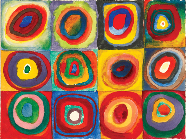
 Modernism. The big one really. Damn I'm going to have to write more about this one. So modernism sprung up a good few years after realism throw it's grubby boots into the door (then painted them in fine detail), and was a movement that objected to the beliefs that art should be judged by the technical talent of the painter rather than their artistic abilities. They proposed that inspiration and the message behind the painting is more important than the painting itself. My own views aside, the movement gained a lot of traction. As the movement grew, it began to garner itself a series of beliefs about how the world should be. They believed that they should forget 'the old ways' of doing things and approach things from a totally new angle. They brought in new fashions, new architecture, and a new way of living. Admittedly some of their proposed ideas didn't land with as much gusto as others. The modernist theory of how to eat in particular was not as well received. But minor failures aside, modernism really started a fire. A fire that kept burning for a long time. Some of the embers of that fire can still be seen today and many contemporary artists still hold their values with a strong level of esteem. The modernist movement spawned or encapsulated a variety of other more minor art movements as well. Dadaism was a well known offshoot of modernism that existed with it's own (sometimes bizarre) set of beliefs. Surrealism and Cubism also formed inside the modernist beliefs paving the way for some of the most well known artists around. The pictures here are from Edward McKnight Kauffer, Vasily Kandinsky, and Fernand Léger. I'd be playing the abstracty surreally card with the bird for this movement. It'll be a weird one.
Post-Modernism


 Now postmodernism is a peculiar movement. It really is. It began by applying the same approach modernism took to the art before it, except postmodernism applied it to modernism itself. The result is a movement that strives on picking apart the notion of art itself. It's a movement heavily based around critique and theory. Rather than modernism which can often be identified easily as a single movement, postmodernism exists in several strands, as there are so many approaches to the movement and beliefs. The movement also spawned minimalism, which aims to deconstruct an image into it's smallest, purest notions. The pictures come from Piet Mondrian, Francis Berry, and Pablo Picasso.
Pop Art

 Pop art is included here as more of a silly sign-off than anything else so I'll keep this one very brief. It shares similar beliefs as modernism and postmodernism and explores the notion of kitsch and the perpetual question of 'what is art?'. The pictures are from the style of Andy Warhol and Roy Lichtenstein. Interestingly pop art has become one of the most kitsch art styles of modern times, adorning a huge variety of items. Both Warhols' and Lichtensteins' works have been parodied and homaged so many times the style in general has become something cheap and excessively tacked-on.
So that concludes the various artists I'll be referencing in the bird part of the piece. And now for the rest. I'd already decided this one would be done in my typical black-and-white finelinery style, so rather than putting in the artist here, I'll say WATCH THIS SPACE and it'll lead the way into the first Artist Spotlight. Thanks for reading!
Things were a bit different with this one. I found my key idea pretty early on. I was finding it hard to find something that captured modernist lifestyles and thoughts, so I was going to have to do something that treated things a bit closer to their face value rather than the deeper values. I wish it didn't have to be this way but I feel a level of contempt towards modernist art, and the more I delve into their beliefs and methods the more I get annoyed. So...face value it is.
I'd been exploring the same sort of ideas for a while, of showing the progression of art styles through some sort of medium. Some ideas were more tongue-in-cheek than others, and the sillier and angrier the ideas came, the less I cared for the project. But one day when I was out for a walk in the woods back home in Cumbria I came across the idea of something far simpler and almost pretty.
I decided to have the whole thing set in a room overlooking a garden, with a couple who decide to paint a bird in the garden. As it progresses other artists arrive and show them other styles to paint in. With each artist the bird changes to reflect the new style. That was the basic premise. The animation would start with Romanticism, then shift to Realism with an industrialist painter, then Modernism with a upstarty revolutionary, then Post-Modernism with an art critic, then Pop Art with a young hipster-type. Almost like Chinese Whispers, but with art. It's hardly a perfect idea but it's the best I can manage.
Research-wise I decided it would be best to approach each genre separately to get a feel for them before drawing the bird designs. The bird itself isn't a real design, rather something loosely based on a robin. I just wanted something fluffy and cute and fairly expressive. But so- onto the artists.
Romanticism
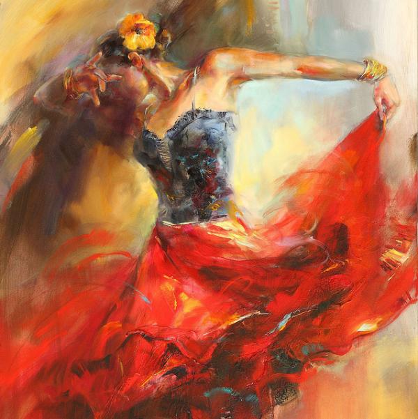
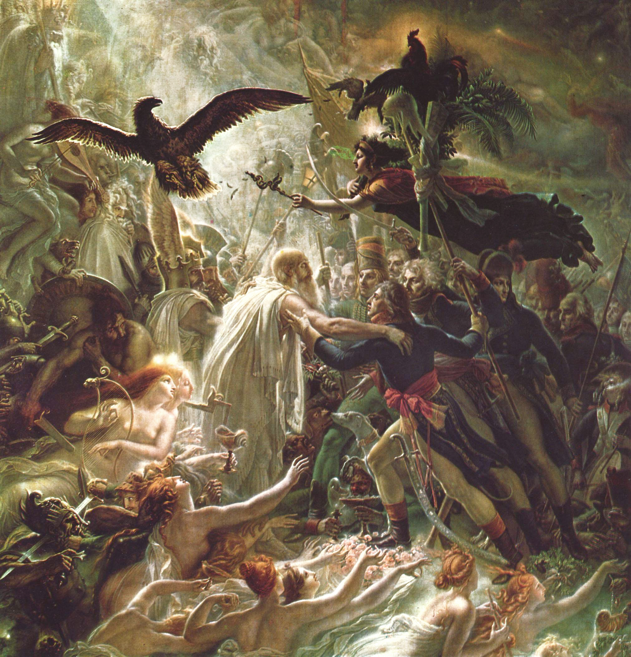
Romanticism-era art's key feature is that it tends to add extra flair and extravagance to the subject. Scenes get busier, landscapes more beautiful, people more attractive. For the romanticism bird I'll drastically enhance the colours and try to make it as pretty as possible. I'll use pencil crayons with some dashings of felt pen. The art here was done by Anna Razumovskaya, Albert Bierstadt, and Anne-Louis Girodet. The movement was popular throughout the 17th and 18th centuries. This was one of the most appealing art styles to me of the bunch as it serves to paint the subjects in a positive light, and allows plenty of room for symbolism and hidden meaning, whilst still providing something pleasant to look at for the viewer.
Realism
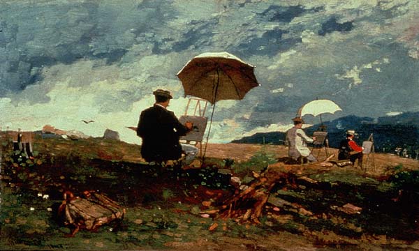


Realism is based around - you guessed it - making things look real. Popularised during industrial revolution-era Britain and rapidly spread around the world, it's aim was to pull away from the overly cheerful and distracting nature of romanticism towards something that painted the subject exactly how they are. This led to a movement of very technically-skilled artists as that was more important in realism than artistic license and less real interpretations. The art here was provided by Winslow Homer, Gustave Courbet, and James McNeill Whistler, who produced what is probably the movement's most famous piece: Whistler's Mother. For this bird I'd be using a duller palette and toning down the extravagance of the previous picture, focusing on the form more.
Modernism


Post-Modernism


Pop Art

So that concludes the various artists I'll be referencing in the bird part of the piece. And now for the rest. I'd already decided this one would be done in my typical black-and-white finelinery style, so rather than putting in the artist here, I'll say WATCH THIS SPACE and it'll lead the way into the first Artist Spotlight. Thanks for reading!
Inspiration and Explanations: Unit Two
This unit was far easier for me. And this was a problem apparently. From the beginning I already knew I had an angle to approach this project from. But that's not allowed. I need DEVELOPMENT. I need SEVERAL DIFFERENT IDEAS. God I hate this subject sometimes. Either way, gotta do what I've gotta do. And so: rant aside, welcome to the second part of my talk through each project.
As I mentioned in the last paragraph, I already knew where I was going to be going with this project. At least vaguely. Rather than strictly using the Earth Artifact as a disk to show what we are at the moment, I theorised the disk would contain some sort of camera link, so they could see firsthand what the earth is like, and if we're still there. I really wasn't sure where to take it from there though. I liked the idea of leaving it ambiguous, but I needed to show that our influence is there and to show it's definetely earth, as I might not have time to make an opening clip to describe the scenario. I had quite a lot of ideas, but the more I thought about them the more I realised they'd make for an uninteresting animation. Not enough can happen with a fixed camera. At that point I reconsidered the project idea. I wondered if I should do something a bit more conventional. And it was a really nice idea I'd had too at that point: a collage made up of all sorts of leaflets and wrappings and basically stuff that screams 'humanity'. But the more I tried the idea, the more I realised that doing anything sophisticated would probably take a bit too long and the animation would be clunky. And that was something I was trying to avoid in this one. In retrospect that too was probably not my best idea, as the animation ended up taking a SUBSTANTIAL amount of work to even get off the ground, let alone to the stage I'd initially envisioned. But more on that later, like...in the project itself. Now it's time to talk ARTISTS. Rather than do what I did with the previous unit, I'm just going to post all the art at once, Then talk about it at the bottom of the heap. So yeah, lots of pictures incoming!


As I mentioned in the last paragraph, I already knew where I was going to be going with this project. At least vaguely. Rather than strictly using the Earth Artifact as a disk to show what we are at the moment, I theorised the disk would contain some sort of camera link, so they could see firsthand what the earth is like, and if we're still there. I really wasn't sure where to take it from there though. I liked the idea of leaving it ambiguous, but I needed to show that our influence is there and to show it's definetely earth, as I might not have time to make an opening clip to describe the scenario. I had quite a lot of ideas, but the more I thought about them the more I realised they'd make for an uninteresting animation. Not enough can happen with a fixed camera. At that point I reconsidered the project idea. I wondered if I should do something a bit more conventional. And it was a really nice idea I'd had too at that point: a collage made up of all sorts of leaflets and wrappings and basically stuff that screams 'humanity'. But the more I tried the idea, the more I realised that doing anything sophisticated would probably take a bit too long and the animation would be clunky. And that was something I was trying to avoid in this one. In retrospect that too was probably not my best idea, as the animation ended up taking a SUBSTANTIAL amount of work to even get off the ground, let alone to the stage I'd initially envisioned. But more on that later, like...in the project itself. Now it's time to talk ARTISTS. Rather than do what I did with the previous unit, I'm just going to post all the art at once, Then talk about it at the bottom of the heap. So yeah, lots of pictures incoming!

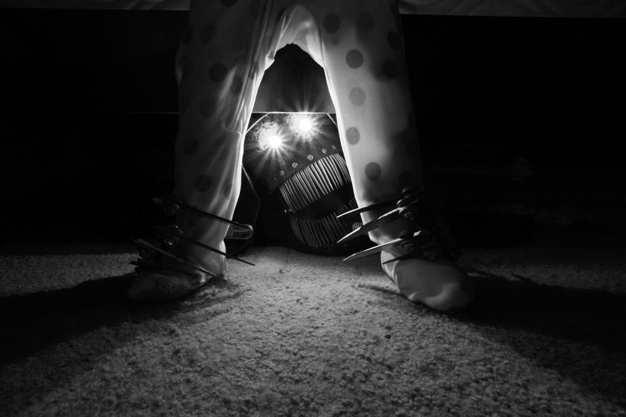
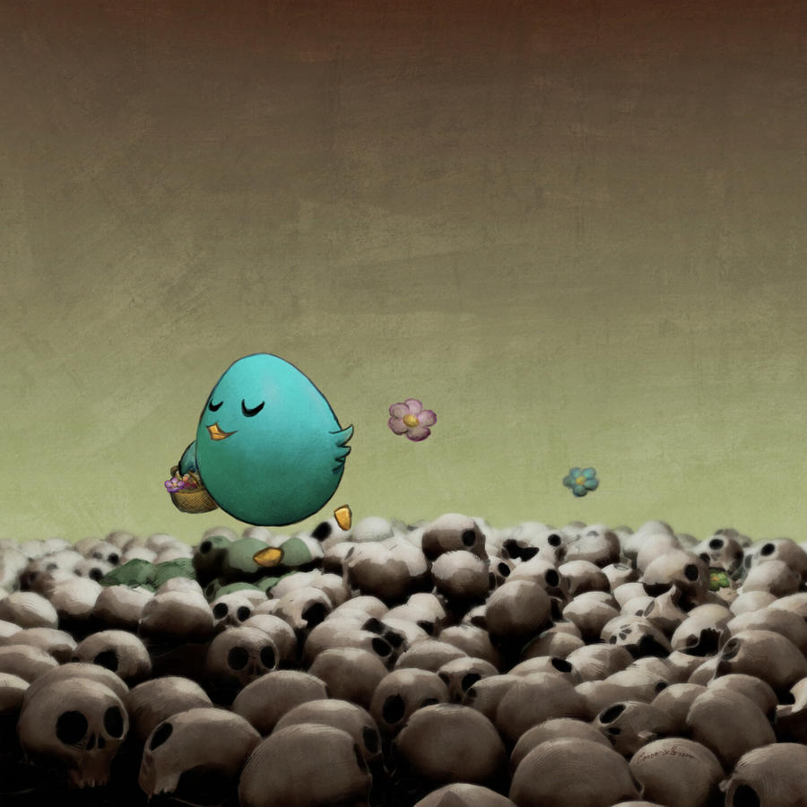
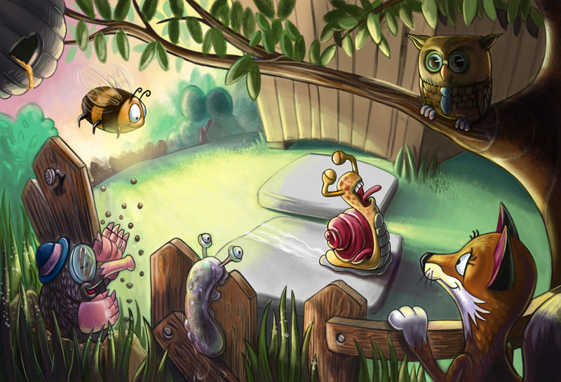
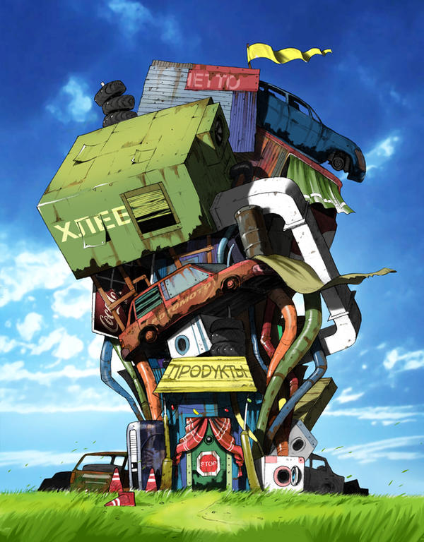
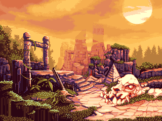
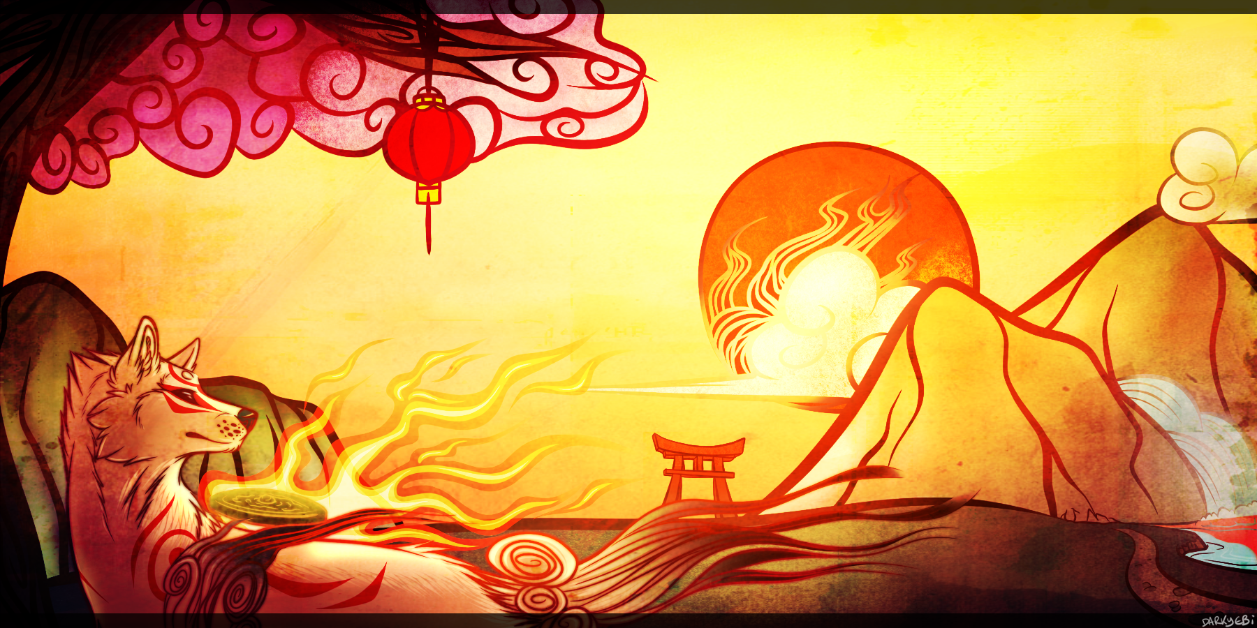
These were all looked through in an attempt to find ideas for the general feel and atmosphere of the world at that point in time. By the time I'd got to research I'd decided that there wasn't going to be any other people besides my vary hazy concept of what or who the protagonist was. So I did what I normally do in these situations, and look around deviantart for ideas. At first I was thinking along the lines of a really pretty world, just without any people. Possibly traces of our existence but no people. But thinking about it I began to wonder if it was a little too bland and empty. The picture is by Roberto Nieto and is based around Howl's Moving Castle, one of my favourite films ever made, After that I naturally looked to the other extreme and thought about doing something with a much darker vibe. I found this photo on one of my favourite artist's pages (Adoptabot from Deviantart). Seriously check that guy out, his sculpture-making is really good. I really like the general vibe that picture gave off and I liked the idea of doing something a little sinister and wierd. I decided to delve deeper into that kind of territory and found Floral Walk by Corvocollorosso. Once I found this one I knew the tone I was after. Everything about this picture was what I'd been looking for. I love the feeling of something that's pretty dark and full of sadness, but the protaganist has no idea what it is. It's just their home. I think that's really beautiful. At this point it really set in motion what I was after and how to achieve it. I then began to consider quite what perspective to approach it from. I was really fond of doing something from the eyes of something smaller than us, seeing things in a distorted view. I might revisit that concept later as the way I presented the final piece negated that somewhat. Again, this one came from another artist I knew prior. An artist by the name of Monkeys-In-My-Head. This doesn't capture the feeling I was hoping for but gave me the idea of doing something on a smaller scale so it's worth mentioning. At this point I began thinking about the environment, as this would spell out what kind of character would live there. Despite the skull theme being used so well in Floral Walk, I felt it pushed things over a bit too obviously, so I started looking into other ideas. Before long I'd settled on the idea of a dumping ground of sorts, where human refuse has been blown or moved to at some point after their departure. Despite being a bit on the cheery side, The Shop by Victor Koroedov sort of sums up the idea. By now I was set on the idea of having a huge cluster of human junk surrounded by a dead landscape. The next picture comes from DrunkyMcFry. I found this when I was looking into background ideas (mostly for the distance and the world outside the junkheap). For starters I'm a huge fan of pixel art, and not only is the picture beautiful, but I loved the colour palette. The final picture here was what cemented my background ideas, and a lot about the art style in general. SMASH-ii from deviantart drew it. It also doesn't hurt that it's from a videogame I love; Okami.
By this point I'd decided the protagonist would be a robot, as this would fit the brief and context best, along with the location for the backgrounds. I din't use any artists as references for the robot design process, but before I began I made a folder of inspiration so I'll repeat those below.
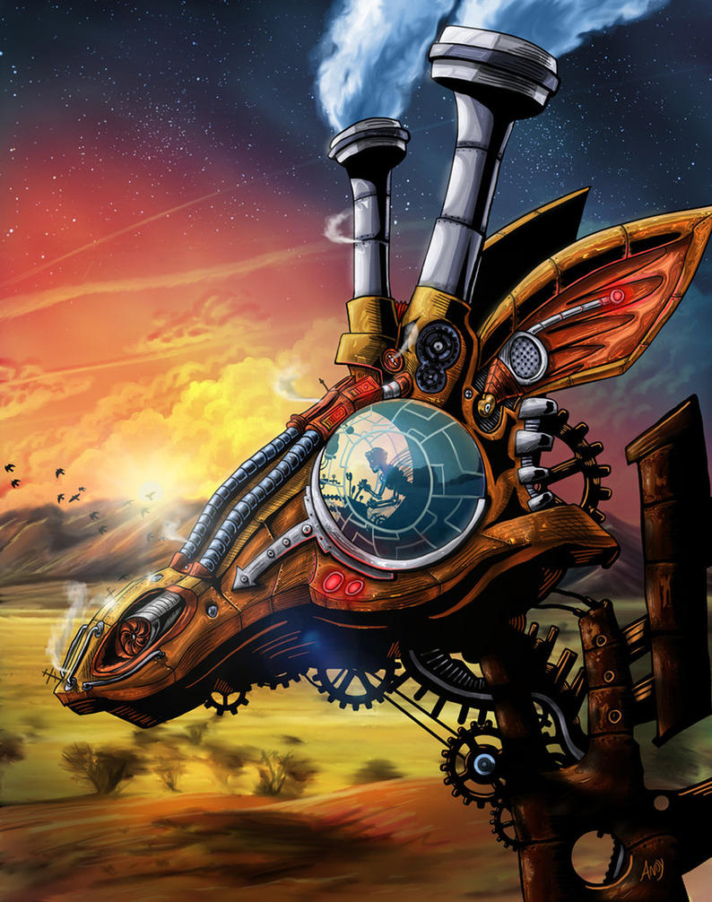

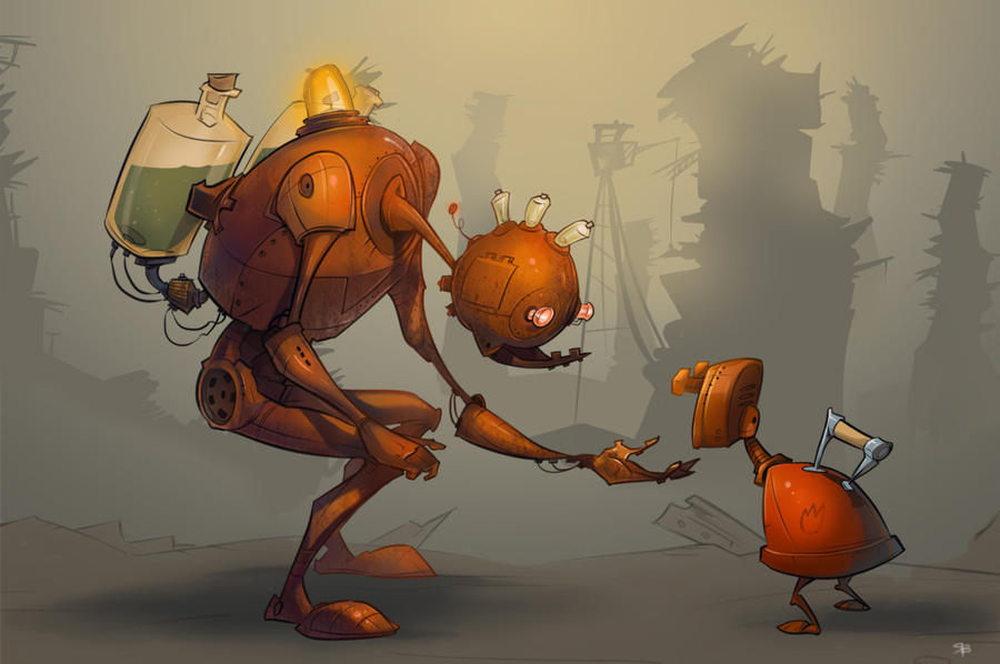
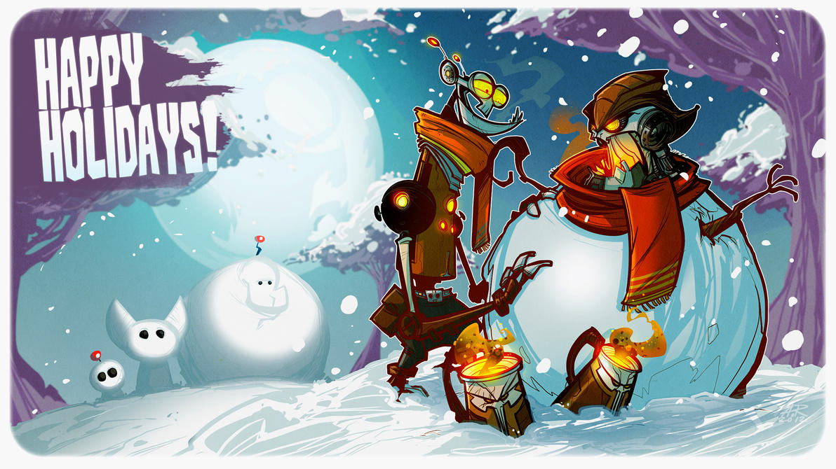
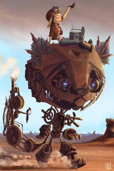
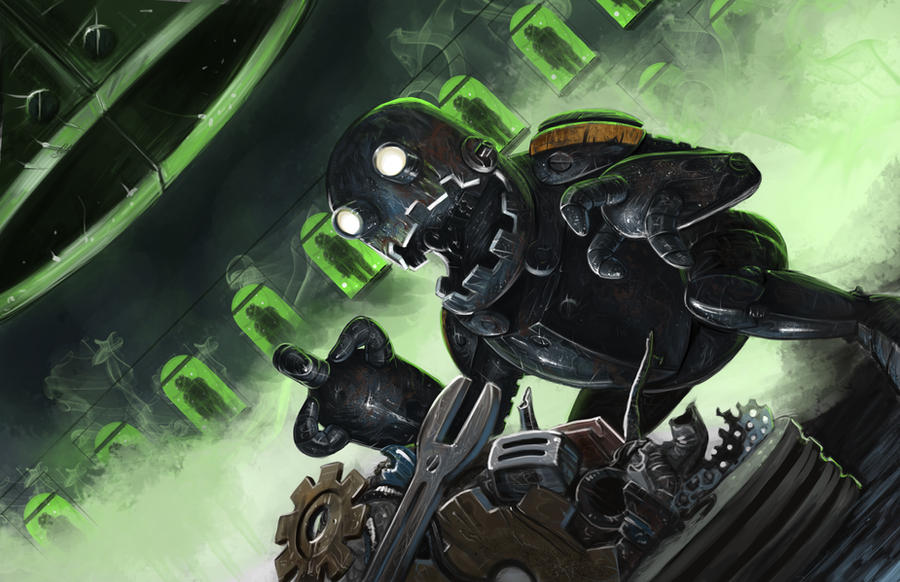
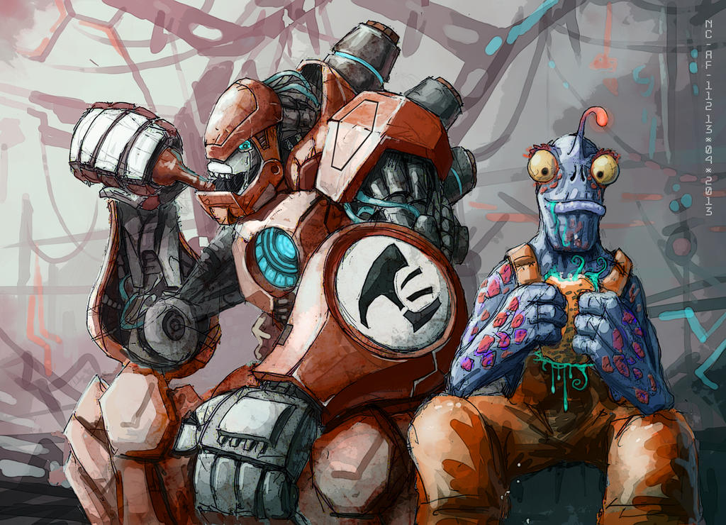
Somewhere along the line I'd decided I would need a villain for the piece too, some sort of monster. Some of the stranger, more animalistic creatures on the list went towards that.
So yeah, that concludes Unit Two's inspiration section. Thanks for reading once again.Friday, 24 April 2015
Inspiration and Explanations: Unit One
Unit one was City In Flux, so needless to say, a large amount of my inspiration came from the towns and cities around me. I've taken many photos around cities before and after I found out about the project I took a trip to Leeds for a set for the sketchbook, and for referencing. Thankfully it was a rather stunning day too, so there are some rather nice photographs from the day. Other than that, there wasn't a massive amount of first-hand research I could do. I had a pretty hard time thinking of a decent idea for the project so I spent quite a while looking at artists for ideas, and of course, an art style.


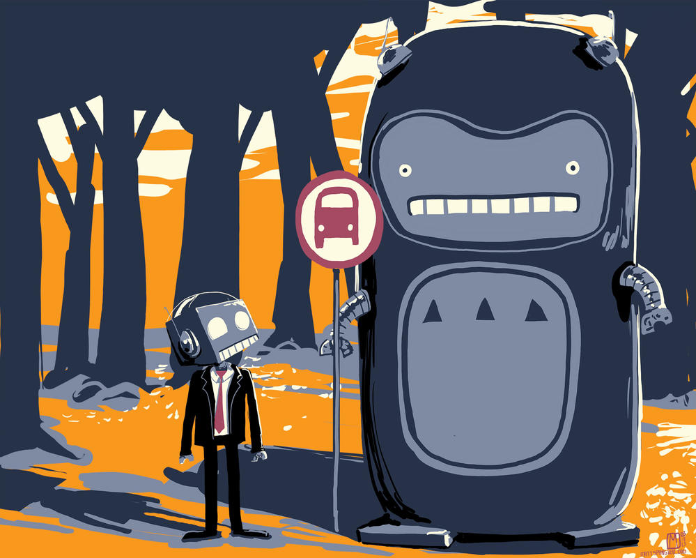
 Mattias Adolffson was naturally a consideration. I always tend to gravitate towards his work. I love the way he draws characters and the variety of shapes and characters he uses. The washed-out style often helps too. I think some of that style ended up in my final animation. The colour ended up similar too, although that was inspired by someone else.


 There's something about the tone that really strikes a chord with me every time I read it. It's remorselessly dark, but rather than showing the readers horrible things, it just picks apart at the nagging moments of real life. In retrospect I seriously missed the mark with this, but it still kept the same slightly depressing feel.
 That just about wraps all this up. This is probably going to be the longest of these by quite a bit. This projects took a while to sink it's roots in with me.
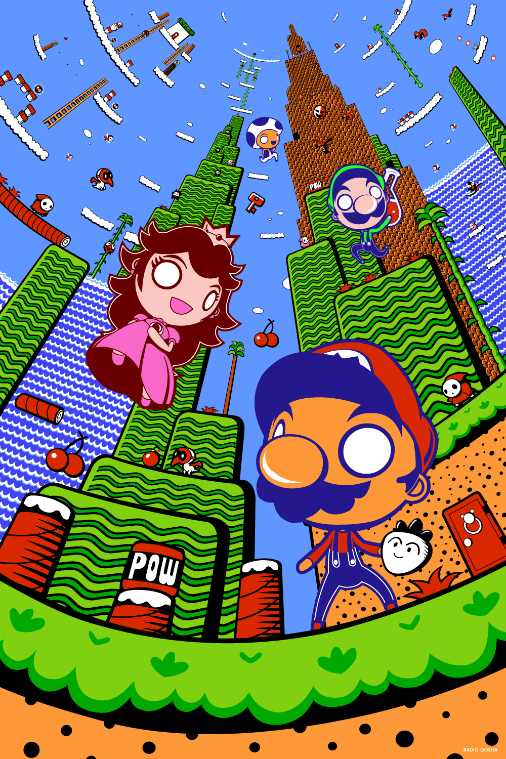
First here is Gosha Dole. On the more ambitious scale admittedly but I would have loved to do something to this effect. I love the use of perspective and colour. One of my original ideas was to do a piece based around the camera spinning on one spot and the city expanding and progressing around it. Sadly at this point I was very unfamiliar with animation and wasn't sure how applicable or feasible it would be to make it. Shame really, it would've been some seriously cool work.
Next is Peter Jarvis, known as Monkeys-In-My-Head from Deviantart. I like the cutesy style and the use of colour. It was one of the styles I'd considered using for the final piece. If I wasn't fed up of colouring at the time I'd have borrowed their rendering style.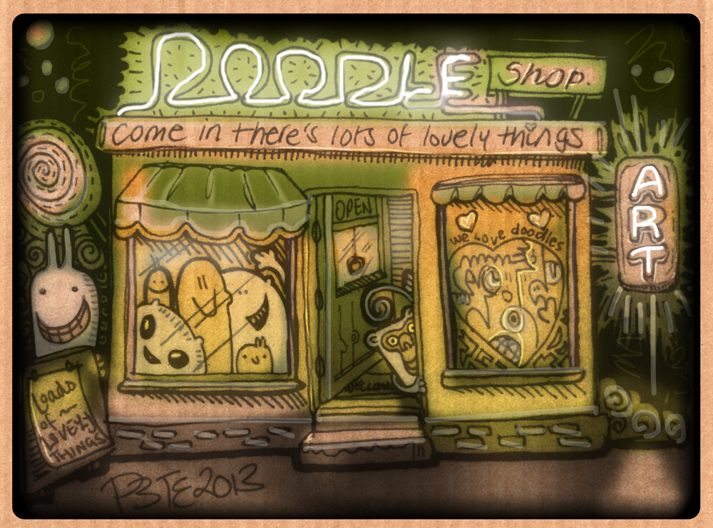
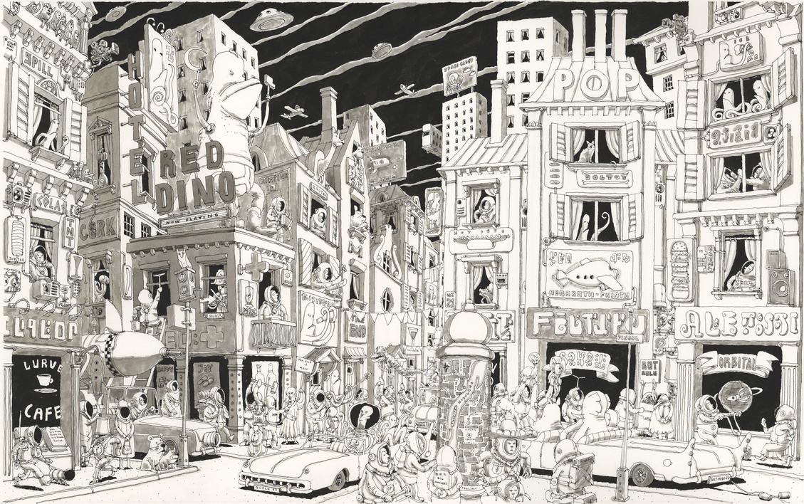
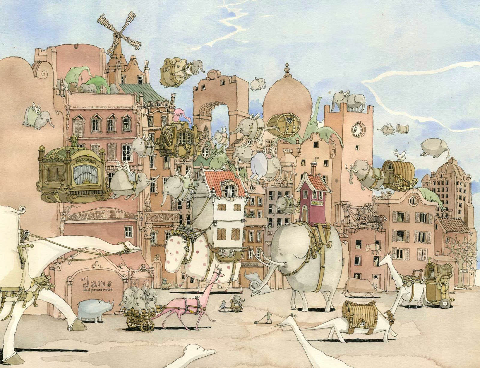 Mattias Adolffson was naturally a consideration. I always tend to gravitate towards his work. I love the way he draws characters and the variety of shapes and characters he uses. The washed-out style often helps too. I think some of that style ended up in my final animation. The colour ended up similar too, although that was inspired by someone else.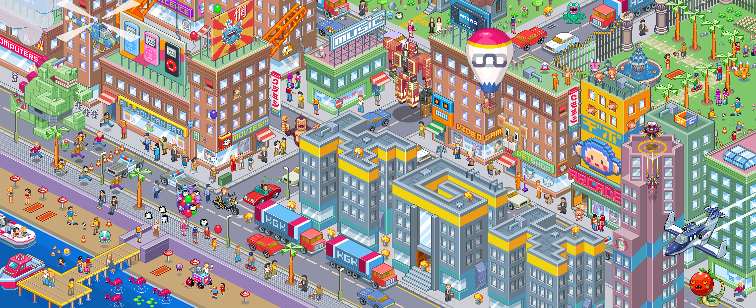
Another art style I'd considered was pixel art. Whilst awkward to do initially, it comes with a number of benefits such as the ability to alter sections whilst still keeping the picture perfectly uniform. It would mean the animation would look organic, and fit seamlessly into the art. It was something I'd revisit but on a much simpler degree during my later aftereffects practice exercise. But as usual, I had no idea how to animate before the first unit, so this would be difficult to pull off. This one was done by Gunstar-Red.
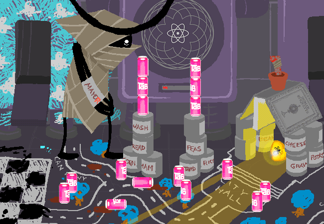
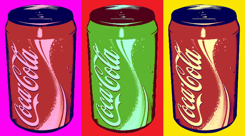
Another idea I had for the project, one that was pretty tempting early on, was inspired by Homestuck, by Andrew Hussie. In particular, one character known as the Wayward Vagabond creates a town made out of tin cans and calls it Can Town. I'd considered doing something similar. Maybe using some stop motion animation or maybe some digital work on top of it. But I decided against it. It's something I would love to revisit though. The other can picture was done by OverPhotography.
It was at about this time when I decided that the project couldn't be about the city. At least, not entirely. I had to put the focus on the people instead. So I reworked the project idea in my head from 'how the city changes' to 'how the city changes people' instead. I was finally getting somewhere. After deciding that, I looked towards my usual first response for projects. I looked towards Jimmy Corrigan - a book written by Christopher Ware. I looked at it briefly at the start of the unit but purely for art style. But now I wanted the tone more than anything.

 There's something about the tone that really strikes a chord with me every time I read it. It's remorselessly dark, but rather than showing the readers horrible things, it just picks apart at the nagging moments of real life. In retrospect I seriously missed the mark with this, but it still kept the same slightly depressing feel.
From this I started processing my ideas into a series of characters. I think my main problem was that I really over-dramatised all of the problems into genuine big deals. The characters were done in my current Captain Cool-esque style, but with some added emphasis on getting the outfits to look realistic. The building and the cars were drawn somewhere between my robot style, and those from Jimmy Corrigan. But colour-wise I looked in a completely different direction. Somewhere closer to home: Transformers. In particular, the quite excellent More Than Meets The Eye. I'll do a full feature or something on it later. But for the first half of it's current run, it was coloured by the quite excellent Josh Burcham in a very washed-out kind of style and it works really well.
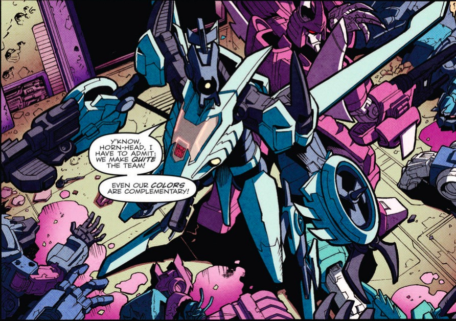 That just about wraps all this up. This is probably going to be the longest of these by quite a bit. This projects took a while to sink it's roots in with me.
Photoshop Timeline Practice

We started off with some preeetty simple GIF practice, simply to show us how timelines on photoshop work.
Then we tried something more complicated with an underlay and lots of that kind of thing.
We drew over the frames of the video, essentially tracing the motion for the character.
Then when I removed the underlay it looked like this:
I'm fairly pleased with the whole thing, even if some of the motion didn't sync up an nicely as I would've liked.
Dinosaur Moving Typography Practice
DINOSAURS - A Title Sequence from Jonny Clementson on Vimeo.
This was done on Adobe Aftereffects as Kinetic Typography practice.
Contextual Portfolio Part One
Well, I guess I've put this off for long enough. So...I guess I have to talk about stuff I like and how it ties into the projects and all that good stuff. So as I have really no ideas what to talk about there, I'll talk about my art and how I got to where I am so far. And of course, the artists that inspired me.
To start off: showing off time!!!
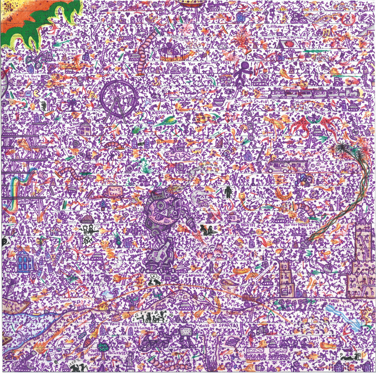
 The doodle wars was where it started I guess. I mean, not one this good (I did this recently) but stickman fights and that sort of thing. Back then, I was not a good artist. I mean, I was like nine years old, but that is besides the point. I made quite a few at that age. Most were fairly uninteresting. I don't believe I still own any of the originals.
 Next up came The Big One. Y'see at that point my brother was producing a set of comics called Captain Wedgie. Naturally inspired by Captain Underpants, they were short stories rather than full-on comics, and surprisingly popular affairs. So being the competitive so-and-so I am I decided to set up a rival comic. Admittedly it was something I'd considered before but it would have never happened had I not had such a rivalry. And so: Captain Cool was born.
A far more...well I can't exactly call it mature, but...traditional take on a superhero comic, Captain Cool told the story of an average business man who gains superpowers every time he gets electrocuted. As a premise it was simple enough, and as were the stories told. Three issues were written during my tenure at primary school. The first dealt with the uprising of a wicked witch. The second dealt with a group of burglars led by Tony Blair. The third involved vikings. And Batman. All three were fairly short story arcs with #2 being the highlight of the initial triplet. Then came secondary school and the series took a strong step upwards. Issue four was one hell of a milestone. Taking the series into far more interesting and (unintentionally) morally dubious territory. It dealt with an all-out alien invasion and set up several characters for the stories to come. For the first time I felt the series had come to a point I was happy with. Up to today it still stands as the finest of the series. Issue five saw the series return to its roots so to speak. As the villain it featured the winner of the Design a Monster contest from the first issue. Relocating the action to Egypt, it featured The Beast of the Pharaoh wreaking various levels of havoc. As much as I'd love to critique the issue along with the rest , it was lost a few years back. Whilst it still resides in my bedroom somewhere I haven't found it in quite a while. I believe it was the weakest of the second triplet of stories, but it's tough to remember. The story was another self-contained one and featured the rise and fall of another hero, Doctor Flame. It also contained a dramatic shift in art styles towards one similar to that which I use today. The sixth and final story in the second triplet was quite possibly the most ambitious. Bringing together a new host of villains in the form of Zarok, a surviving antagonist from the fourth issue, a robot designed by another friend as Mister Schnozz, and a pair of twins consisting of Freddy McEvil, runner up in the character poll, and Mister Squishy, a gangster character created for on a whim. They led an invasion of mass-produced stickmen. That issue, whilst far more epic in scope, was something of a disaster in story terms, lacking the strong arc of the fourth issue or the neatness of the fifth. Issue seven was started but barely made it a few pages in before I gave up on it, After that I contemplated recommencing the series at various points, but to no avail. Captain Cool was left at that milestone.

Towards the end of Captain Cool's run, my heart was beginning to be elsewhere. At that point I'd been captivated by the art and universe of Warhammer 40,000, in particular, that of the Space Marines.
Before I go onto that though I thought I'd add some perspective foir the time periods. Throughout my years at secondary school I'd gradually been improving at art. Year eight was a slight dip but generally all was going strongly in that front. I just though I'd add this to show what was happening in terms of more traditional art, and that I wasn't just drawing the stuff from my 'phases'.
 I'd started off at...well I'd call it a pretty bad place artistically. The drawings were rather cartoonish and blobby, they'd never really been done with references, and just generally, they were bad. But I persisted. For far, far longer than I ever should have done. I began to use references and started using better materials. Before long I'd begun to develop something close to a style. Sure it wasn't accurate to the models or official artwork proportianally but I liked where my style was going. For the first time I genuinely liked where I was at with my art. It felt like I was doing something good. It was about this time that I started my deviantart account and began to get positive feedback on my art and a small following. This really became a driving force for my art and helped seperate the good from the bad. The Space Marine era went on for quite a while. At least 3 years. Towards the end things were getting pretty decent. Whilst my proportions were still slightly cartoonish, the art was getting great. I'd started empolying shading to my art and trying to go for a slightly more realistic feel. I'd filled an entire sketchbook with these things and even umong my school my art was getting known.
 Admittedly doing most of my drawings in lessons contributed to that. It was late year ten when things began to dry up in the warhammer front. I'd taken to drawing other things a bit towards the end of my sketchbook. Cars, pictures of my Bionicles, Iron Man. I guess I was just getting bored of space marines. It was somewhere around that time when I draw what came to be known as the Soulbot, and ushered in another phase for my art.
I realised that the skills I'd learned over the last few years could easily be applied to other things. I'd begun to experiment with higher levels of detail and I was liking it. But one of my key limitations in school was the lack of references. Everything I drew was going to have to be from my head. So I began drawing robots. This was when things exploded somewhat.
Before I detail the start of the current era, I figured I should bring up my big success story: The Doodle Wars. This is the series that culminated in the stickman battle you saw earlier. At some point decided it would be cool to do another stickman fight, but on lined paper using the lines as floors of a building. At some point early on I broke my usual standards and didn't colour the different sides in opposing colours. It all became a uniform purple. This was an unprecidented success on deviantart, and spawned six sequels to date. The sixth entry in the series proved the most successful by far, getting awarded Daily Deviation status on deviantart and garnering some 40,000 views. But after then I tried my most ambitious one and made a larger, far more packed entry. And I made it too intricate. Too intricate for Deviantart's thumbnail size. Sure it was popular, but it never reached the groundbreaking levels of the last entry in the series.It's at that point the doodle wars has been lefty or now. I daresay another one will come soon, but I need a new purple pen.

 So yeah, Robots. I started creating different body shapes and decided to throw character stereotypes into robot form. Whereas the space marines got off to a rough start, with the robots it was GO from the very beginning. I began by rendering them in a similar style to the space marines, albeit with more detail. But as my style progressed and I became better at applying detail, I began to abandon colour in order to draw more attention to the linework. After then I continued drawing robots. Whilst the number decreased due to the pressures of schoolwork and later university work, the ones that were produced were nothing short of awesome. The last proper one was Bigger Chris, who was the biggest, most detailed piece I've ever done. And it was good.

Despite my robot output thinning towards the present day, I started progressing my abilities at drawing people again with one of my A-Level units. It was the first 'Free Choice' module, so I focussed my attention to superhero comics, and for my final piece, I began what would become the revival of Captain Cool.
Right now I'm continuing to improve my abilities in people-drawing, by trying to incorporate it into as much of my uni work as possible. Over the summer I'll be starting on a revamped issue seven of Captain Cool, which will be the final issue of the 'original series' before moving the series to a new format, potentially as a webcomic. I also plan to do a LOT of robot drawing over summer to make up for the lack of it I've done this year.
 So yeah, that was how I've got to where I am now.
To start off: showing off time!!!
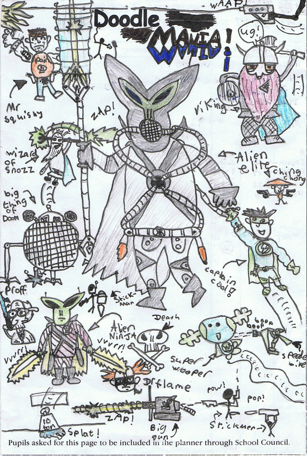 Next up came The Big One. Y'see at that point my brother was producing a set of comics called Captain Wedgie. Naturally inspired by Captain Underpants, they were short stories rather than full-on comics, and surprisingly popular affairs. So being the competitive so-and-so I am I decided to set up a rival comic. Admittedly it was something I'd considered before but it would have never happened had I not had such a rivalry. And so: Captain Cool was born.
A far more...well I can't exactly call it mature, but...traditional take on a superhero comic, Captain Cool told the story of an average business man who gains superpowers every time he gets electrocuted. As a premise it was simple enough, and as were the stories told. Three issues were written during my tenure at primary school. The first dealt with the uprising of a wicked witch. The second dealt with a group of burglars led by Tony Blair. The third involved vikings. And Batman. All three were fairly short story arcs with #2 being the highlight of the initial triplet. Then came secondary school and the series took a strong step upwards. Issue four was one hell of a milestone. Taking the series into far more interesting and (unintentionally) morally dubious territory. It dealt with an all-out alien invasion and set up several characters for the stories to come. For the first time I felt the series had come to a point I was happy with. Up to today it still stands as the finest of the series. Issue five saw the series return to its roots so to speak. As the villain it featured the winner of the Design a Monster contest from the first issue. Relocating the action to Egypt, it featured The Beast of the Pharaoh wreaking various levels of havoc. As much as I'd love to critique the issue along with the rest , it was lost a few years back. Whilst it still resides in my bedroom somewhere I haven't found it in quite a while. I believe it was the weakest of the second triplet of stories, but it's tough to remember. The story was another self-contained one and featured the rise and fall of another hero, Doctor Flame. It also contained a dramatic shift in art styles towards one similar to that which I use today. The sixth and final story in the second triplet was quite possibly the most ambitious. Bringing together a new host of villains in the form of Zarok, a surviving antagonist from the fourth issue, a robot designed by another friend as Mister Schnozz, and a pair of twins consisting of Freddy McEvil, runner up in the character poll, and Mister Squishy, a gangster character created for on a whim. They led an invasion of mass-produced stickmen. That issue, whilst far more epic in scope, was something of a disaster in story terms, lacking the strong arc of the fourth issue or the neatness of the fifth. Issue seven was started but barely made it a few pages in before I gave up on it, After that I contemplated recommencing the series at various points, but to no avail. Captain Cool was left at that milestone.
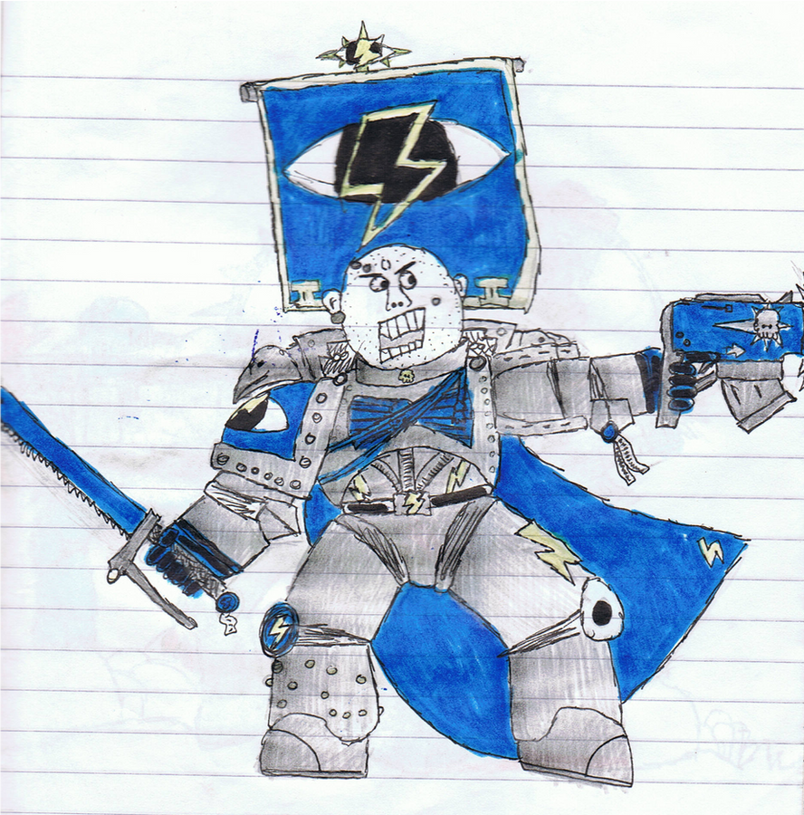
Towards the end of Captain Cool's run, my heart was beginning to be elsewhere. At that point I'd been captivated by the art and universe of Warhammer 40,000, in particular, that of the Space Marines.
Before I go onto that though I thought I'd add some perspective foir the time periods. Throughout my years at secondary school I'd gradually been improving at art. Year eight was a slight dip but generally all was going strongly in that front. I just though I'd add this to show what was happening in terms of more traditional art, and that I wasn't just drawing the stuff from my 'phases'.
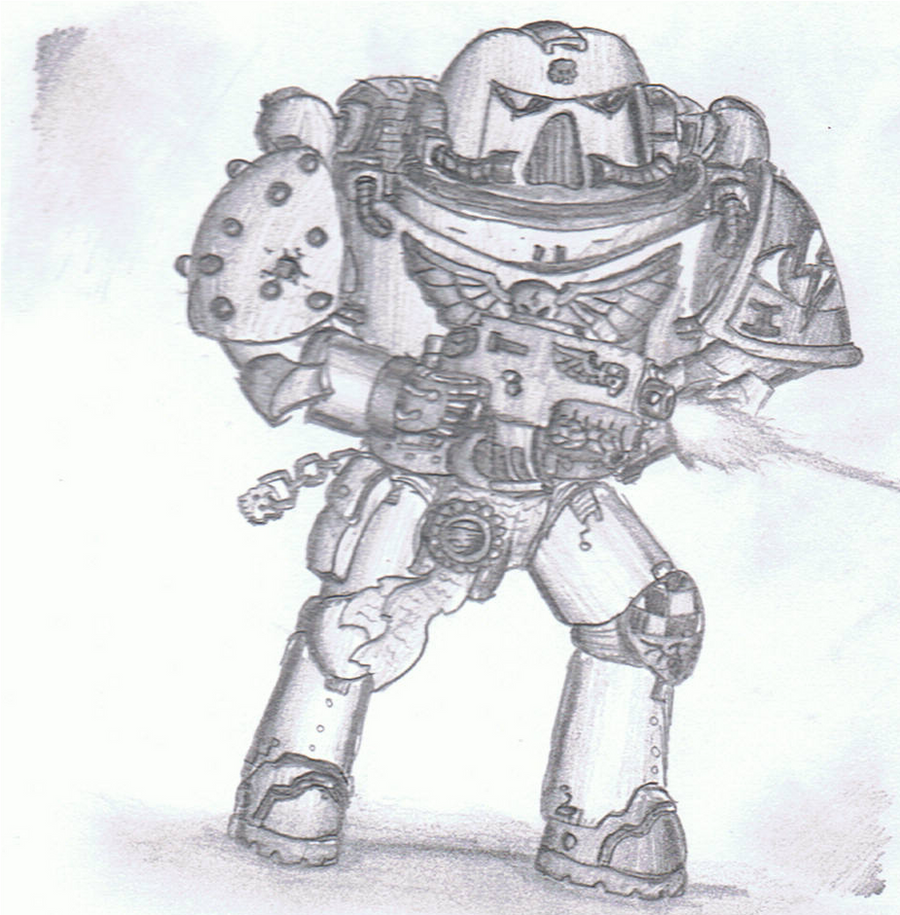 I'd started off at...well I'd call it a pretty bad place artistically. The drawings were rather cartoonish and blobby, they'd never really been done with references, and just generally, they were bad. But I persisted. For far, far longer than I ever should have done. I began to use references and started using better materials. Before long I'd begun to develop something close to a style. Sure it wasn't accurate to the models or official artwork proportianally but I liked where my style was going. For the first time I genuinely liked where I was at with my art. It felt like I was doing something good. It was about this time that I started my deviantart account and began to get positive feedback on my art and a small following. This really became a driving force for my art and helped seperate the good from the bad. The Space Marine era went on for quite a while. At least 3 years. Towards the end things were getting pretty decent. Whilst my proportions were still slightly cartoonish, the art was getting great. I'd started empolying shading to my art and trying to go for a slightly more realistic feel. I'd filled an entire sketchbook with these things and even umong my school my art was getting known.
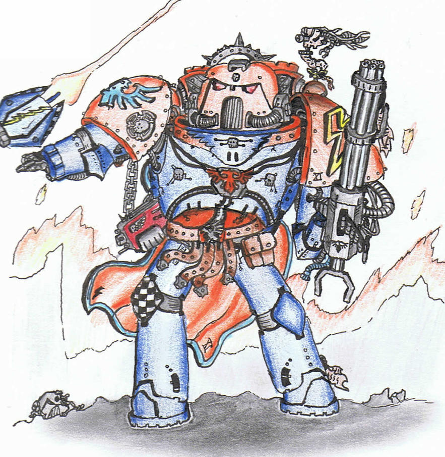 Admittedly doing most of my drawings in lessons contributed to that. It was late year ten when things began to dry up in the warhammer front. I'd taken to drawing other things a bit towards the end of my sketchbook. Cars, pictures of my Bionicles, Iron Man. I guess I was just getting bored of space marines. It was somewhere around that time when I draw what came to be known as the Soulbot, and ushered in another phase for my art.
I realised that the skills I'd learned over the last few years could easily be applied to other things. I'd begun to experiment with higher levels of detail and I was liking it. But one of my key limitations in school was the lack of references. Everything I drew was going to have to be from my head. So I began drawing robots. This was when things exploded somewhat.
Before I detail the start of the current era, I figured I should bring up my big success story: The Doodle Wars. This is the series that culminated in the stickman battle you saw earlier. At some point decided it would be cool to do another stickman fight, but on lined paper using the lines as floors of a building. At some point early on I broke my usual standards and didn't colour the different sides in opposing colours. It all became a uniform purple. This was an unprecidented success on deviantart, and spawned six sequels to date. The sixth entry in the series proved the most successful by far, getting awarded Daily Deviation status on deviantart and garnering some 40,000 views. But after then I tried my most ambitious one and made a larger, far more packed entry. And I made it too intricate. Too intricate for Deviantart's thumbnail size. Sure it was popular, but it never reached the groundbreaking levels of the last entry in the series.It's at that point the doodle wars has been lefty or now. I daresay another one will come soon, but I need a new purple pen.
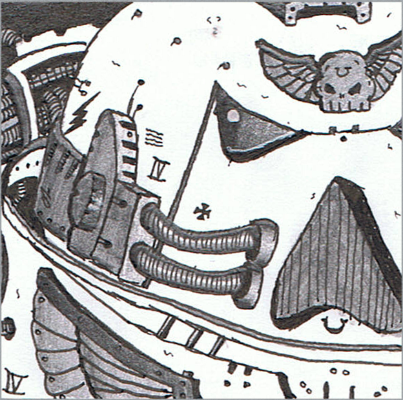
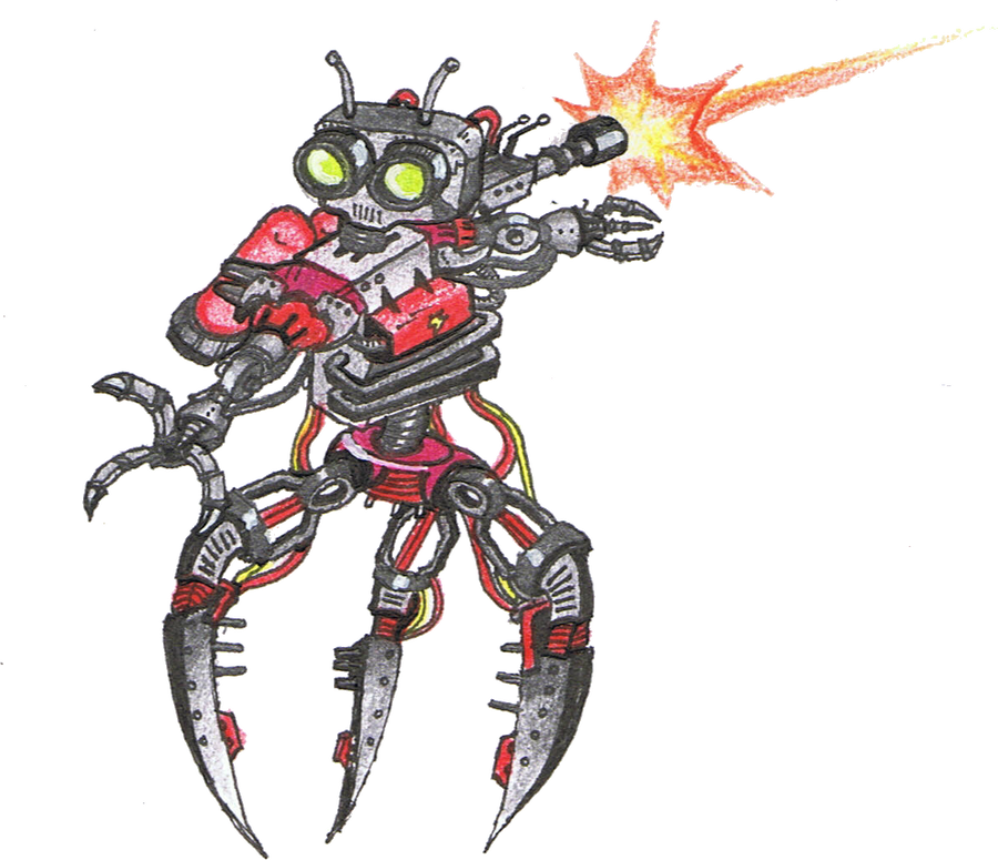
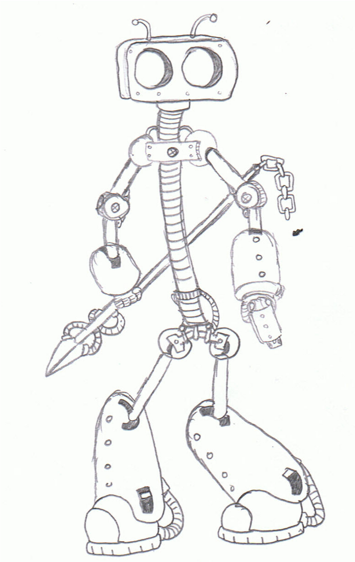 So yeah, Robots. I started creating different body shapes and decided to throw character stereotypes into robot form. Whereas the space marines got off to a rough start, with the robots it was GO from the very beginning. I began by rendering them in a similar style to the space marines, albeit with more detail. But as my style progressed and I became better at applying detail, I began to abandon colour in order to draw more attention to the linework. After then I continued drawing robots. Whilst the number decreased due to the pressures of schoolwork and later university work, the ones that were produced were nothing short of awesome. The last proper one was Bigger Chris, who was the biggest, most detailed piece I've ever done. And it was good.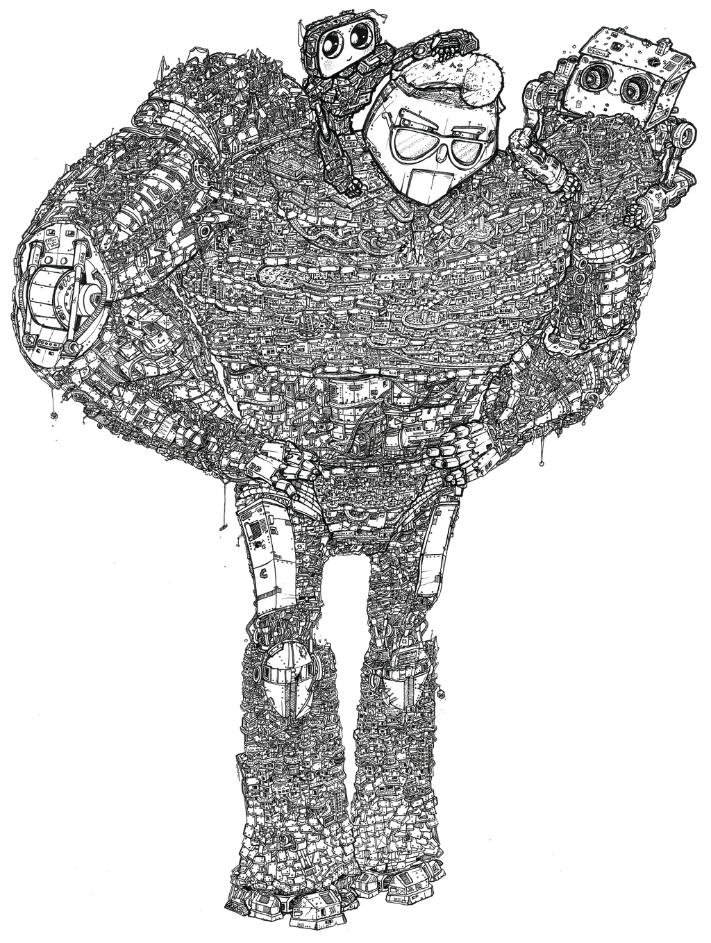
Despite my robot output thinning towards the present day, I started progressing my abilities at drawing people again with one of my A-Level units. It was the first 'Free Choice' module, so I focussed my attention to superhero comics, and for my final piece, I began what would become the revival of Captain Cool.
Right now I'm continuing to improve my abilities in people-drawing, by trying to incorporate it into as much of my uni work as possible. Over the summer I'll be starting on a revamped issue seven of Captain Cool, which will be the final issue of the 'original series' before moving the series to a new format, potentially as a webcomic. I also plan to do a LOT of robot drawing over summer to make up for the lack of it I've done this year.
Subscribe to:
Posts (Atom)