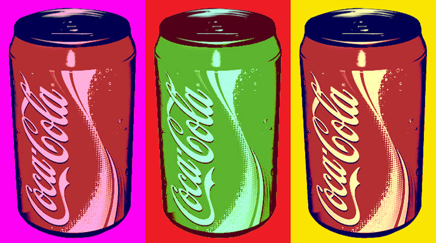
So I'll be posting up my final animation piece (aside from the showreel of course) tomorrow so I figured I would say a few words here about it. As this thing's probably been marked already this will mostly be for my own gain when I write this lot up in my sketchbook. So yeah, given it's late at night and the stuff mentioned above, I probably won't put any pictures in much. Maybe a couple.
So a quick overview first: it's an animation about art movements. I couldn't find quite enough to sink my teeth into with modernism or postmodernism I had an idea about how to do an animation based around art movements. As I still wanted to get a bit of focus on modernism and post modernism I based the movements on the ones before and after modernism. So there's Romanticism, Realism, Modernism, Post-Modernism, and Pop Art.
The project went through several shifts in perspective and style over the time I've been working on it. Even to the stage where I was planning on a very different ending just a few hours ago. So I'll start at the most appropriate part for this: The End. You see I was initially planning a slow zoom in through the window where the title would appear after the fighting artists are offscreen in a nice hand-drawn font and the first bird would fly by. But it was then I realised that because of all the horribly complex animated action at the bottom I'd have an extremely hard time pulling that off. perhaps if I were using aftereffects it might've worked but I was so far down this route that I had no options to change. By this point I'd already finished the fight section for the end and it had ended up a bit more brutal than intended. And I don't quite know why I though of this but I remembered the ending of one of my favourite horror-ish films: Funny Games. If I get time I'll do a spotlight on it. I mean generally speaking it's not a film I'd thought I would like. A thoroughly harsh film that's really unpleasant to watch, it has just enough satire and taste to pull it off. But the point I though of was the very end. After the film ends in a pretty spectacular manner the title hits the screen on a black background with red text (I ended up using white on mine though) with heavy thrash metal cutting in. It's an unpleasant ending for an unpleasant film. And I love it. And despite my animation not having sound at the moment I'll try and emulate that ending.
Whilst i think of other influences I'll just jot down where the inspiration came for each bird. The first one was done in my standard cartoony style but with the eyes borrowed from the very glossy eyes of my robot drawings and a couple of touches from Girls With Slingshots. The second and third just used generic google searches to find some inspiration. I'm not that happy with them really. I did them a week or so before the second batch and it kinda shows. For the modernism one I borrowed heavily from this picture:
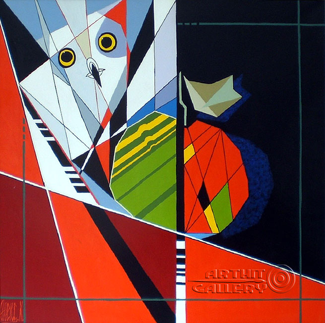
I sadly can't find who did it. I'll try and get it for the sketchbook though. The postmodernism one was quite fun to do. As postmodernism is so varied I decided to give it a shot myself. I took the theory of minimalism, and employed it to a bird. I managed to reduce it to a square with a triangle for a beak. The wing was added just to give me something to animate. The pop art one was a mixture of lichtenstein and warhol's styles, using a very comic-based bird picture partially inspired by the bird logo of Darby Productions and my general experiences reading comics, and the duplicating picture style of warhol.
So onto the animation itself. I'd done three animations at this point. Or at least done a good chunk of three. The first was a decent length and looked fairl nice, but the animation was really clunky and the dialogue was terribly done. I'd also tried to hide how basic it was and probably made it worse by doing it. The second was my attempt at doing really smooth and decent animation. I used aftereffects for the first time in a final piece. And the last time too it would seem for this year at least. The animation was smooth and really nice but rigging up the characters took an age, and the animating was very slow. It's something I might revisit in the future though. I also tried to return to it recently but the layers are so badly organised it would take forever to do more work on so I'll just sew on the other pictures I'd done. So I'd done really clunky before and got a decent amount from even if it was very badly executed. And I'd done smooth animation that looks almost professional but it takes too long to put together a decent project. So for my 'third' project, the one I replaced Kelly's sessions with, I tried simplifying the art (and doing it digitally) and attempting a more frame-by-frame style. It turned out fairly well but used up that option for the final project. So I went back to the start, and used the same techniques as the first animation but with a knowing attitude, and far more experience. I also found inspiration from The Darkness's latest music video, which was made by one of my favourite comic artists ever, Nick Roche. The video's called Barbarian but I'm too tired to link it now. But yeah, I made this animation knowing immediately the limitations I would have and that instead of going for massive quality, I';d craft the whole thing with some preset boundaries in place. And through doin g this I was able to deliver on some of the best art Ive done for an animation yet.
So 'Birds: An Animation About Art' will drop tomorrow, and it's a weird one. I think I like it.
Tuesday, 5 May 2015
Sunday, 26 April 2015
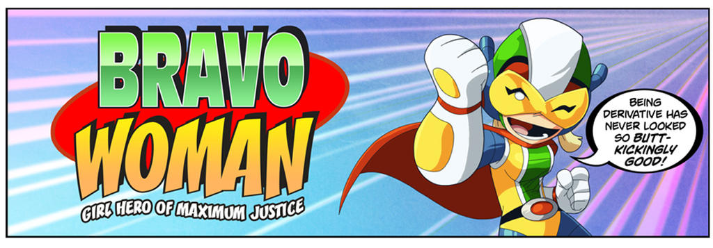
Spotlight: Bravoman: Super-Unequaled Hero of Excellence by Matt Moylan and Dax Gordine
Bravoman oh beautiful Bravoman. Why did you life end so suddenly? Oh sweet Bravoman you had so much left to give!
Okay that aside, Bravoman is the next chapter in my Spotlight list. It was a webcomic set up by Shiftylook, a studio set up to try and make good of some of Namco-Bandai's unused intellectual property. You see, Bravoman started out as a really difficult 1980s side-scrolling videogame. It got a very limited release outside of japan and outside of a couple of crossovers he never really showed up since. But as one of the launch titles for the Shiftylook campaign he was suddenly back in the spotlight!
As a comic it's a hilarious fourth-wall breaking affair with a truly wonderful set of characters. Its plotlines range from genuinely good to utterly bonkers, and it's a total hoot. Later it also gained itself a webtoon show with voices by Rob Paulsen and Dee Bradley Baker among others. It's quite fantastic and has an awesome theme tune.
It also gained a new videogame, but that really wasn't very good. It was perhaps the first sign of things to come. It felt rushed, and another month or two of development would have made it great. But alas, it was not to be. Shiftylook went bust. And it dragged all of its work with it. Numerous webcomics vanished. Lost to some corporate idiot's lack of business sense. It's pretty tragic. At least Bravoman got a nice enough finish. And hopefully they'll finish publishing the Bravoman books.
GO--GO--BRAVO!!!
As a comic it's a hilarious fourth-wall breaking affair with a truly wonderful set of characters. Its plotlines range from genuinely good to utterly bonkers, and it's a total hoot. Later it also gained itself a webtoon show with voices by Rob Paulsen and Dee Bradley Baker among others. It's quite fantastic and has an awesome theme tune.
GO--GO--BRAVO!!!
Spotlight: Last Stand Of The Wreckers by Nick Roche and James Roberts (and Guido Guidi)
This one's been a long time coming. So welcome to my favourite comic series ever made.
It's no secret that I have a lot of love for Transformers. Whilst the films are mediocre and the TV shows usually good, the one part of the brand that really captured me and continues to amaze is the IDW comic series. They got off to a slow start in 2005 after the previous license-holders went down in a storm of bankrupcy, but after a few years they rebooted the series with a something of a year-long romp, before starting another series with a different author. Around that time an up-and-coming Irish artist and writer Nick Roche pitched in idea for a five-part miniseries. Last Stand Of The Wreckers was born.
Transformers is a brand with some thirty years of history. During that time many new iterations of the brand showed their faces, but the cast of the 1980s cartoon show would be the most endearing and the characters would always inspire those to come. The IDW continuity is specifically based on those characters so this comes across even stronger here. Y'see with transformers there's a very nasty habit of always having the spotlight on that particular group of characters. Part of IDW still falls prey to that. But Wreckers was different. It set out with a simple aim: to make the reader care about a series of new characters as much as they did the old, established ones. And then it set about one of the most brutal plotlines in transforming robot history. It is a story of courage, heroism, and good people dying in stupid, pointless ways.
Quite frankly it's bloody brilliant and even if you don't know Transformers you'll probably get a lot out of this story. The art is really expressive and the writing is so on-point and relatable you'd forget it was robots talking. And that's one of the true merits of Wreckers. It's not just good transformers. It's just good everything.
It's no secret that I have a lot of love for Transformers. Whilst the films are mediocre and the TV shows usually good, the one part of the brand that really captured me and continues to amaze is the IDW comic series. They got off to a slow start in 2005 after the previous license-holders went down in a storm of bankrupcy, but after a few years they rebooted the series with a something of a year-long romp, before starting another series with a different author. Around that time an up-and-coming Irish artist and writer Nick Roche pitched in idea for a five-part miniseries. Last Stand Of The Wreckers was born.
Transformers is a brand with some thirty years of history. During that time many new iterations of the brand showed their faces, but the cast of the 1980s cartoon show would be the most endearing and the characters would always inspire those to come. The IDW continuity is specifically based on those characters so this comes across even stronger here. Y'see with transformers there's a very nasty habit of always having the spotlight on that particular group of characters. Part of IDW still falls prey to that. But Wreckers was different. It set out with a simple aim: to make the reader care about a series of new characters as much as they did the old, established ones. And then it set about one of the most brutal plotlines in transforming robot history. It is a story of courage, heroism, and good people dying in stupid, pointless ways.
Quite frankly it's bloody brilliant and even if you don't know Transformers you'll probably get a lot out of this story. The art is really expressive and the writing is so on-point and relatable you'd forget it was robots talking. And that's one of the true merits of Wreckers. It's not just good transformers. It's just good everything.
Spotlight: Danielle Corsetto and Girls with Slingshots
So as I still have a little bit of time before all this is due to be handed in, I figured I should do some short talks about artists that have been important over the course of the year. So here goes.
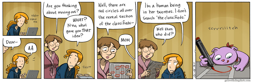
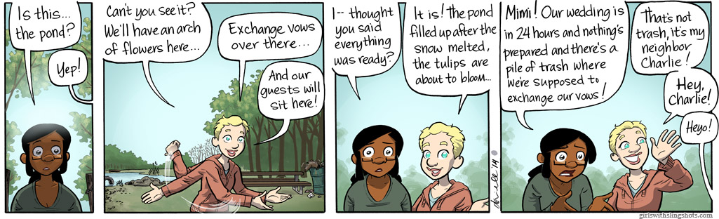
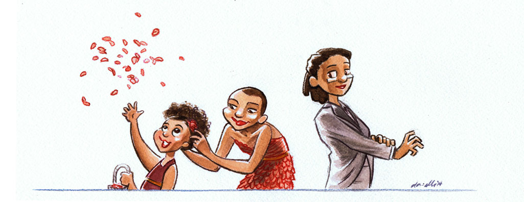
Girls with Slingshots is a webcomic. One of the best too. It ran for over ten years and ended this January. The strip was mostly daily and has amassed over 2000 pages in its duration, telling the story of Hazel Tellington, and her friends. It covers all kinds of topics and doesn't shy away from the more taboo issues of sex and sexuality either. It's a really good read.
It also proved of excellent assistance during my stead of working on the final project, as I decided against using my usual style in favour of something different. So I borrowed a couple of aspects from the girls with slingshots art style, as well as reminding me about different body types and shapes.
Girls with Slingshots is a webcomic. One of the best too. It ran for over ten years and ended this January. The strip was mostly daily and has amassed over 2000 pages in its duration, telling the story of Hazel Tellington, and her friends. It covers all kinds of topics and doesn't shy away from the more taboo issues of sex and sexuality either. It's a really good read.
It also proved of excellent assistance during my stead of working on the final project, as I decided against using my usual style in favour of something different. So I borrowed a couple of aspects from the girls with slingshots art style, as well as reminding me about different body types and shapes.
SPACE ROCKET GOODNESS
More Adobe Illustrator practice. Had to do a rocket. Pretty basic stuff really. Not a whole lot to say about it in all honesty.
Pixel Party
Pixel Party 64 from Jonny Clementson on Vimeo.
So,,,controversy time!!
Once every few weeks we have a 'physical session' with John Kelly. We've dona a couple of vaguely interesting things there but it's mostly been really pointless as I've done all of this kind of thing before, and it feels like I could be putting that time to better use. And once the sessions shifted towards typography I decided to take the leap and do something different, instead putting the tricks learned during the aftereffects session with Sara to good use. With it being an animation course I figured you'd be fine with this. I mean, I hope you're fine with this. If not, well, oh dear.
Either way i wanted to put all my aftereffects lessons into something that would show off what I'd learned but unlike my main coursework animation work wouldn't require excessive artwork to create. So here I created some very basic Mario-homaging pixel art then put to use what I'd learned, and experimented a bit more on the way.
The way I look at this I think it was a far better use of my time than doing more typography work which quite frankly isn't terribly useful. Either way...enjoy!
...or get angry at me...whichever works!
Saturday, 25 April 2015
Inspiration and Explanations: Unit Three
Feels a bit wierd writing about this one. With the last two units they've been finished for a long while. This one's still being made. On the plus side all the business with artists is already done.
Things were a bit different with this one. I found my key idea pretty early on. I was finding it hard to find something that captured modernist lifestyles and thoughts, so I was going to have to do something that treated things a bit closer to their face value rather than the deeper values. I wish it didn't have to be this way but I feel a level of contempt towards modernist art, and the more I delve into their beliefs and methods the more I get annoyed. So...face value it is.
I'd been exploring the same sort of ideas for a while, of showing the progression of art styles through some sort of medium. Some ideas were more tongue-in-cheek than others, and the sillier and angrier the ideas came, the less I cared for the project. But one day when I was out for a walk in the woods back home in Cumbria I came across the idea of something far simpler and almost pretty.
I decided to have the whole thing set in a room overlooking a garden, with a couple who decide to paint a bird in the garden. As it progresses other artists arrive and show them other styles to paint in. With each artist the bird changes to reflect the new style. That was the basic premise. The animation would start with Romanticism, then shift to Realism with an industrialist painter, then Modernism with a upstarty revolutionary, then Post-Modernism with an art critic, then Pop Art with a young hipster-type. Almost like Chinese Whispers, but with art. It's hardly a perfect idea but it's the best I can manage.
Research-wise I decided it would be best to approach each genre separately to get a feel for them before drawing the bird designs. The bird itself isn't a real design, rather something loosely based on a robin. I just wanted something fluffy and cute and fairly expressive. But so- onto the artists.
Romanticism
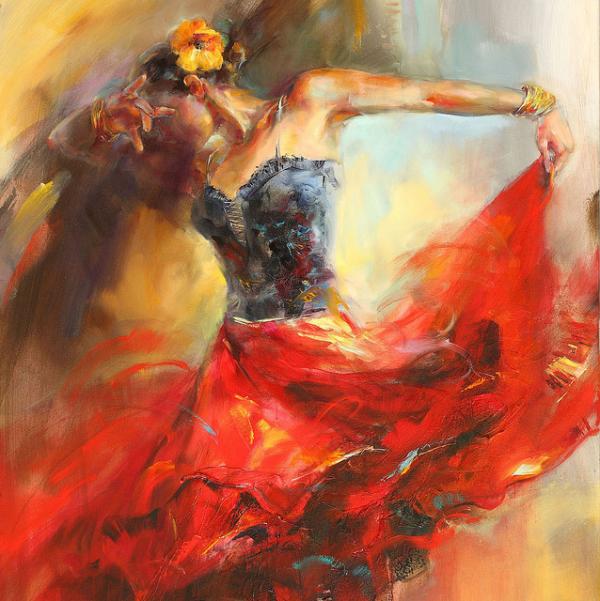
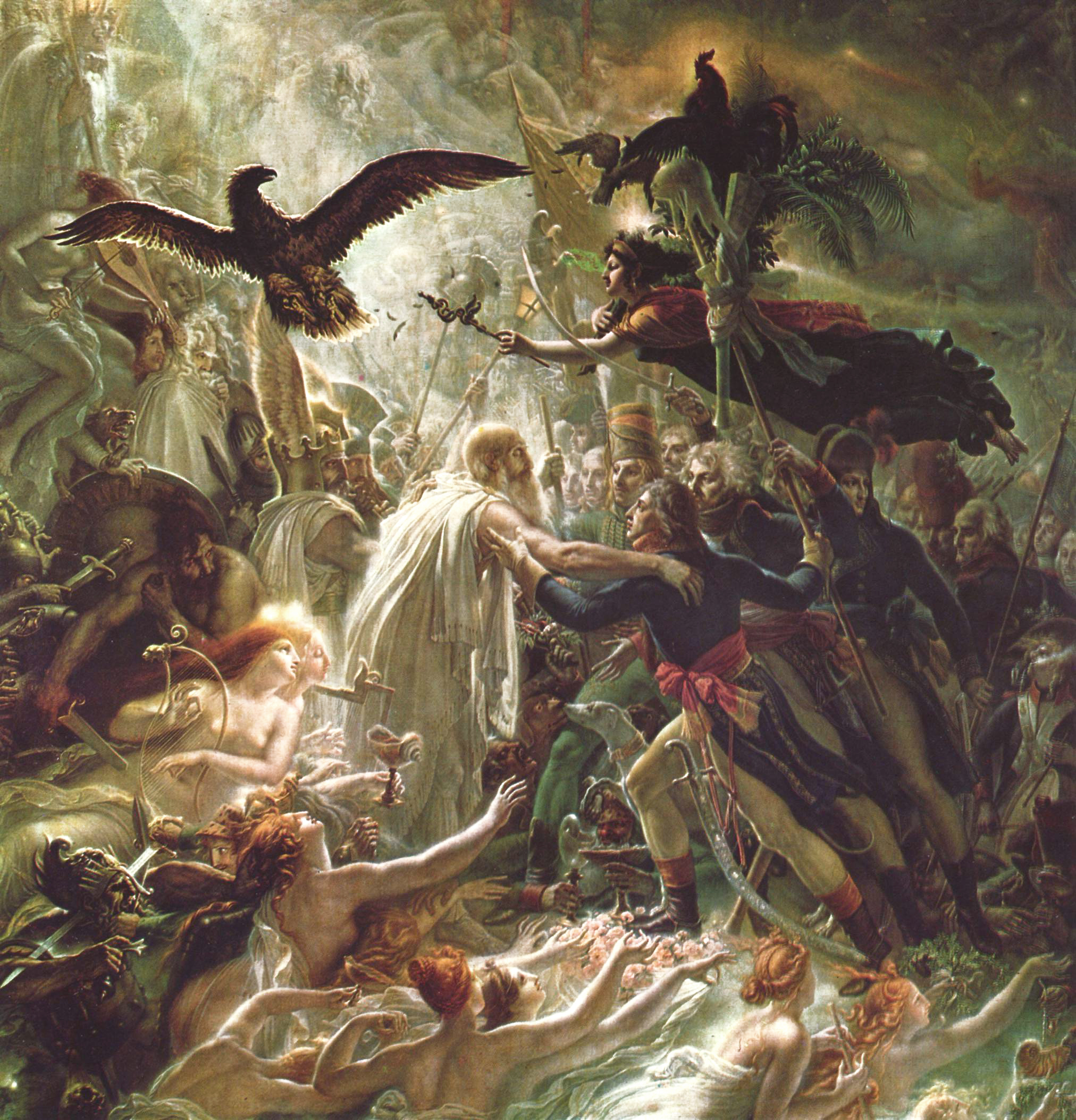
Romanticism-era art's key feature is that it tends to add extra flair and extravagance to the subject. Scenes get busier, landscapes more beautiful, people more attractive. For the romanticism bird I'll drastically enhance the colours and try to make it as pretty as possible. I'll use pencil crayons with some dashings of felt pen. The art here was done by Anna Razumovskaya, Albert Bierstadt, and Anne-Louis Girodet. The movement was popular throughout the 17th and 18th centuries. This was one of the most appealing art styles to me of the bunch as it serves to paint the subjects in a positive light, and allows plenty of room for symbolism and hidden meaning, whilst still providing something pleasant to look at for the viewer.
Realism
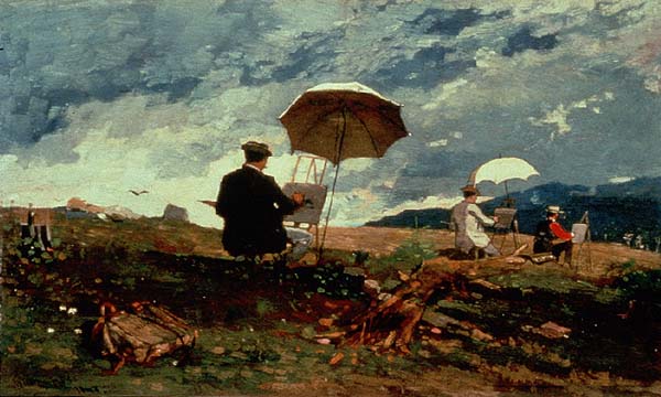
Realism is based around - you guessed it - making things look real. Popularised during industrial revolution-era Britain and rapidly spread around the world, it's aim was to pull away from the overly cheerful and distracting nature of romanticism towards something that painted the subject exactly how they are. This led to a movement of very technically-skilled artists as that was more important in realism than artistic license and less real interpretations. The art here was provided by Winslow Homer, Gustave Courbet, and James McNeill Whistler, who produced what is probably the movement's most famous piece: Whistler's Mother. For this bird I'd be using a duller palette and toning down the extravagance of the previous picture, focusing on the form more.
Modernism
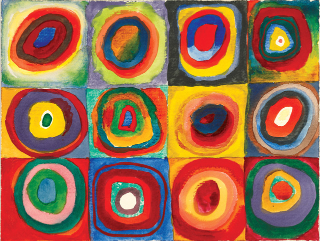
Modernism. The big one really. Damn I'm going to have to write more about this one. So modernism sprung up a good few years after realism throw it's grubby boots into the door (then painted them in fine detail), and was a movement that objected to the beliefs that art should be judged by the technical talent of the painter rather than their artistic abilities. They proposed that inspiration and the message behind the painting is more important than the painting itself. My own views aside, the movement gained a lot of traction. As the movement grew, it began to garner itself a series of beliefs about how the world should be. They believed that they should forget 'the old ways' of doing things and approach things from a totally new angle. They brought in new fashions, new architecture, and a new way of living. Admittedly some of their proposed ideas didn't land with as much gusto as others. The modernist theory of how to eat in particular was not as well received. But minor failures aside, modernism really started a fire. A fire that kept burning for a long time. Some of the embers of that fire can still be seen today and many contemporary artists still hold their values with a strong level of esteem. The modernist movement spawned or encapsulated a variety of other more minor art movements as well. Dadaism was a well known offshoot of modernism that existed with it's own (sometimes bizarre) set of beliefs. Surrealism and Cubism also formed inside the modernist beliefs paving the way for some of the most well known artists around. The pictures here are from Edward McKnight Kauffer, Vasily Kandinsky, and Fernand Léger. I'd be playing the abstracty surreally card with the bird for this movement. It'll be a weird one.
Post-Modernism
Now postmodernism is a peculiar movement. It really is. It began by applying the same approach modernism took to the art before it, except postmodernism applied it to modernism itself. The result is a movement that strives on picking apart the notion of art itself. It's a movement heavily based around critique and theory. Rather than modernism which can often be identified easily as a single movement, postmodernism exists in several strands, as there are so many approaches to the movement and beliefs. The movement also spawned minimalism, which aims to deconstruct an image into it's smallest, purest notions. The pictures come from Piet Mondrian, Francis Berry, and Pablo Picasso.
Pop Art
Pop art is included here as more of a silly sign-off than anything else so I'll keep this one very brief. It shares similar beliefs as modernism and postmodernism and explores the notion of kitsch and the perpetual question of 'what is art?'. The pictures are from the style of Andy Warhol and Roy Lichtenstein. Interestingly pop art has become one of the most kitsch art styles of modern times, adorning a huge variety of items. Both Warhols' and Lichtensteins' works have been parodied and homaged so many times the style in general has become something cheap and excessively tacked-on.
So that concludes the various artists I'll be referencing in the bird part of the piece. And now for the rest. I'd already decided this one would be done in my typical black-and-white finelinery style, so rather than putting in the artist here, I'll say WATCH THIS SPACE and it'll lead the way into the first Artist Spotlight. Thanks for reading!
Things were a bit different with this one. I found my key idea pretty early on. I was finding it hard to find something that captured modernist lifestyles and thoughts, so I was going to have to do something that treated things a bit closer to their face value rather than the deeper values. I wish it didn't have to be this way but I feel a level of contempt towards modernist art, and the more I delve into their beliefs and methods the more I get annoyed. So...face value it is.
I'd been exploring the same sort of ideas for a while, of showing the progression of art styles through some sort of medium. Some ideas were more tongue-in-cheek than others, and the sillier and angrier the ideas came, the less I cared for the project. But one day when I was out for a walk in the woods back home in Cumbria I came across the idea of something far simpler and almost pretty.
I decided to have the whole thing set in a room overlooking a garden, with a couple who decide to paint a bird in the garden. As it progresses other artists arrive and show them other styles to paint in. With each artist the bird changes to reflect the new style. That was the basic premise. The animation would start with Romanticism, then shift to Realism with an industrialist painter, then Modernism with a upstarty revolutionary, then Post-Modernism with an art critic, then Pop Art with a young hipster-type. Almost like Chinese Whispers, but with art. It's hardly a perfect idea but it's the best I can manage.
Research-wise I decided it would be best to approach each genre separately to get a feel for them before drawing the bird designs. The bird itself isn't a real design, rather something loosely based on a robin. I just wanted something fluffy and cute and fairly expressive. But so- onto the artists.
Romanticism
Romanticism-era art's key feature is that it tends to add extra flair and extravagance to the subject. Scenes get busier, landscapes more beautiful, people more attractive. For the romanticism bird I'll drastically enhance the colours and try to make it as pretty as possible. I'll use pencil crayons with some dashings of felt pen. The art here was done by Anna Razumovskaya, Albert Bierstadt, and Anne-Louis Girodet. The movement was popular throughout the 17th and 18th centuries. This was one of the most appealing art styles to me of the bunch as it serves to paint the subjects in a positive light, and allows plenty of room for symbolism and hidden meaning, whilst still providing something pleasant to look at for the viewer.
Realism
Realism is based around - you guessed it - making things look real. Popularised during industrial revolution-era Britain and rapidly spread around the world, it's aim was to pull away from the overly cheerful and distracting nature of romanticism towards something that painted the subject exactly how they are. This led to a movement of very technically-skilled artists as that was more important in realism than artistic license and less real interpretations. The art here was provided by Winslow Homer, Gustave Courbet, and James McNeill Whistler, who produced what is probably the movement's most famous piece: Whistler's Mother. For this bird I'd be using a duller palette and toning down the extravagance of the previous picture, focusing on the form more.
Modernism
Modernism. The big one really. Damn I'm going to have to write more about this one. So modernism sprung up a good few years after realism throw it's grubby boots into the door (then painted them in fine detail), and was a movement that objected to the beliefs that art should be judged by the technical talent of the painter rather than their artistic abilities. They proposed that inspiration and the message behind the painting is more important than the painting itself. My own views aside, the movement gained a lot of traction. As the movement grew, it began to garner itself a series of beliefs about how the world should be. They believed that they should forget 'the old ways' of doing things and approach things from a totally new angle. They brought in new fashions, new architecture, and a new way of living. Admittedly some of their proposed ideas didn't land with as much gusto as others. The modernist theory of how to eat in particular was not as well received. But minor failures aside, modernism really started a fire. A fire that kept burning for a long time. Some of the embers of that fire can still be seen today and many contemporary artists still hold their values with a strong level of esteem. The modernist movement spawned or encapsulated a variety of other more minor art movements as well. Dadaism was a well known offshoot of modernism that existed with it's own (sometimes bizarre) set of beliefs. Surrealism and Cubism also formed inside the modernist beliefs paving the way for some of the most well known artists around. The pictures here are from Edward McKnight Kauffer, Vasily Kandinsky, and Fernand Léger. I'd be playing the abstracty surreally card with the bird for this movement. It'll be a weird one.
Post-Modernism
Now postmodernism is a peculiar movement. It really is. It began by applying the same approach modernism took to the art before it, except postmodernism applied it to modernism itself. The result is a movement that strives on picking apart the notion of art itself. It's a movement heavily based around critique and theory. Rather than modernism which can often be identified easily as a single movement, postmodernism exists in several strands, as there are so many approaches to the movement and beliefs. The movement also spawned minimalism, which aims to deconstruct an image into it's smallest, purest notions. The pictures come from Piet Mondrian, Francis Berry, and Pablo Picasso.
Pop Art
So that concludes the various artists I'll be referencing in the bird part of the piece. And now for the rest. I'd already decided this one would be done in my typical black-and-white finelinery style, so rather than putting in the artist here, I'll say WATCH THIS SPACE and it'll lead the way into the first Artist Spotlight. Thanks for reading!
Subscribe to:
Posts (Atom)