Sunday, 1 November 2015

Shadowplay Typography

Typography and I have had a rough relationship. It's something that's never appealed to me as much as it did others. I just don't mesh with it as well as I do most other aspects of the course. So of course I wasn't looking forward to the typography aspect of this year. Thankfully though, I got a good idea and I decided to roll with it. I'm almost pleased with it. Almost.

We had to write out the phrase I Am ................... where we had to fill in the dotted line with something that defined us. After a bit of thinking of ideas I came up with I am Too Tall. The whole idea came from that. Here is the type page I did during that first workshop.


Three weeks later came the session where we had to develop our original idea. I was getting nowhere with this. Most people were just doing things bigger. But the Tracy came up with something really smart: trying to make this thing in real life. So I got some of the cardboard from the corner and put together all the letters I would need. It proved a little more problematic than expected. Firstly, the cardboard was incredibly flimsy. Plus they didn't have the smoothest ride home. Thankfully I solved this when I accidentally found a lump of wood from when we built my Ikea shelves. I now had a proper weighted stand. I also had to build a lighting rig using a kitchen roll stand, a washing basket, and a clip-on desk light. Things weren't that smooth. Sadly there was one problem I couldn't fix. The backdrop. So sadly you get a shot of yesterday's washing there. I don't think this worked as well as the original writing, but it was really fun to work on. I think typography and me have some making up to do.


Saturday, 31 October 2015

Daily Mail Dystopia - Round One

My final piece for this unit is an animation consisting of two distinct parts that will eventually be merged: a 3D section of backgrounds and camera angles, and a series of 2D scenes that go on top of the background. What I have here is the final cut of the background scene alongside the music. The music was a bit more of a challenge here, as the music I chose for the project was only a minute long in a two-minute animation, so I had to do some audio editing to make the track work. The opening section is new as well as the post-restaurant outro. I'm quite of proud of this.


Daily Mail Dystopia Background & Camera Run from Jonny Clementson on Vimeo.

The Bomb

Because I was planning on using Cinema 4D for the Daily Mail Dystopia idea, I had to fix one problem first. That problem was the fact that I'd never used Cinema 4D before. So with the help of a Grayscale Gorilla tutorial, and a couple of evenings, I produced a little test piece. It's nothing too complicated, but uses most of what I'd learned to do so far in the software.


Tuesday, 27 October 2015

Adbot in Virusland


This was the outcome of the first Aftereffects workshop we did with Sara. The character was designed for my original idea for the Conversation project, but was never used. So I figured I'd put it to some use here. We experimented with different types of motion and controls. I'm quite happy with the way this turned out, especially the visuals.

Monday, 26 October 2015

Photoshop Animation

Some of my work from the Wednesday morning sessions.

We used some guides to help animate characters using Photoshop.

We started off with making a ball bounce then we did some freestyle practice, and we learned about walking loops after that. I'll upload the character designs later.


Tuesday, 6 October 2015

October Catch-Up

So, it's been a while since the last post. Summer's been and gone. And what an odd summer it was. Mostly consumed by my job at the local uniform shop, I still found time to make some work on the side and gain some new influences. But before all of that, I have a handful of animations to share.

Firstly is my final outcome for Unit 3, an animation called Birds. Even looking back from october, theis holds out really well. More for the tone than anything else, it really stands out and sets the template tonally for what I want to achieve this year.


Birds - An Animation About Art from Jonny Clementson on Vimeo.

Secondly comes the showreel. This was my first true experience of working and editing to music, so I let that define everything. The whole piece grew from there.


Showreel 2015 from Jonny Clementson on Vimeo.

And finally comes the stop-motion piece. We did a workshop towards the tail-end of last year over a couple of days practicing stop-motion using paper cut-outs and SLR cameras. It was a really fun experience and I will likely use stop-motion in a future unit for my outcome.


BFFs - A Tale in Stop-Motion from Jonny Clementson on Vimeo.

And now for the summer's batch of new inspirations and experiences. The first thing I'll be talking about is the webcomic Multiplex by Gordon McAlpin. Over the summer I re-read the archive and alongside re-experiencing one of the best-executed webcomics around, it also opened my eyes to an art style I'd never really considered seriously before: Vectors. Whilst I dabbled in them last year, I found them as a useful asset for design and logo-making, but as more of a tool that an art style. But then multiplex opened my eyes to how useful such things can be. Furthermore it restored my interest in movies and reaffirmed what an excellent character piece the comic is.

Next up in the holiday comic batch comes Prague Race (at top) by Petra Erika Nordlund, which is about as heavy a departure from the stylings of Multiplex as posible. The whole comic is hand-draw, which is a huge rarity in the world of webcomics. I adore the dark and creepy yet also charming and cute tone of the comic, and the characters are endearing and relatable. The tone is certainly having an effect on my current plans for the first unit of this year, and elements of the art style could creep in, as these things often do.

The next comic entry here comes in from far more of a writing perspective than an artistic one. It's the writing of Marc Ellerby. Over the summer, I read two of his books: Chloe Noonan: Monster Hunter (above), and Ellerbisms. Chloe Noonan is a Buffy-inspired comedy about someone who is totally unprepared to fight monsters getting a huge amount of responsibility. That's selling it badly though. It's really not about the monster hunting at all. It's episodic and mostly about Chole and her friends and all of the more normal things in her life. The monsters just form the backdrop which is a refreshing change from the norm. It's a comic that's hard to quite explain its appeal, but it's there, and it's great. Next from Ellerby is Ellerbisms, an autobio comic. This one started out life as a webcomic but was published at a later date. The tone here's pretty different. Whilst there is still some of Ellerby's trademark humour and silliness, the whole piece has a feeling of something more somber, as the majority of it is based on the author's years dating someone, and the events that led to it all falling apart. Both are well worth a read.

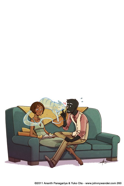
As you've probably grasped the theme for this list, the next comic here is Lucky Penny, by
Yuko Ota and Ananth Hirsh. It's part of a larger webcomic run called Johnny Wander that mostly consists of autobio comics and short pieces of fiction, like The Girl With The Skeleton Hand (at the bottom of the post), which is also excellent. But we're not here to talk about that. Lucky Penny is the first properly long-form piece published on their website. It tells the story of Penny, who is incredibly unlucky (it's kind of a misnomer). The story is fairly familiar, telling the story of a girl who meets a guy and everything going wrong then right again, but it's the art and the characters that make the story really work. Yuko is a fantastic artist, and the sheer flair with which the story easily removes any familiarity in the overall plot. The regular series is really decent too, populated with great characters and genuine heart.


The penultimate comic on the post is a lot closer to home. Both topic-wise and in actual setting (it's in Sheffield). It's a monthly comic called Giant Days by John Allison. Yes, I'm talking about John Allison and not talking about Scary Go Round. I'm sorry. But seriously, Giant days is a pure beam of sunlight. In a comic scene that's mostly filled with doom and gloom and ever-grittier reboots this one stands out by a mile. It's a comic by Boom Studios, who are responsible for some of the most progressive and interesting comics on the market today, and even by their standards this is cheery. It tells the story of three girls who meet at university and all the wacky antics they get up to. It features a lot of Allison's traditional style such as his trademark dialogue and british sense of humour, but the execution here is a level above most of his other output (which is still great). The art also does wonders for the comic. It's a match made in heaven, and does the comic some serious favours. It's expressive, incredibly fluid, and manages to keep up with the craziness of the writing.

I think it's about time to wrap this list up. It's getting rather longer than I'd anticipated. I really did read a lot of comics over summer. I might do a post on some movies later. Well, mostly just one movie, but it really was a good one. But that aside, it's time to the most out-of-place entry on this list.

Recently I'd hit a little bit of a slump with my reading and watching and videogaming material. I was watching the new Daredevil Netflix series which whilst excellent is pretty dark in tone and it's hardly cheerful watching. And thanks to some internet issues at home, I was stuck with the meagre selection of games I'd downloaded before uni. I decided I'd finish the Walking Dead game. Despite how good the first couple of episodes were, the rest of the series just got a bit stuck on the 'horrendously bleak' front and the rest of the episodes were just no fun. Playing a game where nobody has any hope and spends all their time being sad doesn't make for a great experience. And on the comics front I'd made...okay I wouldn't call it a mistake, but probably just mistimed my decision to read Batgirl. Similarly to The Walking Dead, the first ten or so comics were really good. The sense of drama was well played and the characters likeable. But the series took a downturn, getting bogged down with angst, poor villains, and an extraordinary sense of bleakness. Things were really looking down. But then came the new creative team at issue 35. Batgirl went from being a series about death and good people getting hurt and grim monsters and age-long plot arcs to being a series full of charm, relatable characters, and a light-hearted spirit. And that's the important thing. There are so many comics, games, and TV series full of darkness. It takes some guts to stand above them all with a smile and a one-liner, and all the fun a Batgirl comic should have.


Tuesday, 5 May 2015

Talking About Birds

So I'll be posting up my final animation piece (aside from the showreel of course) tomorrow so I figured I would say a few words here about it. As this thing's probably been marked already this will mostly be for my own gain when I write this lot up in my sketchbook. So yeah, given it's late at night  and the stuff mentioned above, I probably won't put any pictures in much. Maybe a couple.

So a quick overview first: it's an animation about art movements. I couldn't find quite enough to sink my teeth into with modernism or postmodernism I had an idea about how to do an animation based around art movements. As I still wanted to get a bit of focus on modernism and post modernism I based the movements on the ones before and after modernism. So there's Romanticism, Realism, Modernism, Post-Modernism, and Pop Art.

The project went through several shifts in perspective and style over the time I've been working on it. Even to the stage where I was planning on a very different ending just a few hours ago. So I'll start at the most appropriate part for this: The End. You see I was initially planning a slow zoom in through the window where the title would appear after the fighting artists are offscreen in a nice hand-drawn font and the first bird would fly by. But it was then I realised that because of all the horribly complex animated action at the bottom I'd have an extremely hard time pulling that off. perhaps if I were using aftereffects it might've worked but I was so far down this route that I had no options to change. By this point I'd already finished the fight section for the end and it had ended up a bit more brutal than intended. And I don't quite know why I though of this but I remembered the ending of one of my favourite horror-ish films: Funny Games. If I get time I'll do a spotlight on it. I mean generally speaking it's not a film I'd thought I would like. A thoroughly harsh film that's really unpleasant to watch, it has just enough satire and taste to pull it off. But the point I though of was the very end. After the film ends in a pretty spectacular manner the title hits the screen on a black background with red text (I ended up using white on mine though) with heavy thrash metal cutting in. It's an unpleasant ending for an unpleasant film. And I love it. And despite my animation not having sound at the moment I'll try and emulate that ending.

Whilst i think of other influences I'll just jot down where the inspiration came for each bird. The first one was done in my standard cartoony style but with the eyes borrowed from the very glossy eyes of my robot drawings and a couple of touches from Girls With Slingshots. The second and third just used generic google searches to find some inspiration. I'm not that happy with them really. I did them a week or so before the second batch and it kinda shows. For the modernism one I borrowed heavily from this picture:
I sadly can't find who did it. I'll try and get it for the sketchbook though. The postmodernism one was quite fun to do. As postmodernism is so varied I decided to give it a shot myself. I took the theory of minimalism, and employed it to a bird. I managed to reduce it to a square with a triangle for a beak. The wing was added just to give me something to animate. The pop art one was a mixture of lichtenstein and warhol's styles, using a very comic-based bird picture partially inspired by the bird logo of Darby Productions and my general experiences reading comics, and the duplicating picture style of warhol.

So onto the animation itself. I'd done three animations at this point. Or at least done a good chunk of three. The first was a decent length and looked fairl nice, but the animation was really clunky and the dialogue was terribly done. I'd also tried to hide how basic it was and probably made it worse by doing it. The second was my attempt at doing really smooth and decent animation. I used aftereffects for the first time in a final piece. And the last time too it would seem for this year at least. The animation was smooth and really nice but rigging up the characters took an age, and the animating was very slow. It's something I might revisit in the future though. I also tried to return to it recently but the layers are so badly organised it would take forever to do more work on so I'll just sew on the other pictures I'd done. So I'd done really clunky before and got a decent amount from even if it was very badly executed. And I'd done smooth animation that looks almost professional but it takes too long to put together a decent project. So for my 'third' project, the one I replaced Kelly's sessions with, I tried simplifying the art (and doing it digitally) and attempting a more frame-by-frame style. It turned out fairly well but used up that option for the final project. So I went back to the start, and used the same techniques as the first animation but with a knowing attitude, and far more experience. I also found inspiration from The Darkness's latest music video, which was made by one of my favourite comic artists ever, Nick Roche. The video's called Barbarian but I'm too tired to link it now. But yeah, I made this animation knowing immediately the limitations I would have and that instead of going for massive quality, I';d craft the whole thing with some preset boundaries in place. And through doin g this I was able to deliver on some of the best art Ive done for an animation yet.

So 'Birds: An Animation About Art' will drop tomorrow, and it's a weird one. I think I like it.