The Open Work is a concept that was introduced to us this term. I won't delve too far into the book the theory's from or anything, as we've been doing a lot of that in lectures recently. So instead I'll talk a bit about my thoughts on the concept.
The concept is very basic at heart: that there are really two perceptions that come together when someone looks at some artwork. The first is the artist's perspective when the picture was created. This includes the creator's motives, their feelings, what they were depicting, and other features they chose to add to the picture. The other party here is the viewer. Whilst the viewer doesn't contribute to the piece itself, they do bring a lot of other things to the equation. The viewer's life experiences make up most of their part of this. Unless the viewer had an identical set of life experiences to the creator, they'll see the piece differently to them. And other people will see it differently too. It's all about what people can relate to. Different people will see different things in a piece of art, and therefore will view it differently.
This is a useful thing to keep in mind as a creator, especially as one who generally works for a (theoretically) larger audience. I can't just produce something that works for me and nobody else. In a commercial world, my pieces have to be relatable, so that most people who view it can find something in it they can associate with. This highlights the importance of test groups and market research, as well as helping to push away the notion that creators are always right.
This brings me to the negative part of this talk. The discussions of Open Work have highlighted many of the flaws in the world of art as we know it. Firstly comes the 'Grand Canyon' artists as I think of them here. The artists who intentionally create their work to be as open as physically possible. This is the kind of artwork that's always 'up for interpretation'. The sort of artwork we'll puzzle over for ten minutes then walk away having each thought of a different idea about what it is. The sort of artwork that leaves everything up to the viewer. Now in some cases this can be perfectly acceptable, when the artist leaves intentional traces of things for everyone to find. When the artist tries to guide us to finding things. When they make the picture out of shapes that can connect to things we know. In essence, like the Rorschach test. Whilst they're specifically ambiguous, they're created with elements in them that we can attach to. This is fine.
What isn't fine is when artists create artwork with no intention of form whatsoever, leaving nothing for the viewer to work with. Leaving things so wide open they manage to practically break the term. Because in making works so incredibly open, they've actually created closed works. Works where the artist sees the picture the same as the viewer. A wide area of absolute zero. We're talking about true surrealism here. Completely abstract art. Art that contains nothing of meaning whatsoever. Art that despite all else, is a true waste of space. It's lazy, and struggles to call itself art.
The other variant upon this is the 'fingerprint lock'. This applies to art that's so personal that nobody else can see it in anywhere close to a complete view. Because from my point of view, a truly open piece of work is one that everyone can see something different in, but come away having felt that that was the complete meaning. ''Fingerprint lock' art is generally the same as the description above, except it isn't closed, as it means something unbelievably personal to its creator. But nobody else can gain anything close to a complete meaning from it because it's too personal. This type holds far more value, but pushes against the concept of art. Because art isn't really for a single person. It's for others to look at too. But what use is art that nobody else can relate to.
So this is my take on the open work. It's an incredibly useful concept, in both commercial and critical sense. It helps make sense of a lot of issues both my own work and in others.
Tuesday, 3 November 2015

Lakes International Comic Art Festival

LICAF is one of my favourite events of the year. It's the only proper comic event in Cumbria and it's usually fantastic. It's in its third year now and is continuing to get better year-on-year. This year the guestlist was just fantastic. Scary Go Round's John Allsion; the writer and artist of one of my favourite webcomics was attending. As was Phillip Reeve, who wrote the phenomenal Mortal Engines book series, which is one of my biggest influences in art and design. And finally, there was Mattias Adolfsson. I've mentioned him on this blog before, but to meet him in person AND attend his art workshop was just fantastic.
 LICAF is quite different to a lot of comic conventions around the country. Firstly, the venue is far smaller. Rather than the likes of Thought Bubble in Leeds, or MCM Manchester,LICAF takes place in the small town of Kendal, famous for its amazing Mint cake, and a music festival that no longer takes place there. But because of this it feels far more special. As there are no buildings big enough to house the whole event, it takes place across a number of buildings across town. Because of this a lot of the shops in town put
up displays and special events for the festival. It also differs from most in that there is a heavier focus on workshops and talks. Sadly as a result there is no cosplay culture there. But it's not really that kind of event. It feels more like a celebration of artists and artwork than a convention for fans such as Thought Bubble. It's quite special.
John Allison

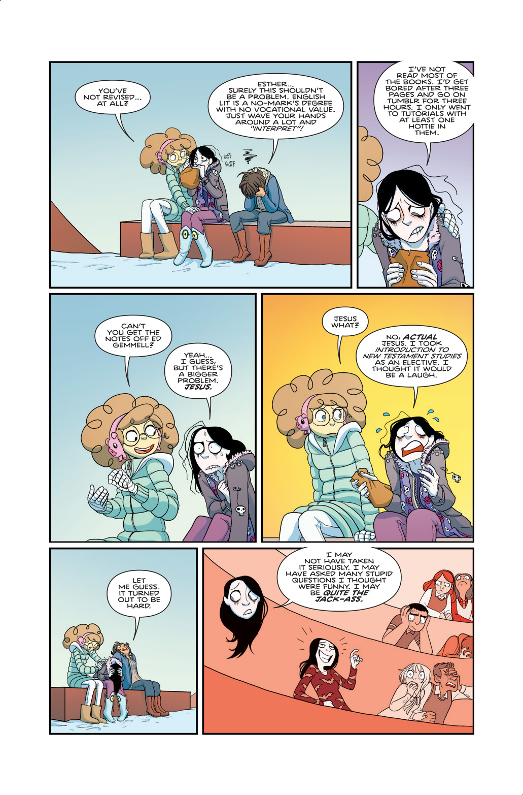
As it stands the Bad Machinery format is ending soon as the characters are finally outgrowing the setting. But from what John Allison has shown with his many side-stories over the years, the best is still yet to come. Above is a picture of himself, drawn by him, and below a page of Bad Machinery

Phillip Reeve

meet him) was reposting that his Mortal Engines series was getting a re-release with the original cover art. That led me to Phillip Reeve's website, where I learned that he had written a new sci-fi book recently called Railhead, and that as part of its publicity, along with the publicity for his younger childrens series Pugs Of the North, he would be visiting the festival. I have to say, out of all the guests of the festival, getting to meet Phillip Reeve was just amazing.
Mortal Engines, the series he's most known for, was my favourite book series growing up, and still holds that place now. It's very dark in places, and has the highest body count of any 'children's book' I've read. But what really inspired me was the universe: a world of moving cities. If you've ever seen my artwork, there's some pretty big ties to the work of Reeve.


Mattias Adolfsson
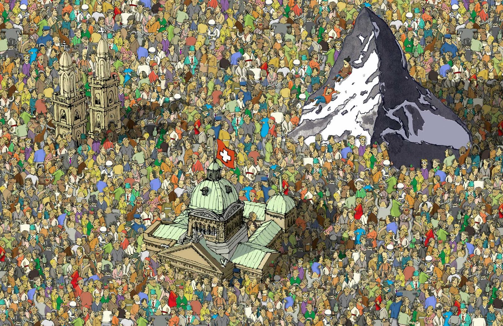
I've already posted about him here before so I'll keep this fairly short. Adolfsson is a Swedish illustrator known for his surrealism and his level of detail. I first encountered his work on Deviantart after I'd begun to take my robot art more seriously. Finding someone that good was actually a little demoralising though. I'd just begun and seeing someone who was doing what I aspired to do to such a degree of success was a little scary at first. But as I progressed, I began to like his work more and more. I think it took a while to appreciate that we weren't both doing the same thing. Whilst I always aimed to keep a sense of realism in my work, Adolfsson always pulls in the other direction towards the surreal. His works are more satirical whilst mine are more sci fi. And while his works are far looser in construction, mine are far smoother, with an almost digital cleanness.
Okay I rambled a little there. One of the best parts about meeting Adolfsson in Kendal was that he did a workshop about spontaneous art and about creating fantastical worlds. We started with an exercise in drawing faces, where we were told to draw one part of one person's face, and then to move to someone else and draw part of some else's face, until you had a face made entirely of other
 people's faces. That was to teach us about not worrying if things don't turn out very realistic, as well as teaching us to work with what's there. Next we had to try and draw people without looking at5 the paper or lifting up the pen. Mine turned out...quite badly. That sort of thing is not my speciality. Next we had some quick drawing cues to sketch out. We had about a minute or two for each picture. The first cue was An Armed peanut. The second was A Polite Jellyfish. Then came Spilled Milk, Fourth was A Sad Robot. Then was Your Worst Fear. I actually went for my second worst fear there as I didn't have enough time to draw a dentist. Next we were told to draw three character facing different directions. But then halfway he told us that when we get bored to start drawing things in front of the characters, and that whenever we got bored, just draw something different. This was one of the biggest insights into his work, as he talked through a lot of the things he did when he was drawing like this. He tended to favour elephants when he's getting bored as they fill a lot of space very quickly. Finally came a challenge very similar to that of Rob's lecture a few weeks back. We each had one minute do draw something, then we had to pass the paper to the next person. We ended up with some pretty crazy stuff. Above is a piece called 'Crowded' and to the left is a self portrait. Below is my work from the session. And a bit of everyone else's too.


 Wrapping Up
That's nowhere near the full account of the festival, but the rest of the time was taken up with me geeking out massively as lots of my favourite artists were everywhere. I also managed to meet Max Sarin, the new Giant Days artist, and almost managed to catch Kate Beaton, the amazing artist and writer of Hark! A Vagrant. I additionally bought far too many things. But I always do at these things.
So yeah. that about wraps it up til' next year. Thanks for reading if you made it this far.
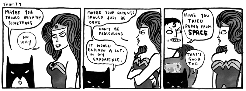
(Left is Max Sarin's art. Below Is Kate Beaton's)
Monday, 2 November 2015
Character Design
Character design is one thing that I'm really happy was included in the course this year. I don't think I'm the only one who thinks that too. Those sessions with Jay tend to be very well received. I produced quite a lot of designs for that workshop so I'll post them all here. After a few doodles I liked the idea of doing something about useless criminals. The main character is Timmy the Ten-year-Old Mob Boss.


Sunday, 1 November 2015
Shadowplay Typography
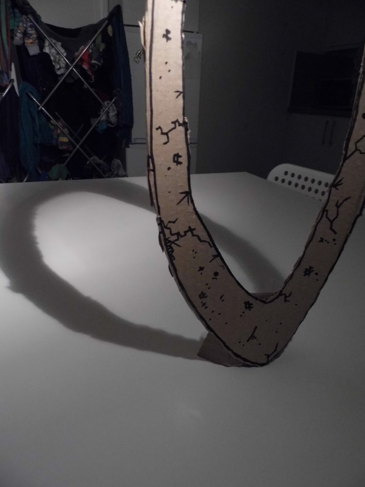
Typography and I have had a rough relationship. It's something that's never appealed to me as much as it did others. I just don't mesh with it as well as I do most other aspects of the course. So of course I wasn't looking forward to the typography aspect of this year. Thankfully though, I got a good idea and I decided to roll with it. I'm almost pleased with it. Almost.

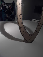
Three weeks later came the session where we had to develop our original idea. I was getting nowhere with this. Most people were just doing things bigger. But the Tracy came up with something really smart: trying to make this thing in real life. So I got some of the cardboard from the corner and put together all the letters I would need. It proved a little more problematic than expected. Firstly, the cardboard was incredibly flimsy. Plus they didn't have the smoothest ride home. Thankfully I solved this when I accidentally found a lump of wood from when we built my Ikea shelves. I now had a proper weighted stand. I also had to build a lighting rig using a kitchen roll stand, a washing basket, and a clip-on desk light. Things weren't that smooth. Sadly there was one problem I couldn't fix. The backdrop. So sadly you get a shot of yesterday's washing there. I don't think this worked as well as the original writing, but it was really fun to work on. I think typography and me have some making up to do.


We had to write out the phrase I Am ................... where we had to fill in the dotted line with something that defined us. After a bit of thinking of ideas I came up with I am Too Tall. The whole idea came from that. Here is the type page I did during that first workshop.

Three weeks later came the session where we had to develop our original idea. I was getting nowhere with this. Most people were just doing things bigger. But the Tracy came up with something really smart: trying to make this thing in real life. So I got some of the cardboard from the corner and put together all the letters I would need. It proved a little more problematic than expected. Firstly, the cardboard was incredibly flimsy. Plus they didn't have the smoothest ride home. Thankfully I solved this when I accidentally found a lump of wood from when we built my Ikea shelves. I now had a proper weighted stand. I also had to build a lighting rig using a kitchen roll stand, a washing basket, and a clip-on desk light. Things weren't that smooth. Sadly there was one problem I couldn't fix. The backdrop. So sadly you get a shot of yesterday's washing there. I don't think this worked as well as the original writing, but it was really fun to work on. I think typography and me have some making up to do.






Saturday, 31 October 2015
Daily Mail Dystopia - Round One
My final piece for this unit is an animation consisting of two distinct parts that will eventually be merged: a 3D section of backgrounds and camera angles, and a series of 2D scenes that go on top of the background. What I have here is the final cut of the background scene alongside the music. The music was a bit more of a challenge here, as the music I chose for the project was only a minute long in a two-minute animation, so I had to do some audio editing to make the track work. The opening section is new as well as the post-restaurant outro. I'm quite of proud of this.
Daily Mail Dystopia Background & Camera Run from Jonny Clementson on Vimeo.
Daily Mail Dystopia Background & Camera Run from Jonny Clementson on Vimeo.
The Bomb
Because I was planning on using Cinema 4D for the Daily Mail Dystopia idea, I had to fix one problem first. That problem was the fact that I'd never used Cinema 4D before. So with the help of a Grayscale Gorilla tutorial, and a couple of evenings, I produced a little test piece. It's nothing too complicated, but uses most of what I'd learned to do so far in the software.
Tuesday, 27 October 2015
Adbot in Virusland
This was the outcome of the first Aftereffects workshop we did with Sara. The character was designed for my original idea for the Conversation project, but was never used. So I figured I'd put it to some use here. We experimented with different types of motion and controls. I'm quite happy with the way this turned out, especially the visuals.
Subscribe to:
Posts (Atom)