Friday, 13 May 2016

Research And Inspiration - Gestalt

Gestalt was a strange unit research-wise. Being a unit with no commercial nature at all, there wasn't a market to research in the slightest. And being as unique as it is, there's nothing quite like it, as a whole at least.

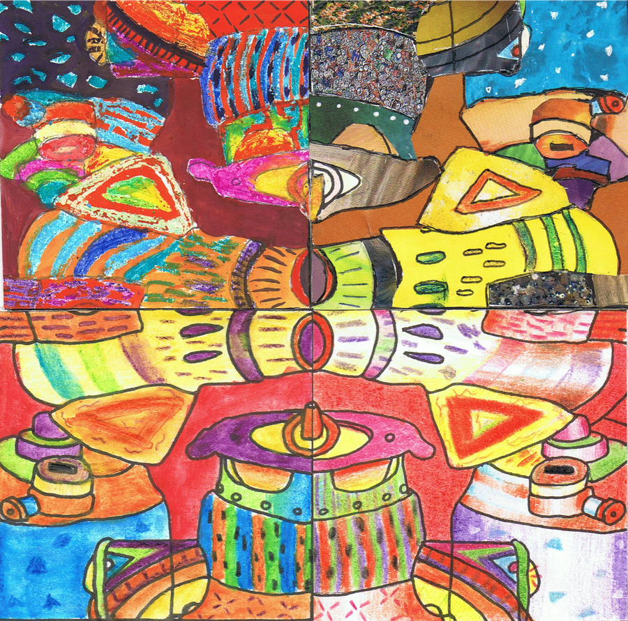
The idea itself came from a combination of a discussion with Tracy, and with some of my previous work. Tracy was the first person to agree that there wasn't enough basis to make a whole unit based around a single picture done in my robot style. So I instantly thought back to my back-catalog and remembered that I've done a few pictures in chunks. So I decided to combine the nature of two of my previous pieces here. The first was a picture I did for school, where I repeated the same pattern but used a different technique for each. The second was a picture I did for a robot contest where I had to make three pictures that formed one. Each one worked on its own but became something greater when combined. That was something I liked.
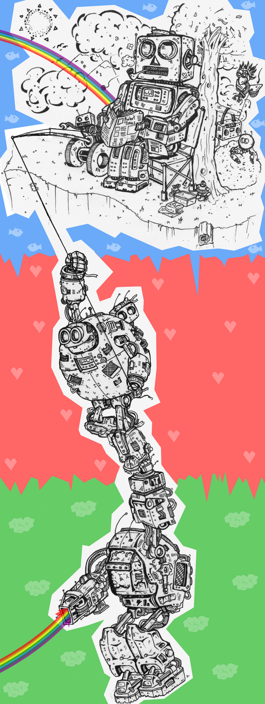

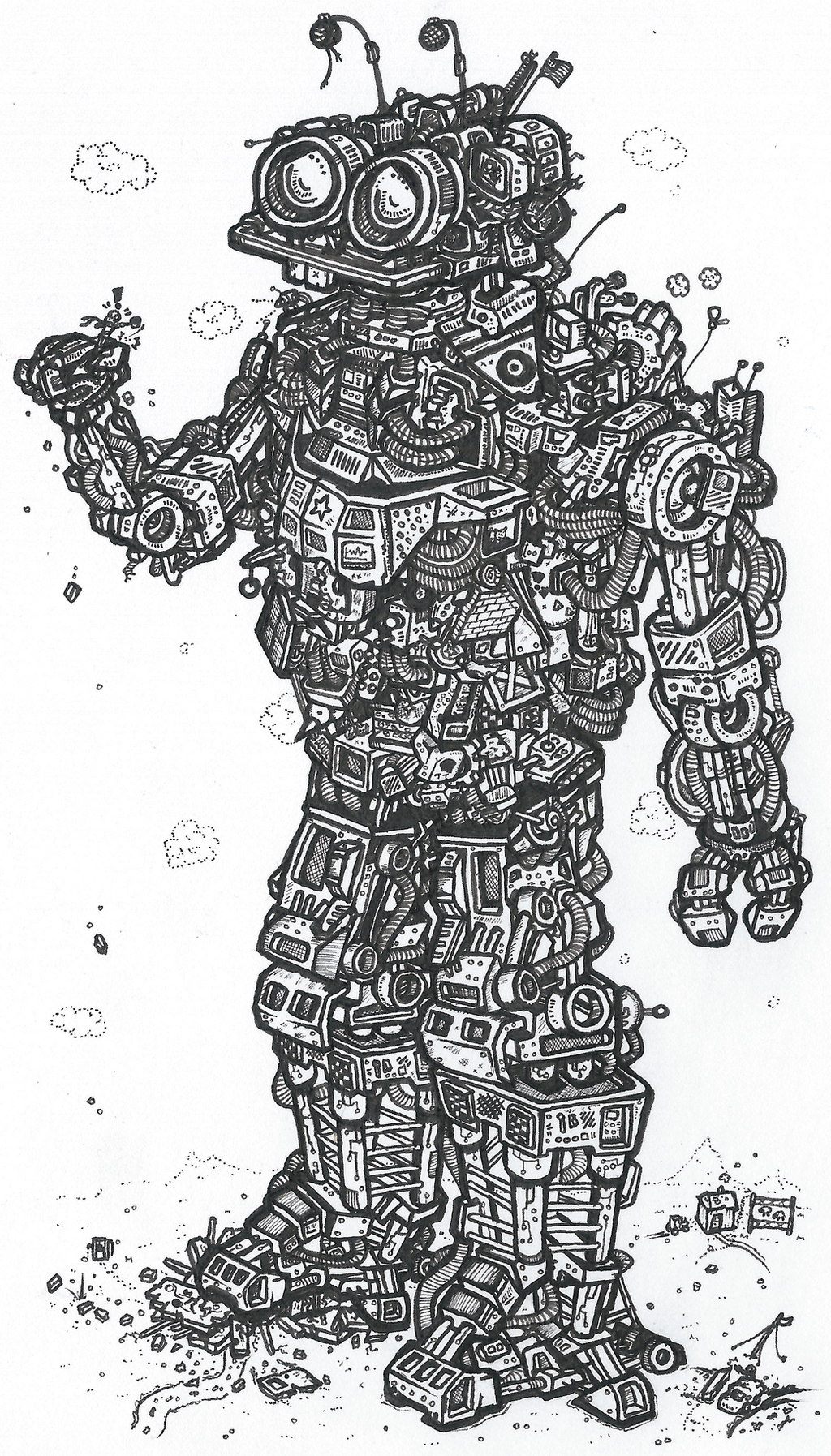
Design-wise I wanted to make a departure from the more over-designed big bots I was used to so I looked back to some of my more traditional robots. My soulbot style was out the question as it was too skinny, and wouldn't give me anything to work with. None of my other existing ideas worked either so I had to come up with something new. The final design used elements found in quite a few old pictures as well as an injection of something new. It was going to have to be humanoid and accessable but charming at the same time. Bucky was a good place to start here. I also used The Highlander as a key reference as it was the best indicator of where my style's currently at.

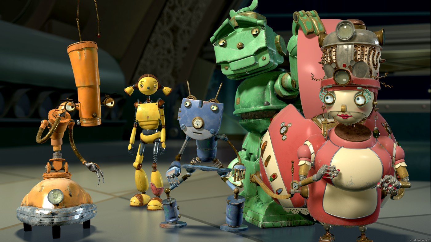
For the cinema 4D chest I didn't immediately find inspiration anywhere. I just dived straight in there and started building. But as I worked and came up with ideas, the animated film Robots began to spring to mind very often, It became especially important as I began to toy around with physics engines to do some slight animation work with him. The madcap contraptions of Wallace and Gromit were also helpful when creating the feel for it.

For the Robotic Fineliner arm my main inspiration was of course, myself. This was the big glory-hog project and this is the most show-offy part in it. Of course I'm my own inspiration here. The key inspirations were the (at the time) half-drawn dragon and my citybots, as I felt like it needed to be very detailed. Bigger Chris proved to be a useful guide as a fairly similar approach was used here, essentially using my robot technique as overcomplicated colouring for half the project. This arm allowed me to continue that pictures ideas, especially the more advanced way I've been trying to use detail recently. Whilst the detail is mostly used to create form for the robots, it's also very useful as a way to throw attention around a picture. Here I tried to condense it to create points of interest and accentuate the key shapes, whilst glossing over others. I'm loving this effect and I got to use it to finish off the dragon too.
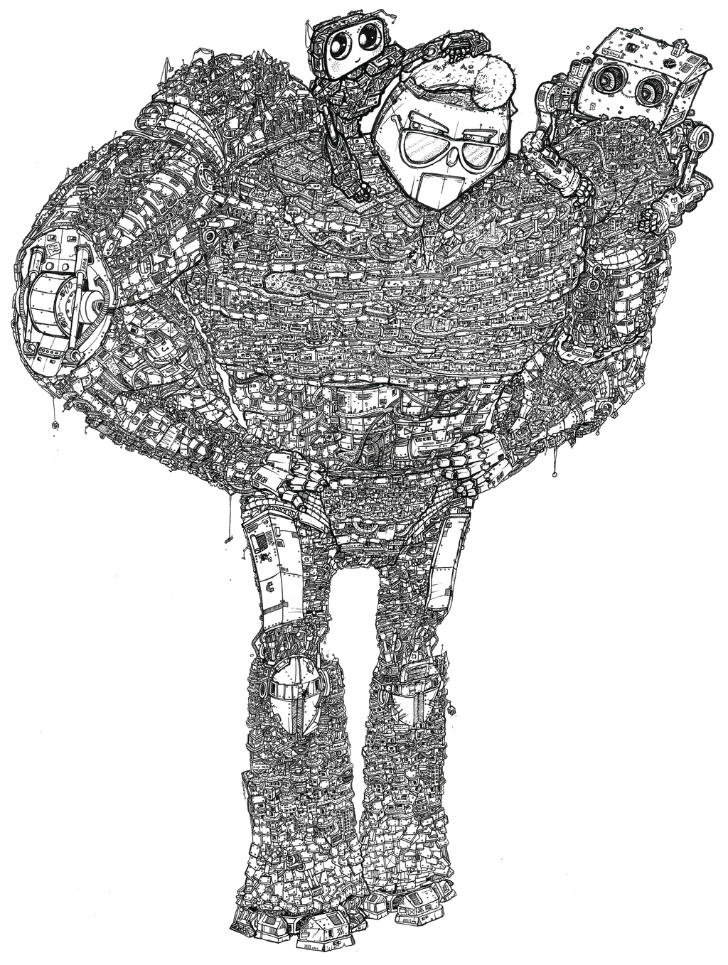

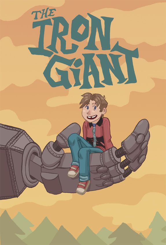
The vector arm was a nightmare. Inspired by the confidence from my second project, I thought it would be easy. I was so very wrong. As well as Home Sweet Home, I had to look to other places for inspiration, as the arm was looking too blank to call finished. The first idea I found was in one of my favourite character designs of all time: Glados from Portal. The way she's so inhuman in design yet still shows a degree of femininity is genius. But what i was interested in here was the way each section was broken up with lots of cabling. It's nothing new in my pictures but I really loved the way it was used here. I also borrowed a few tips from The Iron Giant for the hands, particularly Kayla Miller's fantastic poster design, trying to make them inviting rather than terrifying, as I feared the fineliner hands were.

I don't imagine I'd have started trying out my fineliner rendering had it not been for the work of Kei Zama. She's a Japanese artist known for her incredible ink rendering. She does a lot of Transformers art but isn't officially tied to them or anything. She just loves robots. I was also inspired by traditional pointillism techniques (which I actually used on the glass) and these helped to form my basic knowledge of how to shade with the medium.


I've skipped over the pencil thighs as pencil's such a done-to-death technique it's basically impossible to be inspired whilst using it. The next part to be made was the collage. Despite being loosely inspired by my own previous work in that medium, I also wanted to bring something new in. Despite having a lot of ideas plotted out, my main inspiration came from my material. I had to work with what I had. Thankfully this included a whole host of Which magazines as well as a few photography and music ones. This gave me pretty much everything I had. To get started I also made a couple of mood boards as I hadn't done any for this unit yet. I kinda regret this. Whilst they were a nice confidence boost, they used up a few too many of the best pictures from the magazines. Probably should have done these after.


The final part of the robot was the comic leg. The array of inspirations here is so incredible. It's essentially inspired by every comic I've ever read. predominantly it's superhero comics though, as those are big-budget enough to have both a penciller and an inker. It's also really impressive how much difference there is between finishes here. The main inspiration I'll use here comes from Olivier Coipel. He's one of the best Marvel-employed artists around and whilst his work has it's roots in traditional comic, art, the meticulous quality here is incredible.


I've already mentioned the influence of Transformers Devastator in the final setup of this robot but I feel like there are a few more ideas in here. The idea for the desert came from the incredible PS3 game Journey, and all the mysterious shreds of culture lying around in the sand. There's something really interesting about sand, and it also felt like it fitted the colours incredibly well. I'm just annoyed I spent a week making a 3D workshop first!


Research and Inspiration - Home Sweet Home

The project required a great deal of research before I could even get it off the ground. Being a competition brief for a large company, you have to get your facts right. So before any animation started, I dived once again into the metaphorical swimming pool of research.

My first stop was looking into HSBC as a business. I couldn't advertise them until I knew what they were all about. Thankfully the packs included in the project told me a good amount about the company before I even began to trawl their website. Thankfully, unlike some companies in the brief, HSBC hadn't misled anyone with their booklet and backed up all the claims they had made. I also looked for elements in the brand and ethos I could explore for my campaign. Their excellent customer satisfaction ratings and personal approach were the main thing I jumped on and tried to figure out how to weaponise it as an advertising campaign.


I also looked into other advertising campaigns both from HSBC and other banks. And sadly HSBC is a bit behind the curve advertising-wise. The main frontrunner I found was Lloyds TSB and their previous fantastic 3D animated approach that they used until recently. It hits most of the right notes of heart and charm and really gives of the impression of trustworthy-ness and working on a personal scale. It's just a fantastic campaign and works very well.


For the art of this unit Multiplex gave me the confidence to push my vector art to a high standard. It's a webcomic made entirely in vectors and manages to have some really nice looking art despite being done in such a clean, nearly emotionless style. If anything that was my aim for this project: bringing emotion to the emotionless. I'm so pleased I stuck with it as I managed to make a really charming animation using the medium.


I also did a whole lot of research into dogs for the project. I've never been great at drawing them so I wanted some good references. I also had no idea what breed of dog I wanted. So in Jonny tradition I put together a collage of dog ideas. These things really help when I'm struggling with ideas as it allows me to take my mind off the work for an hour or so and puts together a great board of references. I tend to do one or two of these for each project and it really helps.


In the end I went for a golden retriever, mostly inspired by the behavior of Jasper, my cousin's dog, who is excellent at demolishing anything not above table-height. Jasper is such a cutie too.


I put together a second mood board for the biscuits. I was having trouble deciding which biscuits to use so I figured this would help. And it defintely did. Just a few minutes after I made this I had created a set of biscuit sketches and moved into illustrator.


The perspective with the hands and the camera is a direct result of me watching too many Youtube reviews. Most of them use a hands-only-on-camera setup and that translated nicely to a video like this. It allowed me to keep focus on what was happening on the table whilst still keeping some human influence. I'm really happy with this decision. The key inspiration here is Stuart Ashen, who does a huge amount with the format.


For the game I had to do another round of research into smartphone games and tie-ins. The research into tie-in games was quickly abandoned because most I found were really poor, so I looked for far better games to use as inspiration, as I figured that the poor quality was likely a result of a lack of care rather than the medium. As predicted, most of the more successful games are puzzle games as they have the most longevity to them and benefit most from the smartphone as a platform.


Working with biscuits, I figured something akin to Tetris would work well. But rather than simply making a clone of the arcade classic, I began to inject some new ideas into its veins. I pulled the building society theme into it by using a full house pattern, and began to build features around this. Using Bones I also made the dog relevant and created the scoring system based around Crumbs, a spare word I had from when I made my biscuit typography.


Research and Inspiration - Daily Mail Dystopia

Daily Mail Dystopia was one of the most research-intensive productions Ive ever had to do. Every asset of that project had to be accurate or it would lower the value of the whole thing. I did a huge amount of research into Daily Mail headlines. Thankfully the Internet is a huge help for compiling the absolute worst of the worst headlines, so that helped speed things along a lot. It brought forward some truly brilliant stories I just had to use. You would not believe how many things the Daily Mail has decreed that cause cancer. It's pretty hilarious. At one point I was even going to have the central pair of characters die from cancer. It's how the structure came about, with them ending at a restaurant. Because Romantic Dinners Give You Cancer apparently. I ended up ditching the idea because it no longer fitted with the purpose of the animation.


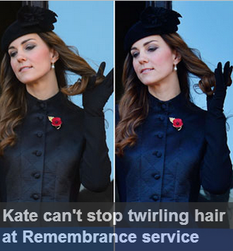
The main aspects I looked for in headlines were the big two of Sexism and Racism, the two standing stones of the plot of the animation. Each is the main plotline of one half of the animation, so I needed to look into both parts thoroughly. I took special attention to the way women were portrayed in terms of celebrity, especially the likes of Kate Middleton, who has been plagued by cameras since she arrived on the scene. Every move of hers is scrutinised by the media. It's got to be a hard way to live.


In terms of racism, The Daily Mail is loaded. For years they have cried to deport immigrants and are spawning wave after wave of hate. So this is where I decided I wanted to do something important.


With the main plotlines formed I began to look for other stories to fill the background. Sillier ones. This was a fun research task. I found stories about giant crabs, steroid-ripped schoolchildren, injuries from falling poop. There were so many fun stories that fueled many of the background characters from the animation.


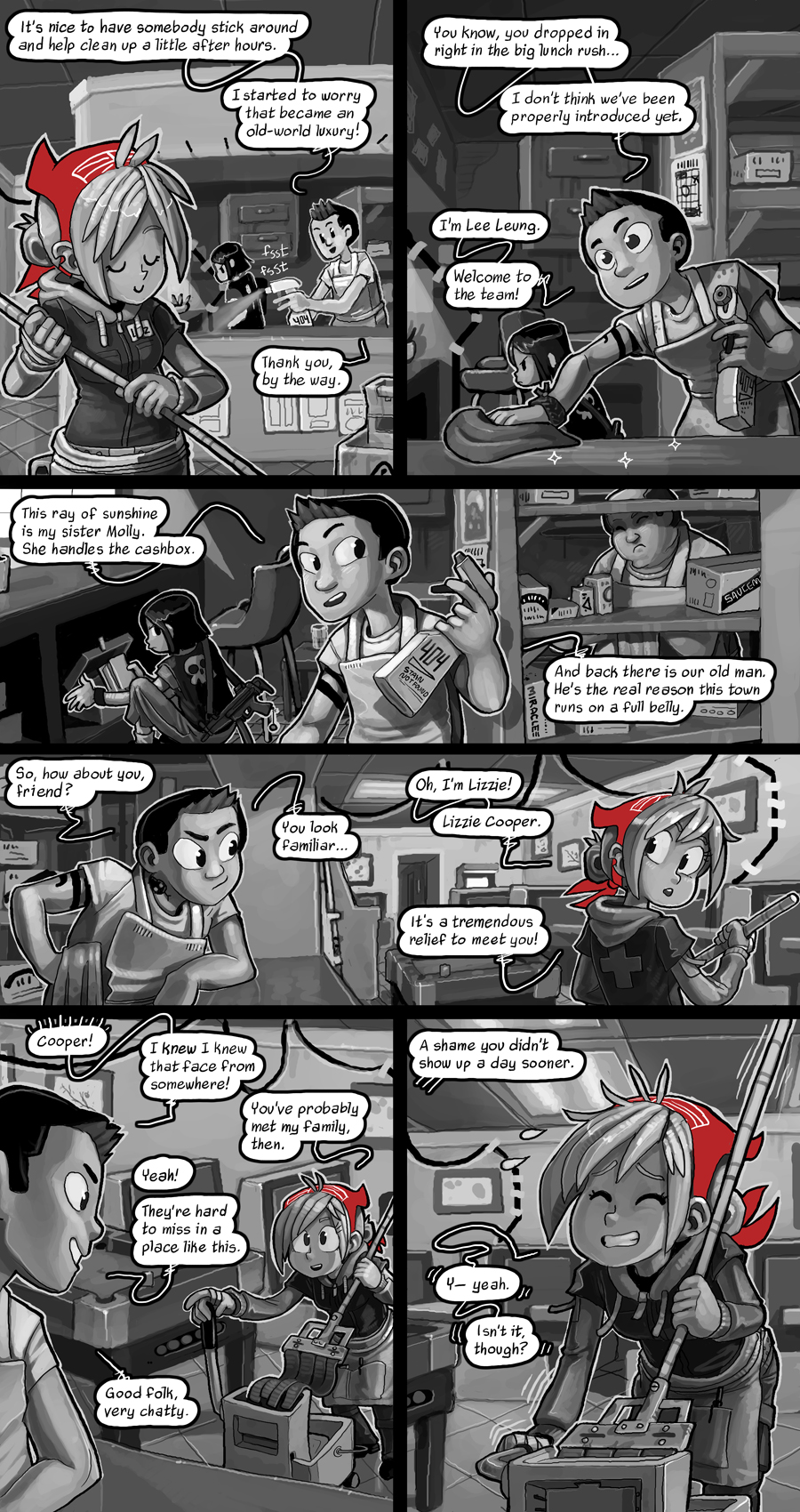
For the main characters I did a bit more research. I wanted them to look like actual young adults so I had to style them in that way. Gone are the usual standards in Jonny Draws People haircuts, as I had to research a bunch of new ones to make my characters look modern. I gained a few ideas from Google image searches and Pinterest but most of my best results came from Batgirl. As a comic that's set in Gotham hipster area Burnside, it contains a whole number of appearances and styles to try out on my characters. Both of the characters I ended up designing were heavily inspired from looks in Batgirl.


It also helped me flock the comic with more generic background characters too, as I couldn't have everyone in the animation be portrayed as bonkers Daily Mail caricatures. It helped me create a diverse and interesting range of people to sit around and be unimportant.


In the realm of less direct research I did quite a bit of research into styles. The basic idea that the animation could work came from the Transformers Robots In Disguise show, which uses 3D characters in 2D environments. I figured I could flip that arrangement around a bit.


The webcomic Dead Winter was accidently a massive inspiration (as I didn't realise how much it had inspired me until far later) The art style isn't too far removed from the animation style used in DMD and I ended up using the same Black, White, and Red colour scheme. Tonally it's not too far off either.


Another key reference for this project was Birds, my Unit 3 piece for last year. It provided a key starting point for the art and animation style. I wanted DMD to be a kind of stylistic sequel to it, being a similarly motivated and created story. The art style was initially borrowed from that before it was simplified for the animation itself. The two original character designs would fit right into Birds though. It led to the same eyes being used for this one, and if you've seen a few of my drawing styles you's realise how much of my styles spring from the eyes. They're nearly always the first thing I draw and tend to define the style of a picture.


Silent Hill 2 was a huge stylistic influence despite having never played it firsthand. The way it used fog to create atmosphere is really smart, especially given that it was originally done due to technical constraints to lower render distances. I had a similar need here, as I couldn't build anything very impressive in C4D so wanted to limit the amount you could see at any given time. I really like this effect,


Thursday, 12 May 2016

Comic Roundup

As has become tradition with this page, it's time to talk about the webcomics, and regular comics, that I have been reading this year. I'll be going through in no particular order as I slowly rememebr what I've been up to. Enjoy!

Stand Still Stay Silent

SSSS is a pretty extraordinary webcomic written and illustrated by the great Minna Sundberg, who comes from Finland. It tells the story of a group of adventurers sent out to explore a post-apocalyptic wasteland. Most of the civilised world has been killed by this horrifying plague that turns people into 'trolls', horrible gribbly monsters with some awesome designs. Whilst there are some moments of genuine horror, the majority of the comic is spent getting to know the incredibly likable cast. We're slowly introduced to them over the course of a few hundred pages which really helps with keeping everyone distinct.
It also has some seriously beautiful artwork. Minna uses a really interesting painterly technique and a limited palette which gives the comic a very distinctive look to it, and greatly adds to the already excellent worldbuilding. I'm really interested to see where it goes because it's been superb so far.


Wilde Life

One of the most recent comics to enter this list, Wilde Life is a supernatural horror/adventure webcomic set in rural Oklahoma, and has a heavy emphasis on the mythology of the area. Like most the comics I love, it has some really good characters. Clifford in particular is really fun to read about. The story's still picking up but there are some really interesting things going on so I'm excited about the future. Art-wise it's got a fairly hand-draw and slightly sketch look to it along with some really bright, happy colours. It fits pretty nicely and allows the scarier moments to hit home hard.


Broodhollow

If a contrast between horrifying and idyllic is what you're looking for then Broodhollow is the place to go. It's another supernatural horror story but this time there's no adventure. Just nightmares. Nah, here's a lot to love here. Broodhollow tells the story of Wadsworth, a man with severe insomnia, who moves to Broodhollow to talk with a doctor about his issues. What follows is some really nice character exploration with heavy doses of traumatising horror thrown in. The horror works so well because the majority of the comic is drawn in a cutesy, stylised manner, but the horrors have far more detailed, lifelike appearences with lens flares being used incredibly effectively. It's a super effective setup and works wonders for the comic.


Girl Genius

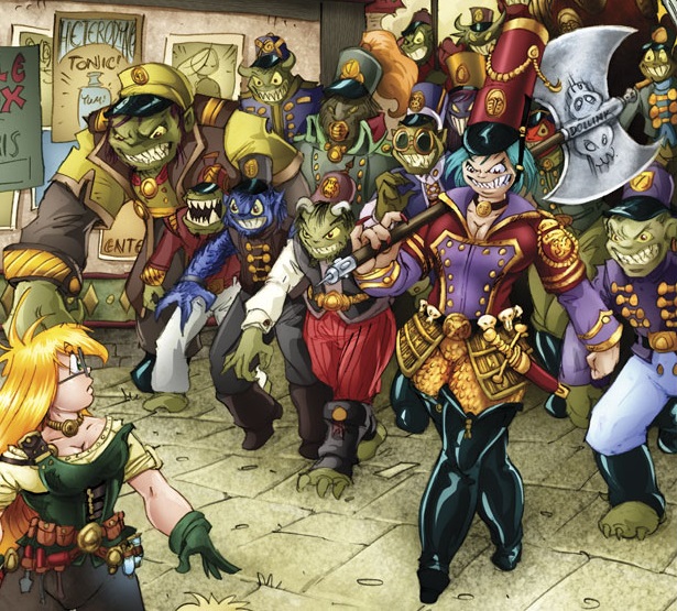
In far more happy territory is Girl Genius, the webcomic epic from Phil and Kaja Foglio. The comic's been running for over ten years now and shows no signs of stopping. I've been rereading it from page 1 and I still haven't caught up yet. It's incredibly long but so well crafted at the same time. Dialogue is constantly to a high standard and there's some incredibly well-planned plotting at play. To have a plotline stretch for ten years but never feel dull is such a triumph of writing and they should be rather proud of it. The comic has a very steampunk aesthetic which really makes the world fascinating. Over the years it's been running the pair have put together a world that feels both lived-in but exciting, and above all else, believable. It's a fantastic read. If you've got a long time.


Seconds

Seconds, by Scott Pilgrim writer Bryan Lee O Malley was so much better than I thought it would be. Until fairly recently, the only work by Bryan I'd read was Scott Pilgrim. Which I loved to a ridiculous degree. But when he released another book I wasn't all that fussy about reading it for some reason. I guess I'd figured him to be a one-trick pony. But blimey I was wrong. Seconds is brilliant. It's mostly a 'be careful what you wish for' story but it's told with such visual flair and some excellent character work that result in it being an absolute delight to read. It even manages to be suspenseful, and makes you root for a character even though it's plain to see she's going off the rails. Absolute comic gold.


Avengers Academy

Around the time of doing my visual appendix, I read the Avengers Vs X-Men event from 2012 to help with costume ideas and stuff. The story is told as part of several different series as well as a main one. One of the minor ones that saw focus was Avengers Academy. So after finishing AvX, I decided to jump back to the start of Avengers Academy and read the whole thing, as I quite enjoyed what I saw during the crossover. And although I've only reached issue 13, I've really enjoyed it so far. It's been a great mix of serious plots and fun moments, but all told through the perspectives of students. It's not about saving the world in the slightest, but rather about helping out the people around. It's a nice read.


Sins Of The Wreckers

As it's me talking, of course there's going to be a Transformers series in here somewhere. And this time it's Sins Of The Wreckers, an in-depth character study in disguise as an action thriller. The floow up to Last Stand, this comic deals with all the horrifying and traumatic repercussions of that series whilst adding in a brilliant new villain and a whole host of extra nightmares. The character work in this comic is simply phenomenal, especially when most of the characters are robots, and only existed in the first place in order to sell toys.


Liars' Dice

Another fluke find, I discovered this comic when the creators followed me on twitter (for some odd reason). I figured I might as well check it out. And I'm really glad I did. It's still a relatively young comic but it's showing a lot of promise. The art's got a really realistic edge to it and helps keep the story grounded, and the character dynamics between the central pair are fantastic to behold. It's snappy, fun, and I'm really looking forward to seeing where it ends up going.


Sleepless Domain

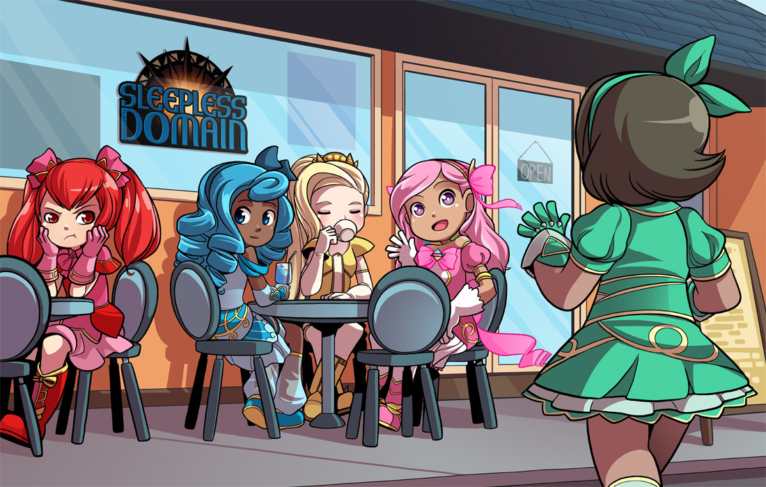
This is one of the big ones. Not because it's massively long or has a huge following, but because there aren't many comics that I get this excited about every time it updates. Y'see it started out as a charming but slightly inconsequential romp about five magical girls. And then it happened. One of the best-executed and satisfying plot-twists I've ever read. Mary Cagle is a genius I tell you. Everything that's happened since has been brilliant.


Music

It's time to break from the norm a bit. For whatever reason I've spoken a lot about art, film, and writing, but never really talked about music. Admittedly it's had less of an effect on my work than most things immediately, but it's almost certainly had an effect at shaping how things have gone this year work-wise, and definitely informed my choices of soundtracks. And given how I constantly listen to music when I work, it's bound to have fed into the work I've done this year.

At the very start of the year I was just coming down from the stuff I'd been listening to over summer. Mostly a rather brilliant band called The Naked and Famous. I'd picked up their fist album at the end of the holidays and was thoroughly in love with it around that time. It's an astonishingly good album, and has that perfect mix of poppy fun-times and LOUDNESS I like in my music.


Over summer I was also beginning to listen to my favourite band, Metric, a bit more. They're a Canadian synthpop band with an amazing collection of albums and one of the best singers out there. They have this really great mix of great pop tunes with just enough of an edge to make it work. And those vocals are amazing. I knew they had an album out towards the end of the year and their singles were starting to slip through from the album. Shortly afterwards the album itself arrived in the post and I listened to nothing else for a few weeks. Not too long after that I saw them live in Glasgow with two of my old school friends. Without a doubt the best night of my life. Boy do they kill it live.


A bit after that I bought a lot of CDs. Mum came up for a trip, and we both went CD shopping then, and I also grabbed another album or two in later visits. The main albums of note were Be Your Own Pet's first album, a joyously loud medley of loudness. I listened to their second album a lot over summer so it was fun to get another one. I also found Art Brut's second album, which completely won me over after their questionable debut. It began a fascination with them that lasted until the summer term. And thirdly came Grouplove who formed the charming nicey-nice part of the new album triangle.


Those three kept me going until my birthday and beyond. Using some of my birthday money i went on another album shopping spree. The main albums of note were Froot by Marina and the Diamonds and Kindred by Passion Pit. I'd got into Marina and PP last year, so I was eager to finish off the Marina collection and get a bit more PP. The better of the two, Froot is a genuinely fantastic album. It's not just my strange tastes talking. It's so good. probably her best record, and after that debut that's really saying a lot. Kindred was also pretty ruddy good. It's very synthy, and has some fantastic bouncy fun tracks and it's very good.


Afterwards I picked up The Naked and Famous's second album. it's not as good as the first by a long shot, but after a while it grew on me. It's just a bit slow and doesn't really go to any very interesting places. Apart from the lead single though. One of the best songs I've heard in ages. Well, since Metric did The Shade over summer. It's such a good song.


I didn't get anything new after that until Christmas. My uncle worked his magic and got me a few more as a christmas present. Whilst I'd requested all of them, the only properly good one came from Franz Ferdinand. It was their fourth album and was filled with ten different reminders about why Franz Ferdinand are brilliant. And every single song is as catchy as heck. I had fun with that one.


As those albums weren't as good a music fix as I wanted, i dug through my CD collection and found that I hadn't put Of Monsters And Men's first album on the computer. So I did that and really liked it. It also tied really nicely into Stand Still Stay Silent, which I'll probably talk about later. I think we need another Webcomic Roundup soon. It's a really good album full of vaguely folksy nice tunes. Which provided a nice foil to Dananananaykroyd


Dananananaykroyd kicked me back to the Be Your Own Pet school of music. It's loud, fast, and surprisingly catchy indie-punk and it's a whole lot of fun to listen to.


The rest of the year was far less rooted in terms of music. As I bought less, I began looking back a bit more, and pulled some neglected albums off the shelf and gave them some more. Klaxons' third album finally got some appreciation. I also dug back into The Flaming Lips' recent albums but found nothing close to love. They're a bit too far from what I like right now.


And in the last few weeks I've been listening to the RWBY Volume 3 Soundtrack as well as rediscovering just how good Calvin Harris's 18 Months album is. I've also got back into The Naked And Famous again, especially their first album, after finding a concert video from that era on Youtube.


There are definitely traces of what I'm into in the music of the animations. The Naked and Famous fed into the darker introspective music of Daily Mail Dystopia, whilst Of Monsters And Men really fed into the YCN brief. The Production soundtrack spring from me getting back into Klaxons, and the Motion Go music was...well...pretty blank. Maybe there's a bit of recent Flaming Lips in there? Maybe?

Either way, I figured it would be interesting to discuss part of the year that I hadn't discussed before.

Gender in Comics - A More Informal Take

For my essay this year, I tackled the topic of gender in comics, which is something that is constantly being brought to my attention thanks to having a background in comics. I covered a lot of good points in that essay but I wanted to have a less formal, and more opinionated discussion without the confines of an essay format here. 

So firstly, I obviously believe that the comics industry (well, the superhero part at least) has a weird double standard going against females. But of course I think that. I wouldn't have written the essay otherwise. But I'm just going to talk around the issues a bit. This probably won't be that coherent but there should be some interesting stuff. 

Firstly I just want to say how impressed I am about superhero comics at the moment. Whilst I tore them apart a lot in the essay, things are really improving at the moment. Thanks to having a new female Thor, and the increasing prominence of Captain Marvel, Marvel comics has a really awesomely diverse avengers team. It's also really great that we have a female Wolverine, as the character that took his place was so much more interesting than the real deal. Great stuff Marvel!

DC's also doing OK but most of that's coming from a small handful of titles. Gotham Academy and Batgirl are doing the rounds as usual but Black Canary and Supergirl have also been getting attention recently. And thankfully DC's big Rebirth even isn't changing much in terms of the important female cast. So well done DC for not screwing that up I guess. 

Sadly things are still going ahead with the Killing Joke movie, but voice actor Mark Hamill has suggested that it's more of an adaption than a direct copy, so there's room for positivity, but I have a lot of doubt about it. The Killing Joke is still a shining beacon that attracts the worst parts of the comic community and I'll be happy once it's dead and buried but it's looking like a while until that happens. More positively though Alan Moore, the writer, has actually expressed distaste some of the book's events, and says that his editor should have reigned him in a bit. So that's good. 

It's also been really interesting watch Kate Leth's twitter feed over the past few days. She recently did a post talking about how bizarre female costumes are. She discussed how strange it is that artists accentuate female breasts individually, and says how the outfits would have to have 'boob socks' to achieve this effect. It's not just sexualising, it's just a bit ridiculous. Like, harking back to my previous points in my visual appendix (which you've probably not read), my main criticism of female comic outfits are that most the people who wear them would never choose to dress in that regard. Ms Marvel is a prime example of this.

It's also strange to note how uninspired female costumes have been until recently. The original Ms Marvel costume is probably the least interesting costume I've ever seen. Whilst it's visually striking with the lightning bolt on black, it says nothing about the character, her powers, or her really interesting alien origins. It's just a bit sexualising and really uninspired. I was so happy to see the new costume in effect.

It's surprising how many people still stand by the belief that male and female superheroes recieve identical treatment, and defend the 'boob sock'. I can't believe nerd culture sometimes. And also amusing was how many people accused Kate Leth of knowing nothing about comic books. KATE LETH, one of the most successful female comic book writers of the 21st century. This fake geek culture really has got to end at some point soon. It's doing the world any good at all. 

One thing I have gleamed from my trips to comic cons is just how localised the issue is. Pretty much every other genre has no such problems, and webcomics have taken things to such a level that there won't be a lack of diversity in the medium for twenty years even if they stopped now. It's a wonderful world out there. It's just that superhero comics have existed in this strange vacuum  for far too long. Thankfully, things do seem to be changing. 

James Roberts

I've mentioned Transformers: More Than Meets The Eye a few times here and there on this blog and it's not going to end any time soon. Especially given that I actually met the writer a few months back. That was a great day.


I knew he was doing a signing in Manchester but I wasn't originally planning on going. None of my friends who like the comic were available, and it meant getting a train to Manchester to do it. That decision was nearly finalised in the morning after I woke up from a terrible nights sleep. During the day we had the 'Save Huddersfield A&E' protest, and it was only after getting lunch that I decided I had to do it. I had to go and meet James Roberts.

And yeah, it was a great decision. He's one of the nicest people in comics I've ever met (and I've met John Alison so that's saying something!), and has such a love for what he writes. It's incredible to see. It was also really nice to meet more fans of the comic. After I eventually got to the end of the queue I got a couple of issues signed as well as my toy of Whirl.


From a writing perspective, Roberts is really unique, especially as a TF writer. He writes his characters with a far more human approach than many of the other writers, and has such a strong grasp of continuity it's somewhat baffling. The man's a genius. He also has an incredible attention to detail and his original scripts are nearing on 50 pages long (I'd know, he sells annotated copies of them). Trawling through the scripts is a surreal experience, filled with microscopic elements all pulling the story together. It's a marvel to behold.


Coming towards final year, I imagine his work is going to become fairly relevant as I move towards my massive final year project. He's one of my few regular inspirations that hasn't come into play yet, so I'm expecting it to happen soon. It's going to be fun.