Thursday, 12 May 2016

Thought Bubble


It's about time I do some Thought Bubble coverage here. It's by far my favourite comic con around. Unlike most which are stuffed full of stands selling Funko Pops and Naruto plushies with only a small artist alley celebrating artists, Thought Bubble does things differently. It's primarily about the independent comic writers and artists. There are huge halls full of them. It's a melting pot of creativity and pretty things and I love it to bits.

Sadly I missed out on the event last year due to being tied up with a trip down to London, but I wasn't going to miss it again. So in November, me and one of my old school friends descended upon the con once again. 


This year had some incredible talent coming to the event. Firstly it saw Tom Siddell, Kate Ashwin, and John Allison coming to another event I'm at which is always fantastic. John I've covered here but I'll talk about the other two in a minute. It also saw Adam Vian and Amanda Elanor Tribble in attendance, both of whom I met at Camcon a year or two back. By surprise I also found a few old faces I had no idea were attending. John Paul Bove and Andrew Wildman, both at the coolest end of Transformers artists were there, along with Jon Lock, the genius behind Afterlife Inc. Vivian also met one of her heroes, the awesome Kate Beaton of Hark A Vagrant!

Whilst there I also met a whole host of amazing new artists. Chief among these is Will Kirkby, whose art is so genuinely amazing it's a wonder I'd never seen him before. Also I found Dungeons and Drawings, an awesome pair of artists who have made some truly awesome redesigns of D&D characters as well as some rather neat comics. I'll probably remember more as I continue this article.


As I've already covered John Allison from LCAF, I'll start off with Tom Siddell, artist and author of Gunnerkrigg Court. Officially holding the title of Jonny's favourite webcomic for a good few years now, Gunnerkrigg is essentially a tick-box list of everything I love in comics. The recurring cast is filled with a whole host of wonderful characters, and one of the most impressive things is how the characters have developed over the course of the comic. Being set in a school, characters age and progress in near-real-time. It's also incredibly well written. Whilst the dialogue and characterising is always fresh and interesting, the true strength of the comic lies in how it can flick around all kinds of different storylines and issues, both whimsical and serious without ever feeling forced. It's just a beautifully crafted comic. Artwise it's also pretty extraordinary. Once Tom hit his stride, the art has become one of the best parts of the reading experience. The characters are drawn in a really nice stylised way that has just enough parts of realism to work, whilst some of the school environments and especially the robot characters get a beautifully detailed art style applied to them.  Later in the comic as Coyote appears, the comic also flicks into a different style, heavily inspired by tribal painting and it works astonishingly well. But to conclude, Gunnerkrigg is brilliant.


Next up is Kate Ashwin of Widdershins. Widdershins is a really important comic to me, as it properly started the webcomic binge I've been on for the last few years, and really set me on my path of loving comic books. Whilst it wasn't the first webcomic I've read (Homestuck and Sandra and Woo got  in there first), it was the first one that opened me up to the sheer variety of webcomics that are out there and started the massive streak of webcomics I've read. Widdershins is an adventure comic set in pre-victorian England, in a fictional town called Widdershins. It features a rotating cast of characters and is broken up into seven different stories as of the moment. It's a really light-hearted comic to read and is really fun with it's use of magic. As with most of my favourite comics, it really works thanks to the character dynamics that steer each adventure around.


Jon Lock created Afterlife Inc so automatically is one of my favourite human beings. I'm serious, Afterlife Inc is so good and perfectly captures my worldview to a scary degree. It's set in a version of the afterlife where plucky businessman Jack Fortune runs the place along with his partners, associates, and archangels. It's bonkers in all of the best ways. Jon does the writing whilst a series of different artists tackle each story. Each of the three volumes so far features  a bunch of different stories. Some feature all the central cast, whilst a couple feature none of them at all. From a world-building perspective it's one of the coolest things I've ever read, and has had a big effect on the way I write and create characters. The captain Cool reboot would be very different if it weren't for this.


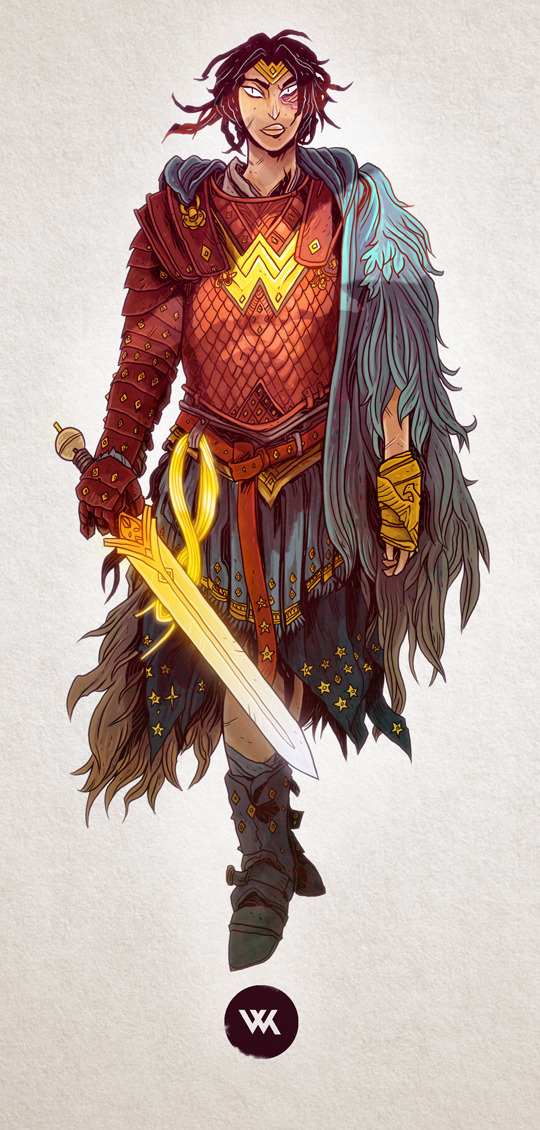
The final artist I'm covering in detail is Will Kirkby, the complete unknown for me. In fact he was the last artist I found at the con, and I was so desperate to buy his sketchbook I had to run out and get even more cash out. I spent a lot of money that day. But back on topic, Will Kirkby has this really stunning art style. Like me, he does really detailed drawings, but his have a more grunge-y aesthetic to them. There's a sort of jagged effect with the way he draws people and I am seriously into it. He tends to do a lot of fantasy art, and is really into RPG games such as D&D and Dark heresy. I've recently been looking through his back-catalogue and found some really amazing stuff. He's also done some short-form comic work with some incredible artwork too. This one is really one to watch.

Wrapping up the best of the rest, Adam Vian is an artist and game designer who created the Long Lost Lempi comics and has a really interesting drawing style. It's such an odd one to describe, focussing very heavily on form, and is super interesting to look at. Amanda Elanor Tribble is one of those artists that I have trouble explaining exactly why I like them. There's just a certain something in her art style I really like. She writes a lot of mini-comics and is currently finishing an illustration degree.
John Paul Bove is a pretty long-serving Transformers artist and writer. Despite colouring Regeneration One and Empire Of Stone, I mostly know JPB as the awesome guy who does the retro posters that saved MCM for me. Seriously, MCM is a bad con. Queues for hours and basically no art. But yeah, his posters are ace. He also coloured the Transformers MTMTE breakfast club poster which I simply adore (and have on my wall). He's a good 'un. The other half of the Regeneration One art team was also in attendance. I don't know Andrew Wildman's art so well, but it was really cool meeting both parts of the team together.


And finally, Dungeons and Drawings, an awesome character designing duo. They focus on making redesigned versions of D&D monsters and do come really cool stuff by boiling the characters down to their most core characteristics and working around them. So much great stuff there.

But yeah, that was Thought Bubble. Best comic event of the year. Bring on 2016! Next time they have most of the ex-Batgirl team as well as Marc Ellerby and a bunch of other amazing people. It's going to be good.


Wednesday, 11 May 2016

Mechadragon

The third and final of the school year's regular robot pictures. And it's definitely my favourite. Compositionally it's pretty interesting and it's got some really effective detail that doesn't drown out the shapes. It's a really strong one.

Wandering Wizard

After starting to draw robots again with Highlander, I found myself starting another one quickly. But unlike my usual pictures I didn't cover it with intricate detailing. Instead I hand-coloured a robot picture for the first time in years. I chose to render it using fineliner strokes. It's fairly time-intensive but has a really nice effect. What's unusual is that this is the first time I've ever used that technique. I've barely ever even seen work like it. Transformers artist Kei Zama is the closest I can think of at the moment. But talk aside, here's the next of the year's robots.


Monday, 9 May 2016

Gestalt - Production and Roundup

Collide was mad. Just completely crazy. Both the show and the actual unit. And the fact that they had to be done at the same time (if you're as crazy as I am). I'll talk about the exhibition later at some point. But this is about the actual project.

As I was bouncing around ideas for Collide I would frequently get distracted and do some more work on my robot drawings. One of the times this happened Jonny Lindley spotted me doing it, and suggested I do a huge one for Collide. Nick shortly followed up with the same idea. But as much as it's an area I have expertise in, I wasn't sold. I've done huge robots before and they're not fun. They burn me out and I always run out of steam. But thanks to a quick chat with Tracy and some already-forming ideas in my head I found the solution. Rather than doing the whole robot in fineliner I would split it up into seven techniques. This way it would deal with the problems of getting burned out of different techniques, as well as ticking the boxes for collide more. It also allowed the unit to become an exploration of my past as an artist.


The first step was planning the design. One of my key ideas here was to keep the feel of one of my regular robots about it, as some of my big 'bots are a little over-designed. So to achieve this I decided I would stick rigidly to my original sketch for the whole project. So one night I began sketching out a quick idea, and before long I had a design. Well half of one. The legs came later. I also plotted out the original list of media I wanted to use.


The first part to be made was the upper torso. Doing it first gave me options about where to go next. For this I used Cinema 4D. This was the single biggest task I'd undertaken in C4D, as Daily Mail Dystopia was a relatively simple process. This was far trickier. I had to convert a 2D sketch into 3D and make it all match up as well as possible with the detail of the original sketch. Some parts of this were far easier than others. The large jagged plates were a genuine nightmare, both in placement and construction. I also had a lot of trouble finding the right places to put all the gas cylinders (it's kinda funny that there are a bunch of gas cylinders in hindsight). It taught me a lot about my drawing process and that my technique of 'shove all the detail around the back' doesn't work so well in 3D. Thankfully some things went really well with this. I discovered sliced torus shapes make brilliant pipes which saved me so much time. Also the Bridge tool is my favourite thing in the world. Finally it was textured up. I went through a few ideas here, including the toon options and wireframe renders before settling on my current look. I found a great tutorial about realistic metal textures and used that for most of the torso, breaking it up with a few different variants as well as glass and lights.


After that I dived into the fineliner arm. This was a fantastic one to work on. Only having to do one part of a robot is nice as it means I can throw all my good ideas at one place. It also allowed me to make some super complex workings and focus on things like negative space and inking a little more. These are both part of my current interest within the robot field. Somewhat astonishing is the detail level here. Without a doubt it's the most detailed thing I've ever drawn. I didn't even intend it to be! I mean it rivals Bigger Chris for detail and was drawn at half the detail level. I have a couple of nitpicks but they're both rather small. Firstly it's missing some of the more interesting detail I put into pictures. Due to time constraints I didn't have a chance to stop and think about interesting things to add into it. There are a few fun points though, and I love the ones I have. It also allowed me to make the thing in just a week. Secondly it's the least cohesive part of the robot but that also works to an advantage here as it gives a great focus point to draw people in.


Next I made the other arm. This one was far more problematic. Coming off the biscuit project I thought this one would be easy as pie. But whilst most of the detailing on the biscuits was done with brushes, that wouldn't work here. All of the details are actual 3-D looking parts of the robot so had to be done properly with sharp lines. This was not a fun process. At a few points I tried to add photoshop stuff to it to help ease the process but it never worked. In the end though, I am fond of it. Whilst there's perhaps a bit too little contrast in some of the shading, it works as a great counterpoint to the fineliner arm, by being the least detailed part of the robot. It's a fun play-off. This was the first time I had to come up with colours properly so I went for a heavily desaturated green and shades of brown and grey. The latter two are standards with my robots but the green gave them a nice flavour.


After that disaster of a week, I learned that I wasn't experienced enough with digital painting to use it
for the crotch. After a few different ideas bounced around my head including blending it with the torso in C4D or stealing one of the planned techniques for later, I decided to use fineliner again. Rather than my crisp, detail-heavy style, I decided to use the scratchy rendering technique I had discovered recently in one of my robot drawings. This was a really strange one to work on as the other techniques were ones I was fairly experienced in or at least knew the possibilities of, whereas I had only ever used this exact technique once before. All things considered though, I am delighted with this one. It's one of my favourite parts of the robot and I'm so happy with the technique. It's a pretty harsh techinique to work in as a huge amount of pen strokes are needed but I feel it's completely worth it. Also I'm amazed by how the water turned out. Drawing water in a technique I barely know is something I'm quite proud of.


Moving down I decided to add a little more to the process. As I finally designed the legs, I realised how to robot's proportions would look. And he's a leggy one. This meant that the two leg techniques would take up half the picture on their own. In order to combat this I decided to split the legs, and add another technique to the mix. Originally one of the legs was to be done in pencil but I was doubting that plan, so I took the opportunity and used the technique for both sets of upper legs. For a process that involves drawing the same thing twice it was surprisingly fun. Mostly because it was very quick. Pencil is such a speedy technique. One of the interesting things I like is the paper. One of the legs was accidentally drawn on cheap cartridge paper and the other on my usual drawing card stock. Theres a nice bit of variation as the cheap paper has far more of a grain to it, whereas the card has a really smooth finish to the shading. They look great together. Plus it proves I didn't just copy/paste them.


The next one is Collage. This one was another tough one. I've done some detailed collages before, but those didn't have to be precise. This one needed to match up to the design as closely as possible. It proved to be quite a task. Thankfully I have a steady enough hand and enough of a head for logistics to make some decent solutions to some rather problematic parts. The majority of the scraps came from Which? magazines we scavenged from recycling along with a couple of NME magazines (after they became terrible) and some calendars. A few extra pictures were printed from the internet for specific purposes such as the masses of wiring. I feel like this limb is one of the most visually interesting parts of the robot. It also provides a really nice contrast to the last limb.


For the last limb I was faced with a bit of a problem, as I had run out of techniques. All of my original ideas had been used up or scrapped, so I was in a small spot of bother. Thankfully I found a solution lying around in Google Drive. Pale Before - a short-lived robot comic project idea between me and two of my school friends. Artistically all three of us worked on it. Eli did the initial pencils and panel layouts. I did the inking, and applied my robot magic to make the pencils pop. Vivian then tackled the colours, using a fairly stripped-down technique of block colours with two shades of highlights and lowlights. It looked rather good. So for this limb I decided to borrow that style, except that I would be doing all of it. This limb was such a blast. The pencils were pulled together fairly quickly, putting together a crisper, more detailed version of the original design. Next came the inks. Using my full collection of fineliners I finally got to put some attention into lining and detailing something without the expectation of turbo-detail. As I expected, the linework was really solid. I finally coloured it, using photoshop and a combination of vectors and brushes. For both of the legs I decided the colour scheme beforehand, and opted for a yellow scheme with touches of the greens, browns, and greys from the arms. I can't remember exactly where that scheme came from.


The final part was the big one. The head. For this I collaborated with my dad, because this required some serious welding, and I'm terrible in that regard. For this part I wanted to build it as a physical object. The first thing that needed doing was parts sourcing. I started by taking the head design up around my dad's various workshops (he's a builder) and started scouting for useful parts. Amazingly I found the main part within a few minutes. An ancient gas cylinder. It was big, heavy, and a crazy idea, but it was perfect. That afternoon Dad managed to find me a second one in my granddad's garage to work as the lower jaw. From that point onwards we were in business. Over the next week I pulled together the last parts we would need, such as torches, pipes, and aerials. Then the build started. The first task was cutting apart the cylinders which was done with a grinder. The bigger cylinder was then tapered inwards using some really smart cutting and welding. Sadly that one was dad's idea. We then attached the two together using a hinge and a platform to keep everything together without filling up the inside with workings. Then using a huge cutting drill we made the eye holes, and stuck some pipe into them. The backs of the eyes were made from the pieces of metal the drill sliced out so it matched the head. The torches were mounted using strips of metal and rubber bands. For the mouth we used a small offcut that we ground teeth into. The hair was a large quantity of wire threaded through a whole lot of holes in his head. That was quite a task. They were secured using a fibreglass seal. That worked incredibly well but smelled for weeks. The stand was made with a series of metal struts leftover from a job and some internally threaded pipe.


The head was sprayed with Rust Oleum Painter's Touch Copper, some silver car wheel paint from the garage, some leftover black spray paint from another project, and some Citadel silver for touching-up. The copper paint proved problematic as the cans were small and I managed to scuff the paint before it was dried so we had to track down another can and spray it in my university room.


The final stage was assembling the parts. The original plan was to build a workshop setup inspired by a famous picture of Transformers Devastator. After a good few days of construction the idea was scrapped for a few reasons. Firstly the computer was slowing down considerable from the process and C4D was lagging itself to death. Secondly it wasn't playing nicely with the colours of the robot. And thirdly, I just couldn't find a lighting setup that worked. At that point I pulled it back to the drawing board. For some reason I decided to try and make a desert setup for him instead. This worked like an absolute treat. It allowed me to use some of the workshop assets as debris scattered around, and made the C4D section of the torso look spectacular. It also played really well with the colours, and made the yellows and greens fit in perfectly and look like reflections of the sand.


The assembly was done by using the original C4D model of the torso, then adding the other parts into the stage as camera-facing planes. I used C4D for this because it made the torso look dynamic, and allowed me to set up some shadows. The shadows were really hard though. I had to set up a version of the robot behind the actual parts to cast a shadow. I did this by using a basic figure shape and posing it like the robot, before adding to various sections. I replaced the head with a sphere to match the design more, removed the torso as I already had one, and bulked out the legs by extruding the leg design. The feet proved very tricky though. I had to lay out a set of objects that loosely resembled the foot design without being visible behind the leg at all and still looking natural. It was a tough process. Getting the camera set 'just so' was hard too, as I kept accidentally moving it. Finally, it became time to render it, and this was a massive task. because of some screw-ups I had to render it at ridiculous resolution in order for it to look good as a print, and C4D would not cooperate in the slightest. It was a nightmare. But I got there.


To wrap up what has become an incredibly long blog post, Gestalt was a massively ambitious project that managed to be completed on time and that's worth celebrating in itself. But the work itself is the real triumph here. As a set of highly precise, beautifully done pictures, the whole project is a success. But as a finished robot it's something I never expected. It's cohesive. It fits together so well that at first glance it's hardly noticeable how it was made. At first I hated this but now I really like it. It makes it more than simply the sum of its parts. It isn't just a pile of different pictures mashed together. It's an actual robot. And I think it looks great. And he's called Gus.

Sunday, 8 May 2016

Home Sweet Home - Production and Roundup

The YCN brief. The normal, not-totally-insane one. It's pretty remarkable looking back at this project how smoothly it went. Considering the massive production of Daily Mail Dystopia and the ridiculous workload of Gestalt. Honestly even Motion Go was crazier. This project just seems to be standing around asking what the fuss is all about.


PASSWORD: HSBCYCN

Whereas the last project fed off the final animation of last year, the big pushing point for this one was Snow Dinosaurs, the animated Christmas card we made during Workshop Week. Another inspiration was the Manchester film festival a few of us went to. I decided to use vectors as they were a fairly quick and nice looking technique, and of course, that's what Snow Dinosaurs was done in. To be honest, this project is so closely tied to Sara's workshops I've included it in the showreel for that segment.


The initial pitch for this project was to make a series of short animations detailing people trying to build houses and it going horribly wrong. Setting myself the target of a week per animation, I dived into the work pretty early, starting work on the biscuit house that was the most fully formed. After a short series of doodles I started work on the artwork. The biscuits came together really quickly. I guess I do have a lot of experience with biscuits. The process was made far more interesting when I discovered the wealth of brushes illustrator has at its disposal. Using them I could create genuinely chocolatey looking chocolate, crumbs, and the rough edges biscuits need. I also made the cutting board and backgrounds using the same methods.


I then pulled all of the assets into After Effects and set to work laying out the structure and hit the single big snag of this project. Animating fifty biscuits is a huge task. Within about half an hour the scope of the project plummeted from four animations to one. In retrospect I'm really glad about that though. It allowed me to make a really clean final piece and polish it to a great degree.


The huge animation task has taught me a huge amount about efficiency in After Effects. It became a task of copying animation cycles and adapting them for each example. The first biscuit spill is a fairly obvious example of this whilst the assembly near the end is a far more subtle use, only borrowing small motions each time. Layering became a big task here too. As the final house needed biscuits to layered in a very specific way, it resulted in the piles looking very shortbread-orientated. To combat that I added a second set of biscuits that would disappear halfway through to make the piles look more even.

Due to various things going a little wrong those 100 biscuits grew and grew. The total is somewhere around 150 now. This animation required a fairly excessive amount of bug-fixing as the sheer volume of biscuits kept stepping out of line. It took quite a while to stop the amount of visible biscuits moving when they shouldn't be.

As well as making the animation and the type you can find elsewhere, I put together some game demo screens for a theoretical smartphone game. Using some assets from before and some new ones I put together three rather nice looking demo screens.


To conclude, I have mixed feelings about this unit. Not about the work, as that stands up as some of the best I've done. It's just that the scale is smaller than my usual stuff and it isn't particularly experimental. But I guess that's the standard when you're working for industry. I'm still really happy with the outcome and the art assets have cropped up all over the place since.

Daily Mail Dystopia - Production and Roundup

So today I put the final touches onto Daily Mail Dystopia, the first animation to be started this year and the last to be finished. There's got to be something poetic there.

The animation was put together as a response to The Daily Mail and the hate and misogyny they inspire. It's directed to the people who post insulting things in the comment sections and believe every word they print. It's meant to be positioned as a sort-of faux public information ad. The sort of longer one they'd play at a cinema.


It's been a heck of a rocky ride this one. Best start at the beginning. At the time it started, I was still coming off the final animation of last year, Birds, and as the only one of last year's projects I consider a success, it's understandable. That animation was really strong in terms of humour, length, and quality of art. But the animation was incredibly simplistic. Each character only had a couple of sprites and the background never moved. So that was the basic plan.

I started sketching out ideas and storyboards and as the idea formed I realised I wouldn't be able to do the background in traditional art. A lot of the planning sprung from the final shot where it pans out over the city revealing that it's the Daily Mail logo. That would be so tricky to do in pen. So I decided to do it in Cinema 4D. At this point I'd barely ever used it before so I decided to combine traditional and digital animation.


The first step went fairly smoothly as I built the city in Cinema 4D. Inspired by tricks from the likes of Silent Hill 2, I played the city to my advantage, hiding my lack of expertise behind darkness and foggy volumetric light. I then built the streetlamps and a few of the more complicated features. After that I put together a set of textures from my computer. Several of these were screenshots from previous animations. Finally, I set out a camera track with the music in mind around the city, following my original plan. For the first time I was able to use some interesting camera angles in a university project.


Finally I rendered it out. In my inexperience, this part went terribly. Rendering the whole thing at once and at home was definitely a bad start. As I've learned over time, my computer is terrible at long renders. It took a couple of days to get to the final scene, and then the render times went crazy. I had used a really render-intensive background and with that scene being pretty long I decided I had to restart. After all of that I had to convert it a couple of times as my computer was having trouble with it and THEN import it into flash then After Effects too. By the end of all that the picture quality was pretty tragic.

I then went back to the C4D file and laid out a series of camera-facing figures in the map to act as animation guides. With the memory of the previous render still around, I chose to only render single frames of choice.


After my first assessment I picked up the project again and began working on the 2D side of things. This went really well thanks to my recent purchase of a lightbox. Within a couple of weeks all the artwork was finished. Then the troubles hit in the editing. With most of the artwork being open at the ends, excessive amounts of paint-brushing and trimming was required to keep the objects in solid white. This, combined with the requirement to make each art assets a separate file created one of the most awkward editing processes of my life.


I was then able to add all the artwork together in Flash. This was a bit of a twisty turny process with some days being great but other full of complication. Some of my art worked perfectly but some was far trickier to work with. The final two scenes were particularly nightmarish along with the hair from scene 4. I put the main characters in first the added the background ones second. Finally I added effects, and did an unbelievable amount of bugfixing. All of this was done in Flash, as I find it far superior for frame-by-frame animation. Generally it made things easy but I did wish it had some motion tracking at points.


One of the heavily improved things from Birds is the movement. Despite having no walking cycles in it due to time constraints, I came up with a new technique that felt dynamic but didn't take days to make. Inspired by the likes of Loony Toons and RWBY, I crafted a really effective way to move characters around. Using five frames of smoke, usually tailored to each frame when possible, along with cartoonish movement lines, I created a method of conveying motion without needing a few hundred frames of walk cycles. I'm proud of this.


Final touches were applied to the Cinema 4D file towards the end of the year. I initially made the animation in full colour before having it suggested to change it to black-and-white, which looked far better. For the final render though, I decided to shift the colours again. All of the textures were changed to shades of grey to mimic the black-and-white finish of the first render, but then I changed the streetlights to red and pink to make a more dramatic effect. I also updated a few more textures here, and improved others by using more repeats to make the detail level realistic. The final render was done in 200 frame chunks both in university and at home. This made for a far easier edit process. Plus I discovered how to export Flash with a transparent background, so as a result, all the files were only ever compressed once. The final edits were done in After Effects, as I fixed a couple of lingering bugs as well as a whole host created by Flash doing a terrible job of rendering out the piece, with frames being skipped and altered left right and center. But thankfully it all came together really nicely.

As a highly experimental project born out of inexperience I can't help but love how it turned out. Despite initial concerns, the final outcome looks busy, and the two techniques blend well together. There are still problems, but I find myself overlooking them in light of how much it took to get to this stage and how happy I am with where it is.