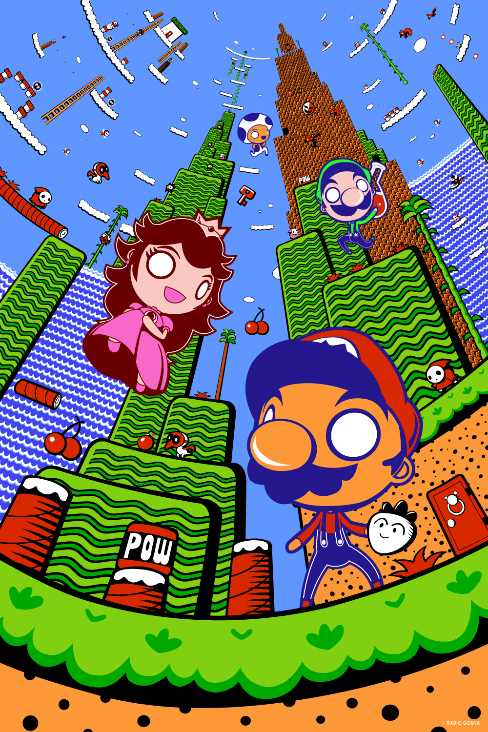
First here is Gosha Dole. On the more ambitious scale admittedly but I would have loved to do something to this effect. I love the use of perspective and colour. One of my original ideas was to do a piece based around the camera spinning on one spot and the city expanding and progressing around it. Sadly at this point I was very unfamiliar with animation and wasn't sure how applicable or feasible it would be to make it. Shame really, it would've been some seriously cool work.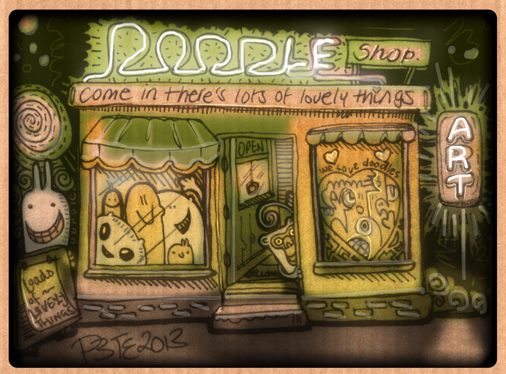
Next is Peter Jarvis, known as Monkeys-In-My-Head from Deviantart. I like the cutesy style and the use of colour. It was one of the styles I'd considered using for the final piece. If I wasn't fed up of colouring at the time I'd have borrowed their rendering style.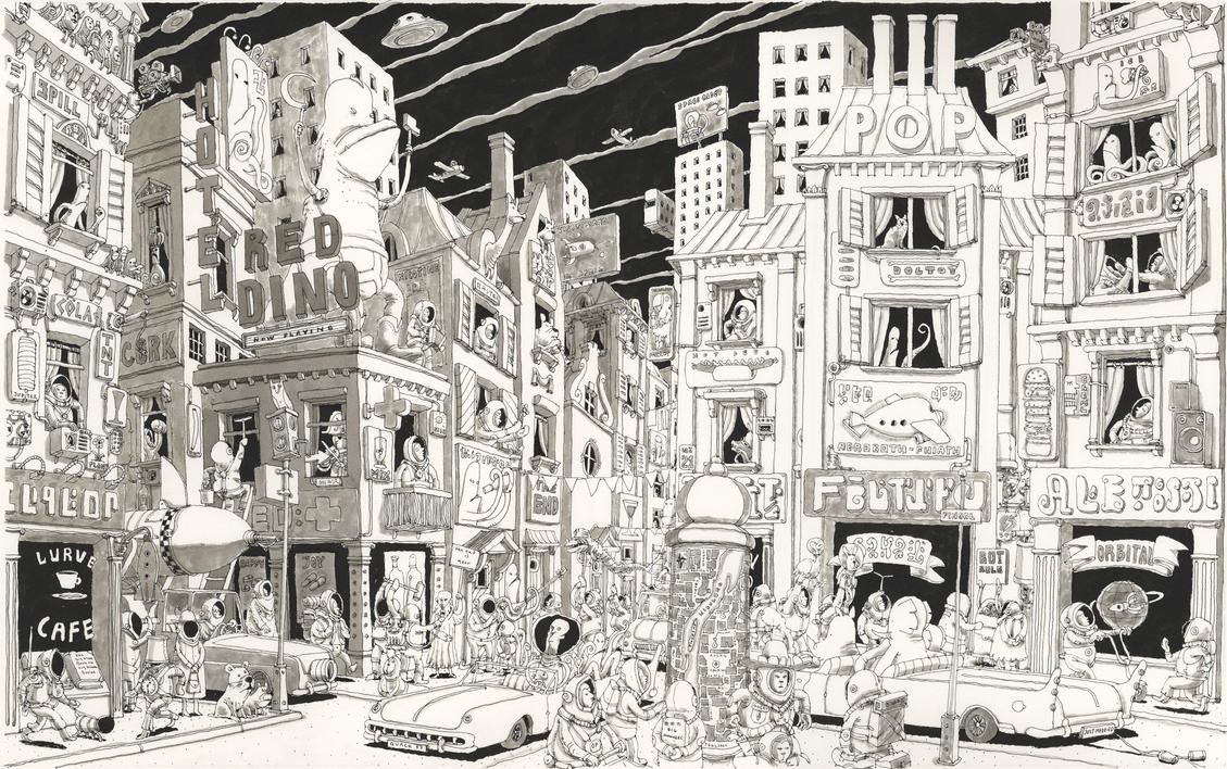
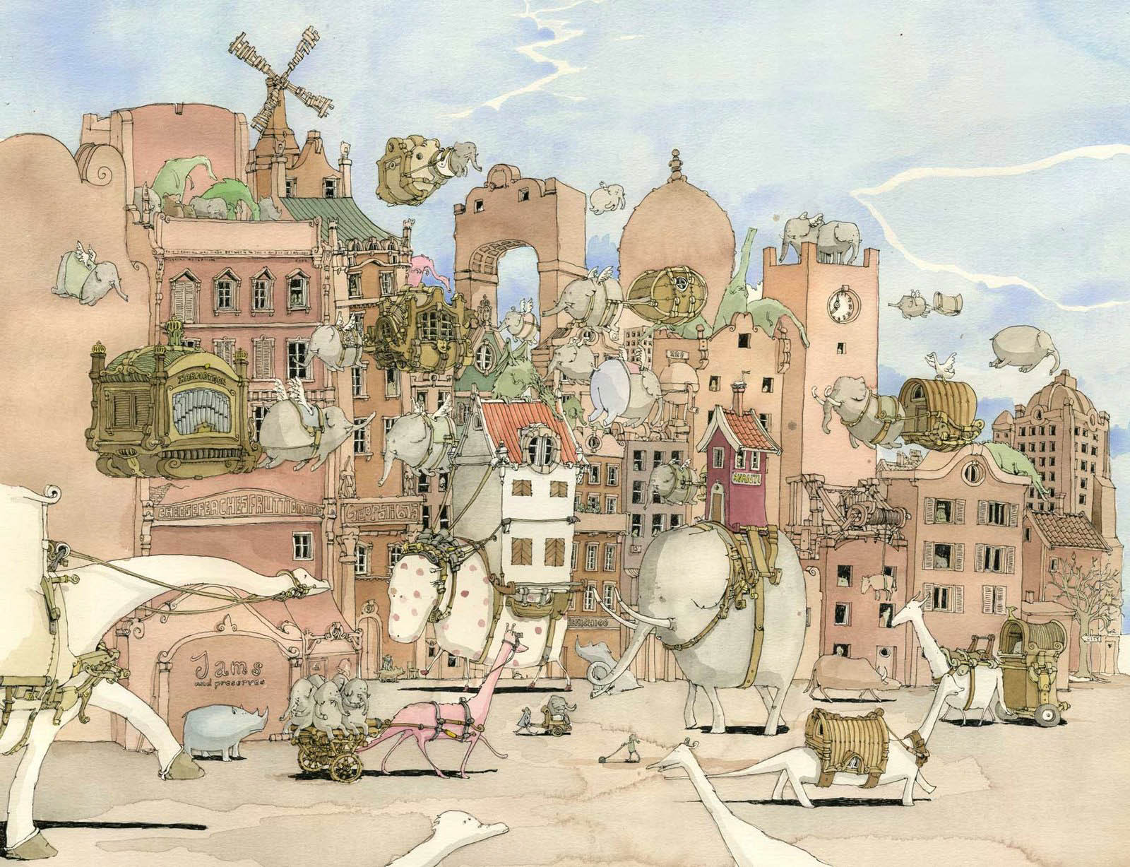 Mattias Adolffson was naturally a consideration. I always tend to gravitate towards his work. I love the way he draws characters and the variety of shapes and characters he uses. The washed-out style often helps too. I think some of that style ended up in my final animation. The colour ended up similar too, although that was inspired by someone else.
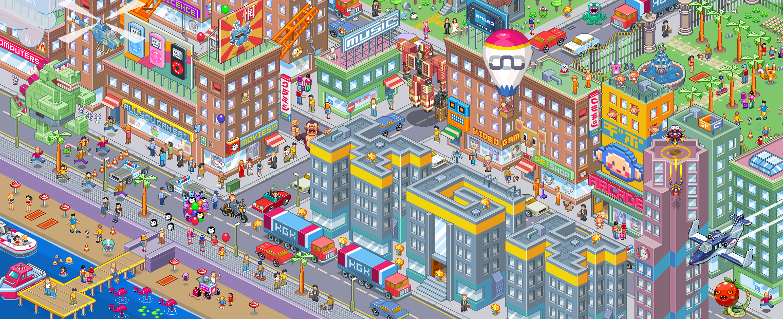
Another art style I'd considered was pixel art. Whilst awkward to do initially, it comes with a number of benefits such as the ability to alter sections whilst still keeping the picture perfectly uniform. It would mean the animation would look organic, and fit seamlessly into the art. It was something I'd revisit but on a much simpler degree during my later aftereffects practice exercise. But as usual, I had no idea how to animate before the first unit, so this would be difficult to pull off. This one was done by Gunstar-Red.
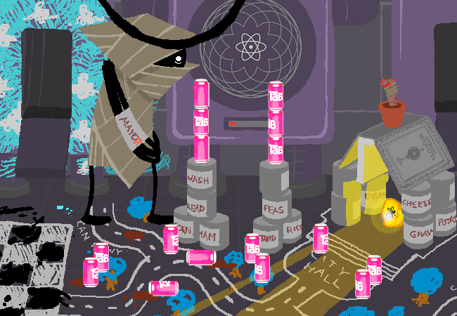
Another idea I had for the project, one that was pretty tempting early on, was inspired by Homestuck, by Andrew Hussie. In particular, one character known as the Wayward Vagabond creates a town made out of tin cans and calls it Can Town. I'd considered doing something similar. Maybe using some stop motion animation or maybe some digital work on top of it. But I decided against it. It's something I would love to revisit though. The other can picture was done by OverPhotography.
It was at about this time when I decided that the project couldn't be about the city. At least, not entirely. I had to put the focus on the people instead. So I reworked the project idea in my head from 'how the city changes' to 'how the city changes people' instead. I was finally getting somewhere. After deciding that, I looked towards my usual first response for projects. I looked towards Jimmy Corrigan - a book written by Christopher Ware. I looked at it briefly at the start of the unit but purely for art style. But now I wanted the tone more than anything.

 There's something about the tone that really strikes a chord with me every time I read it. It's remorselessly dark, but rather than showing the readers horrible things, it just picks apart at the nagging moments of real life. In retrospect I seriously missed the mark with this, but it still kept the same slightly depressing feel.
From this I started processing my ideas into a series of characters. I think my main problem was that I really over-dramatised all of the problems into genuine big deals. The characters were done in my current Captain Cool-esque style, but with some added emphasis on getting the outfits to look realistic. The building and the cars were drawn somewhere between my robot style, and those from Jimmy Corrigan. But colour-wise I looked in a completely different direction. Somewhere closer to home: Transformers. In particular, the quite excellent More Than Meets The Eye. I'll do a full feature or something on it later. But for the first half of it's current run, it was coloured by the quite excellent Josh Burcham in a very washed-out kind of style and it works really well.
No comments:
Post a Comment