I am a mad scientist. I invent things. I put things together to see what will emerge. I take things apart and put them back together again. I break things. I fix things. I learn. I experiment.
I am a mad scientist. I don't limit myself to what has been discovered. I don't hesitate to push into unexplored territory, regardless of the risk. I don't always choose the easiest way there either, but rather the more interesting one. Sometimes I stay still for a while, and embellish what I know and what I make. Innovation is as important as invention.
I am a mad scientist. I discover new things with whatever I do. I revisit old things to find new things within them. Everything I experience is a lesson; a discovery. The things that go well teach me as much as the things that go wrong.
I am a mad scientist. I make mistakes. I make errors. Bad things happen around me. Sometimes irreversable. But I analyse all of them. I pick them apart and find good in them all. Whether it's a lesson or simply something to never try again, there is always something to be found, even in the direst of situations.
I am a mad scientist. I experiment. I try new things. I do tests. I measure. I record. I look at what I have and I see what I can make with it. I enjoy a puzzle and believe the method is as important as the solution.
I am a mad scientist. I am independent. Instead of asking for help I look for my own way. I navigate where I have no map. I build when I have no instructions. I draw when I have no subject. Every time this happens I find new ways to do things. Sometimes the same ways as others, sometimes original.
I am a mad scientist. I think with my head, not with my heart. I trust logic. I trust science. I trust what has worked before to work again. I trust the realms of logic more than I trust my gut instincts.
I am a mad scientist. I take risks. I make reasoned assumptions and test them to their limits. I fall hard sometimes, soft others. The landing bruises but I learn from the healing. When risks work I push them further. When they don't I analyse them and find what went wrong.
I am a mad scientist. I trust what I can see, feel and hear and question the things I can't. Logic is my master.
I am a mad scientist. I look for solutions rather than problems. Nothing brings greater satisfaction than fixing the unfixable or solving the unsolvable.
I am a mad scientist. I see the world as a series of components. I wonder what will happen if some are removed. I look for solutions wherever I am. Anything can be solved by finding the right pieces and putting them together in the right order in the right place.
I am a mad scientist. I think before I act. Randomness is a game for others. I predict and rely on what I know.
I am a mad scientist. Even when what I make doesn't exist in this plane, I make sure it works. Everything is built with the knowledge that if it did exist, it would fulfill it's purpose.
I am a mad scientist. I trust machines to do my bidding, but learn about the machines. I need to trust the machines and I need to understand their ways. Software is simply another land in need of exploring and mapping. Hardware and aquaintance who's mannerisms you must grow accustomed to.
I am a mad scientist. Everything fills a purpose. Teachers teach for a purpose. I attend university for a purpose. I design for a purpose. I live for a purpose.
I am a mad scientist. I draw because it makes me feel good. I watch movies to feel good. I sleep to feel good. I help people because it makes me feel good. I comfort people to make me feel good. I have come to terms that everything humanity does we do for ourselves and for nobody else. Our brains are simply hardwired to make us interact and cooperate. I am okay with this.
I am a mad scientist and the world is my oyster.
Tuesday 3 November 2015
The Highlander
Over the past few weeks I've been tinkering away on a new robot picture between coursework. Last week I finally finished it. This one actually started out as a character design for the main brief, when I was still considering the Adbot idea. Needless to say though, I quickly began to overwork it, and then after a few weeks of tinkering on it, the robot was finished. Once I realised the way the robot was going, I begun my usual steps of working out a theme for the bot. I already had most of the head designed, and at was a sharp, nasty looking one. So I rolled that idea around in my head for a while, and eventually came up with the idea of doing a Scottish Warrior robot. A little bit of Glasgow, a little bit of Braveheart, and a whole load of metal and fur. It had been a long while since my last proper robot picture, and I wanted to use some new skills in it. The main one I used here was the use of fabric for the flags and drapes of the robot. I wanted to achieve a mix of fabric and armour plating, but to manage to differentiate both of those from the core skeleton of the robot. I also managed to use my improved rendering skills with the textiles and with the wooden staff. The robot was initially meant to be holding a sword in its right hand and to have an empty left hand. But I forgot about that when I was drawing the torso and accidently filled in the area where the sword would go. So then I had to work with what I had, and by the end a walking stick seemed like a better fit, although I did add a flag to it. It's also worth noting that this picture was created completely freehand, with no rulers, or even pencil sketches. It's all just fineliner. So without further ado, here's Mad Mel the Scotsman.

The Open Work - A Mini Essay
The Open Work is a concept that was introduced to us this term. I won't delve too far into the book the theory's from or anything, as we've been doing a lot of that in lectures recently. So instead I'll talk a bit about my thoughts on the concept.
The concept is very basic at heart: that there are really two perceptions that come together when someone looks at some artwork. The first is the artist's perspective when the picture was created. This includes the creator's motives, their feelings, what they were depicting, and other features they chose to add to the picture. The other party here is the viewer. Whilst the viewer doesn't contribute to the piece itself, they do bring a lot of other things to the equation. The viewer's life experiences make up most of their part of this. Unless the viewer had an identical set of life experiences to the creator, they'll see the piece differently to them. And other people will see it differently too. It's all about what people can relate to. Different people will see different things in a piece of art, and therefore will view it differently.
This is a useful thing to keep in mind as a creator, especially as one who generally works for a (theoretically) larger audience. I can't just produce something that works for me and nobody else. In a commercial world, my pieces have to be relatable, so that most people who view it can find something in it they can associate with. This highlights the importance of test groups and market research, as well as helping to push away the notion that creators are always right.
This brings me to the negative part of this talk. The discussions of Open Work have highlighted many of the flaws in the world of art as we know it. Firstly comes the 'Grand Canyon' artists as I think of them here. The artists who intentionally create their work to be as open as physically possible. This is the kind of artwork that's always 'up for interpretation'. The sort of artwork we'll puzzle over for ten minutes then walk away having each thought of a different idea about what it is. The sort of artwork that leaves everything up to the viewer. Now in some cases this can be perfectly acceptable, when the artist leaves intentional traces of things for everyone to find. When the artist tries to guide us to finding things. When they make the picture out of shapes that can connect to things we know. In essence, like the Rorschach test. Whilst they're specifically ambiguous, they're created with elements in them that we can attach to. This is fine.
What isn't fine is when artists create artwork with no intention of form whatsoever, leaving nothing for the viewer to work with. Leaving things so wide open they manage to practically break the term. Because in making works so incredibly open, they've actually created closed works. Works where the artist sees the picture the same as the viewer. A wide area of absolute zero. We're talking about true surrealism here. Completely abstract art. Art that contains nothing of meaning whatsoever. Art that despite all else, is a true waste of space. It's lazy, and struggles to call itself art.
The other variant upon this is the 'fingerprint lock'. This applies to art that's so personal that nobody else can see it in anywhere close to a complete view. Because from my point of view, a truly open piece of work is one that everyone can see something different in, but come away having felt that that was the complete meaning. ''Fingerprint lock' art is generally the same as the description above, except it isn't closed, as it means something unbelievably personal to its creator. But nobody else can gain anything close to a complete meaning from it because it's too personal. This type holds far more value, but pushes against the concept of art. Because art isn't really for a single person. It's for others to look at too. But what use is art that nobody else can relate to.
So this is my take on the open work. It's an incredibly useful concept, in both commercial and critical sense. It helps make sense of a lot of issues both my own work and in others.
Lakes International Comic Art Festival

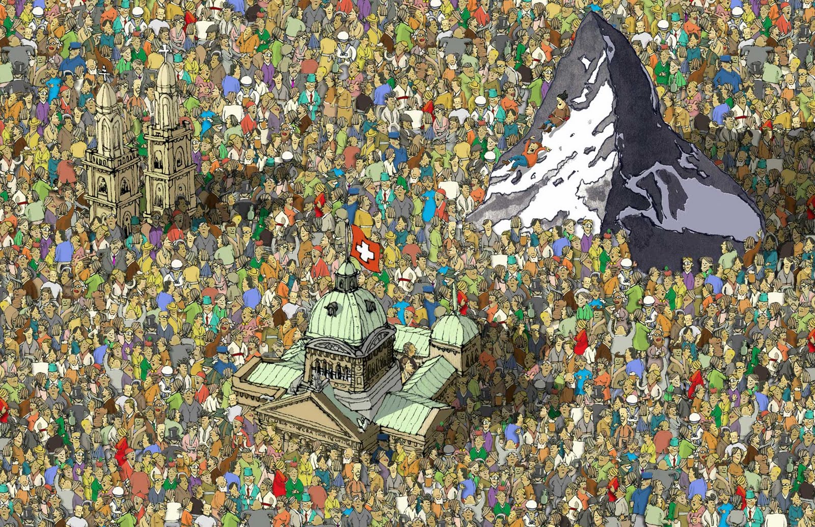
LICAF is one of my favourite events of the year. It's the only proper comic event in Cumbria and it's usually fantastic. It's in its third year now and is continuing to get better year-on-year. This year the guestlist was just fantastic. Scary Go Round's John Allsion; the writer and artist of one of my favourite webcomics was attending. As was Phillip Reeve, who wrote the phenomenal Mortal Engines book series, which is one of my biggest influences in art and design. And finally, there was Mattias Adolfsson. I've mentioned him on this blog before, but to meet him in person AND attend his art workshop was just fantastic.
 LICAF is quite different to a lot of comic conventions around the country. Firstly, the venue is far smaller. Rather than the likes of Thought Bubble in Leeds, or MCM Manchester,LICAF takes place in the small town of Kendal, famous for its amazing Mint cake, and a music festival that no longer takes place there. But because of this it feels far more special. As there are no buildings big enough to house the whole event, it takes place across a number of buildings across town. Because of this a lot of the shops in town put
up displays and special events for the festival. It also differs from most in that there is a heavier focus on workshops and talks. Sadly as a result there is no cosplay culture there. But it's not really that kind of event. It feels more like a celebration of artists and artwork than a convention for fans such as Thought Bubble. It's quite special.
John Allison

As it stands the Bad Machinery format is ending soon as the characters are finally outgrowing the setting. But from what John Allison has shown with his many side-stories over the years, the best is still yet to come. Above is a picture of himself, drawn by him, and below a page of Bad Machinery

Phillip Reeve

meet him) was reposting that his Mortal Engines series was getting a re-release with the original cover art. That led me to Phillip Reeve's website, where I learned that he had written a new sci-fi book recently called Railhead, and that as part of its publicity, along with the publicity for his younger childrens series Pugs Of the North, he would be visiting the festival. I have to say, out of all the guests of the festival, getting to meet Phillip Reeve was just amazing.
Mortal Engines, the series he's most known for, was my favourite book series growing up, and still holds that place now. It's very dark in places, and has the highest body count of any 'children's book' I've read. But what really inspired me was the universe: a world of moving cities. If you've ever seen my artwork, there's some pretty big ties to the work of Reeve.

Mattias Adolfsson
I've already posted about him here before so I'll keep this fairly short. Adolfsson is a Swedish illustrator known for his surrealism and his level of detail. I first encountered his work on Deviantart after I'd begun to take my robot art more seriously. Finding someone that good was actually a little demoralising though. I'd just begun and seeing someone who was doing what I aspired to do to such a degree of success was a little scary at first. But as I progressed, I began to like his work more and more. I think it took a while to appreciate that we weren't both doing the same thing. Whilst I always aimed to keep a sense of realism in my work, Adolfsson always pulls in the other direction towards the surreal. His works are more satirical whilst mine are more sci fi. And while his works are far looser in construction, mine are far smoother, with an almost digital cleanness.
Okay I rambled a little there. One of the best parts about meeting Adolfsson in Kendal was that he did a workshop about spontaneous art and about creating fantastical worlds. We started with an exercise in drawing faces, where we were told to draw one part of one person's face, and then to move to someone else and draw part of some else's face, until you had a face made entirely of other
 people's faces. That was to teach us about not worrying if things don't turn out very realistic, as well as teaching us to work with what's there. Next we had to try and draw people without looking at5 the paper or lifting up the pen. Mine turned out...quite badly. That sort of thing is not my speciality. Next we had some quick drawing cues to sketch out. We had about a minute or two for each picture. The first cue was An Armed peanut. The second was A Polite Jellyfish. Then came Spilled Milk, Fourth was A Sad Robot. Then was Your Worst Fear. I actually went for my second worst fear there as I didn't have enough time to draw a dentist. Next we were told to draw three character facing different directions. But then halfway he told us that when we get bored to start drawing things in front of the characters, and that whenever we got bored, just draw something different. This was one of the biggest insights into his work, as he talked through a lot of the things he did when he was drawing like this. He tended to favour elephants when he's getting bored as they fill a lot of space very quickly. Finally came a challenge very similar to that of Rob's lecture a few weeks back. We each had one minute do draw something, then we had to pass the paper to the next person. We ended up with some pretty crazy stuff. Above is a piece called 'Crowded' and to the left is a self portrait. Below is my work from the session. And a bit of everyone else's too.


 Wrapping Up
That's nowhere near the full account of the festival, but the rest of the time was taken up with me geeking out massively as lots of my favourite artists were everywhere. I also managed to meet Max Sarin, the new Giant Days artist, and almost managed to catch Kate Beaton, the amazing artist and writer of Hark! A Vagrant. I additionally bought far too many things. But I always do at these things.
So yeah. that about wraps it up til' next year. Thanks for reading if you made it this far.
(Left is Max Sarin's art. Below Is Kate Beaton's)
Monday 2 November 2015
Character Design
Character design is one thing that I'm really happy was included in the course this year. I don't think I'm the only one who thinks that too. Those sessions with Jay tend to be very well received. I produced quite a lot of designs for that workshop so I'll post them all here. After a few doodles I liked the idea of doing something about useless criminals. The main character is Timmy the Ten-year-Old Mob Boss.


Sunday 1 November 2015
Shadowplay Typography
Typography and I have had a rough relationship. It's something that's never appealed to me as much as it did others. I just don't mesh with it as well as I do most other aspects of the course. So of course I wasn't looking forward to the typography aspect of this year. Thankfully though, I got a good idea and I decided to roll with it. I'm almost pleased with it. Almost.

Three weeks later came the session where we had to develop our original idea. I was getting nowhere with this. Most people were just doing things bigger. But the Tracy came up with something really smart: trying to make this thing in real life. So I got some of the cardboard from the corner and put together all the letters I would need. It proved a little more problematic than expected. Firstly, the cardboard was incredibly flimsy. Plus they didn't have the smoothest ride home. Thankfully I solved this when I accidentally found a lump of wood from when we built my Ikea shelves. I now had a proper weighted stand. I also had to build a lighting rig using a kitchen roll stand, a washing basket, and a clip-on desk light. Things weren't that smooth. Sadly there was one problem I couldn't fix. The backdrop. So sadly you get a shot of yesterday's washing there. I don't think this worked as well as the original writing, but it was really fun to work on. I think typography and me have some making up to do.


We had to write out the phrase I Am ................... where we had to fill in the dotted line with something that defined us. After a bit of thinking of ideas I came up with I am Too Tall. The whole idea came from that. Here is the type page I did during that first workshop.

Three weeks later came the session where we had to develop our original idea. I was getting nowhere with this. Most people were just doing things bigger. But the Tracy came up with something really smart: trying to make this thing in real life. So I got some of the cardboard from the corner and put together all the letters I would need. It proved a little more problematic than expected. Firstly, the cardboard was incredibly flimsy. Plus they didn't have the smoothest ride home. Thankfully I solved this when I accidentally found a lump of wood from when we built my Ikea shelves. I now had a proper weighted stand. I also had to build a lighting rig using a kitchen roll stand, a washing basket, and a clip-on desk light. Things weren't that smooth. Sadly there was one problem I couldn't fix. The backdrop. So sadly you get a shot of yesterday's washing there. I don't think this worked as well as the original writing, but it was really fun to work on. I think typography and me have some making up to do.


Saturday 31 October 2015
Daily Mail Dystopia - Round One
My final piece for this unit is an animation consisting of two distinct parts that will eventually be merged: a 3D section of backgrounds and camera angles, and a series of 2D scenes that go on top of the background. What I have here is the final cut of the background scene alongside the music. The music was a bit more of a challenge here, as the music I chose for the project was only a minute long in a two-minute animation, so I had to do some audio editing to make the track work. The opening section is new as well as the post-restaurant outro. I'm quite of proud of this.
Daily Mail Dystopia Background & Camera Run from Jonny Clementson on Vimeo.
Daily Mail Dystopia Background & Camera Run from Jonny Clementson on Vimeo.
The Bomb
Because I was planning on using Cinema 4D for the Daily Mail Dystopia idea, I had to fix one problem first. That problem was the fact that I'd never used Cinema 4D before. So with the help of a Grayscale Gorilla tutorial, and a couple of evenings, I produced a little test piece. It's nothing too complicated, but uses most of what I'd learned to do so far in the software.
Tuesday 27 October 2015
Adbot in Virusland
This was the outcome of the first Aftereffects workshop we did with Sara. The character was designed for my original idea for the Conversation project, but was never used. So I figured I'd put it to some use here. We experimented with different types of motion and controls. I'm quite happy with the way this turned out, especially the visuals.
Monday 26 October 2015
Photoshop Animation
Some of my work from the Wednesday morning sessions.
We used some guides to help animate characters using Photoshop.
We started off with making a ball bounce then we did some freestyle practice, and we learned about walking loops after that. I'll upload the character designs later.
We used some guides to help animate characters using Photoshop.
We started off with making a ball bounce then we did some freestyle practice, and we learned about walking loops after that. I'll upload the character designs later.
Tuesday 6 October 2015
October Catch-Up
 So, it's been a while since the last post. Summer's been and gone. And what an odd summer it was. Mostly consumed by my job at the local uniform shop, I still found time to make some work on the side and gain some new influences. But before all of that, I have a handful of animations to share.
Firstly is my final outcome for Unit 3, an animation called Birds. Even looking back from october, theis holds out really well. More for the tone than anything else, it really stands out and sets the template tonally for what I want to achieve this year.
Birds - An Animation About Art from Jonny Clementson on Vimeo.
Secondly comes the showreel. This was my first true experience of working and editing to music, so I let that define everything. The whole piece grew from there.
Showreel 2015 from Jonny Clementson on Vimeo.
And finally comes the stop-motion piece. We did a workshop towards the tail-end of last year over a couple of days practicing stop-motion using paper cut-outs and SLR cameras. It was a really fun experience and I will likely use stop-motion in a future unit for my outcome.
BFFs - A Tale in Stop-Motion from Jonny Clementson on Vimeo.
 And now for the summer's batch of new inspirations and experiences. The first thing I'll be talking about is the webcomic Multiplex by Gordon McAlpin. Over the summer I re-read the archive and alongside re-experiencing one of the best-executed webcomics around, it also opened my eyes to an art style I'd never really considered seriously before: Vectors. Whilst I dabbled in them last year, I found them as a useful asset for design and logo-making, but as more of a tool that an art style. But then multiplex opened my eyes to how useful such things can be. Furthermore it restored my interest in movies and reaffirmed what an excellent character piece the comic is.
Next up in the holiday comic batch comes Prague Race (at top) by Petra Erika Nordlund, which is about as heavy a departure from the stylings of Multiplex as posible. The whole comic is hand-draw, which is a huge rarity in the world of webcomics. I adore the dark and creepy yet also charming and cute tone of the comic, and the characters are endearing and relatable. The tone is certainly having an effect on my current plans for the first unit of this year, and elements of the art style could creep in, as these things often do.


As you've probably grasped the theme for this list, the next comic here is Lucky Penny, by
Yuko Ota and Ananth Hirsh. It's part of a larger webcomic run called Johnny Wander that mostly consists of autobio comics and short pieces of fiction, like The Girl With The Skeleton Hand (at the bottom of the post), which is also excellent. But we're not here to talk about that. Lucky Penny is the first properly long-form piece published on their website. It tells the story of Penny, who is incredibly unlucky (it's kind of a misnomer). The story is fairly familiar, telling the story of a girl who meets a guy and everything going wrong then right again, but it's the art and the characters that make the story really work. Yuko is a fantastic artist, and the sheer flair with which the story easily removes any familiarity in the overall plot. The regular series is really decent too, populated with great characters and genuine heart.

The penultimate comic on the post is a lot closer to home. Both topic-wise and in actual setting (it's in Sheffield). It's a monthly comic called Giant Days by John Allison. Yes, I'm talking about John Allison and not talking about Scary Go Round. I'm sorry. But seriously, Giant days is a pure beam of sunlight. In a comic scene that's mostly filled with doom and gloom and ever-grittier reboots this one stands out by a mile. It's a comic by Boom Studios, who are responsible for some of the most progressive and interesting comics on the market today, and even by their standards this is cheery. It tells the story of three girls who meet at university and all the wacky antics they get up to. It features a lot of Allison's traditional style such as his trademark dialogue and british sense of humour, but the execution here is a level above most of his other output (which is still great). The art also does wonders for the comic. It's a match made in heaven, and does the comic some serious favours. It's expressive, incredibly fluid, and manages to keep up with the craziness of the writing.
I think it's about time to wrap this list up. It's getting rather longer than I'd anticipated. I really did read a lot of comics over summer. I might do a post on some movies later. Well, mostly just one movie, but it really was a good one. But that aside, it's time to the most out-of-place entry on this list.
 Recently I'd hit a little bit of a slump with my reading and watching and videogaming material. I was watching the new Daredevil Netflix series which whilst excellent is pretty dark in tone and it's hardly cheerful watching. And thanks to some internet issues at home, I was stuck with the meagre selection of games I'd downloaded before uni. I decided I'd finish the Walking Dead game. Despite how good the first couple of episodes were, the rest of the series just got a bit stuck on the 'horrendously bleak' front and the rest of the episodes were just no fun. Playing a game where nobody has any hope and spends all their time being sad doesn't make for a great experience. And on the comics front I'd made...okay I wouldn't call it a mistake, but probably just mistimed my decision to read Batgirl. Similarly to The Walking Dead, the first ten or so comics were really good. The sense of drama was well played and the characters likeable. But the series took a downturn, getting bogged down with angst, poor villains, and an extraordinary sense of bleakness. Things were really looking down. But then came the new creative team at issue 35. Batgirl went from being a series about death and good people getting hurt and grim monsters and age-long plot arcs to being a series full of charm, relatable characters, and a light-hearted spirit. And that's the important thing. There are so many comics, games, and TV series full of darkness. It takes some guts to stand above them all with a smile and a one-liner, and all the fun a Batgirl comic should have.
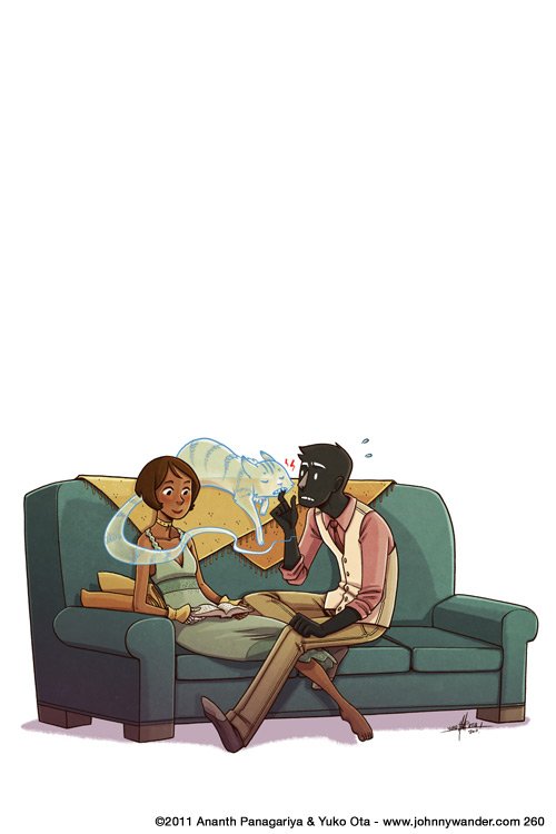
Tuesday 5 May 2015
Talking About Birds
So I'll be posting up my final animation piece (aside from the showreel of course) tomorrow so I figured I would say a few words here about it. As this thing's probably been marked already this will mostly be for my own gain when I write this lot up in my sketchbook. So yeah, given it's late at night and the stuff mentioned above, I probably won't put any pictures in much. Maybe a couple.
So a quick overview first: it's an animation about art movements. I couldn't find quite enough to sink my teeth into with modernism or postmodernism I had an idea about how to do an animation based around art movements. As I still wanted to get a bit of focus on modernism and post modernism I based the movements on the ones before and after modernism. So there's Romanticism, Realism, Modernism, Post-Modernism, and Pop Art.
The project went through several shifts in perspective and style over the time I've been working on it. Even to the stage where I was planning on a very different ending just a few hours ago. So I'll start at the most appropriate part for this: The End. You see I was initially planning a slow zoom in through the window where the title would appear after the fighting artists are offscreen in a nice hand-drawn font and the first bird would fly by. But it was then I realised that because of all the horribly complex animated action at the bottom I'd have an extremely hard time pulling that off. perhaps if I were using aftereffects it might've worked but I was so far down this route that I had no options to change. By this point I'd already finished the fight section for the end and it had ended up a bit more brutal than intended. And I don't quite know why I though of this but I remembered the ending of one of my favourite horror-ish films: Funny Games. If I get time I'll do a spotlight on it. I mean generally speaking it's not a film I'd thought I would like. A thoroughly harsh film that's really unpleasant to watch, it has just enough satire and taste to pull it off. But the point I though of was the very end. After the film ends in a pretty spectacular manner the title hits the screen on a black background with red text (I ended up using white on mine though) with heavy thrash metal cutting in. It's an unpleasant ending for an unpleasant film. And I love it. And despite my animation not having sound at the moment I'll try and emulate that ending.
Whilst i think of other influences I'll just jot down where the inspiration came for each bird. The first one was done in my standard cartoony style but with the eyes borrowed from the very glossy eyes of my robot drawings and a couple of touches from Girls With Slingshots. The second and third just used generic google searches to find some inspiration. I'm not that happy with them really. I did them a week or so before the second batch and it kinda shows. For the modernism one I borrowed heavily from this picture:
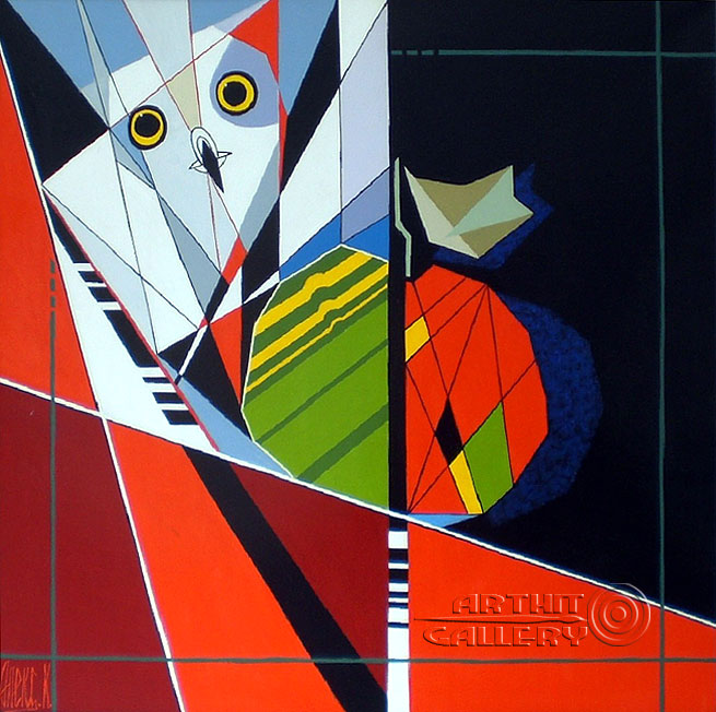 I sadly can't find who did it. I'll try and get it for the sketchbook though. The postmodernism one was quite fun to do. As postmodernism is so varied I decided to give it a shot myself. I took the theory of minimalism, and employed it to a bird. I managed to reduce it to a square with a triangle for a beak. The wing was added just to give me something to animate. The pop art one was a mixture of lichtenstein and warhol's styles, using a very comic-based bird picture partially inspired by the bird logo of Darby Productions and my general experiences reading comics, and the duplicating picture style of warhol.
So onto the animation itself. I'd done three animations at this point. Or at least done a good chunk of three. The first was a decent length and looked fairl nice, but the animation was really clunky and the dialogue was terribly done. I'd also tried to hide how basic it was and probably made it worse by doing it. The second was my attempt at doing really smooth and decent animation. I used aftereffects for the first time in a final piece. And the last time too it would seem for this year at least. The animation was smooth and really nice but rigging up the characters took an age, and the animating was very slow. It's something I might revisit in the future though. I also tried to return to it recently but the layers are so badly organised it would take forever to do more work on so I'll just sew on the other pictures I'd done. So I'd done really clunky before and got a decent amount from even if it was very badly executed. And I'd done smooth animation that looks almost professional but it takes too long to put together a decent project. So for my 'third' project, the one I replaced Kelly's sessions with, I tried simplifying the art (and doing it digitally) and attempting a more frame-by-frame style. It turned out fairly well but used up that option for the final project. So I went back to the start, and used the same techniques as the first animation but with a knowing attitude, and far more experience. I also found inspiration from The Darkness's latest music video, which was made by one of my favourite comic artists ever, Nick Roche. The video's called Barbarian but I'm too tired to link it now. But yeah, I made this animation knowing immediately the limitations I would have and that instead of going for massive quality, I';d craft the whole thing with some preset boundaries in place. And through doin g this I was able to deliver on some of the best art Ive done for an animation yet.
So 'Birds: An Animation About Art' will drop tomorrow, and it's a weird one. I think I like it.
So a quick overview first: it's an animation about art movements. I couldn't find quite enough to sink my teeth into with modernism or postmodernism I had an idea about how to do an animation based around art movements. As I still wanted to get a bit of focus on modernism and post modernism I based the movements on the ones before and after modernism. So there's Romanticism, Realism, Modernism, Post-Modernism, and Pop Art.
The project went through several shifts in perspective and style over the time I've been working on it. Even to the stage where I was planning on a very different ending just a few hours ago. So I'll start at the most appropriate part for this: The End. You see I was initially planning a slow zoom in through the window where the title would appear after the fighting artists are offscreen in a nice hand-drawn font and the first bird would fly by. But it was then I realised that because of all the horribly complex animated action at the bottom I'd have an extremely hard time pulling that off. perhaps if I were using aftereffects it might've worked but I was so far down this route that I had no options to change. By this point I'd already finished the fight section for the end and it had ended up a bit more brutal than intended. And I don't quite know why I though of this but I remembered the ending of one of my favourite horror-ish films: Funny Games. If I get time I'll do a spotlight on it. I mean generally speaking it's not a film I'd thought I would like. A thoroughly harsh film that's really unpleasant to watch, it has just enough satire and taste to pull it off. But the point I though of was the very end. After the film ends in a pretty spectacular manner the title hits the screen on a black background with red text (I ended up using white on mine though) with heavy thrash metal cutting in. It's an unpleasant ending for an unpleasant film. And I love it. And despite my animation not having sound at the moment I'll try and emulate that ending.
Whilst i think of other influences I'll just jot down where the inspiration came for each bird. The first one was done in my standard cartoony style but with the eyes borrowed from the very glossy eyes of my robot drawings and a couple of touches from Girls With Slingshots. The second and third just used generic google searches to find some inspiration. I'm not that happy with them really. I did them a week or so before the second batch and it kinda shows. For the modernism one I borrowed heavily from this picture:
So onto the animation itself. I'd done three animations at this point. Or at least done a good chunk of three. The first was a decent length and looked fairl nice, but the animation was really clunky and the dialogue was terribly done. I'd also tried to hide how basic it was and probably made it worse by doing it. The second was my attempt at doing really smooth and decent animation. I used aftereffects for the first time in a final piece. And the last time too it would seem for this year at least. The animation was smooth and really nice but rigging up the characters took an age, and the animating was very slow. It's something I might revisit in the future though. I also tried to return to it recently but the layers are so badly organised it would take forever to do more work on so I'll just sew on the other pictures I'd done. So I'd done really clunky before and got a decent amount from even if it was very badly executed. And I'd done smooth animation that looks almost professional but it takes too long to put together a decent project. So for my 'third' project, the one I replaced Kelly's sessions with, I tried simplifying the art (and doing it digitally) and attempting a more frame-by-frame style. It turned out fairly well but used up that option for the final project. So I went back to the start, and used the same techniques as the first animation but with a knowing attitude, and far more experience. I also found inspiration from The Darkness's latest music video, which was made by one of my favourite comic artists ever, Nick Roche. The video's called Barbarian but I'm too tired to link it now. But yeah, I made this animation knowing immediately the limitations I would have and that instead of going for massive quality, I';d craft the whole thing with some preset boundaries in place. And through doin g this I was able to deliver on some of the best art Ive done for an animation yet.
So 'Birds: An Animation About Art' will drop tomorrow, and it's a weird one. I think I like it.
Sunday 26 April 2015
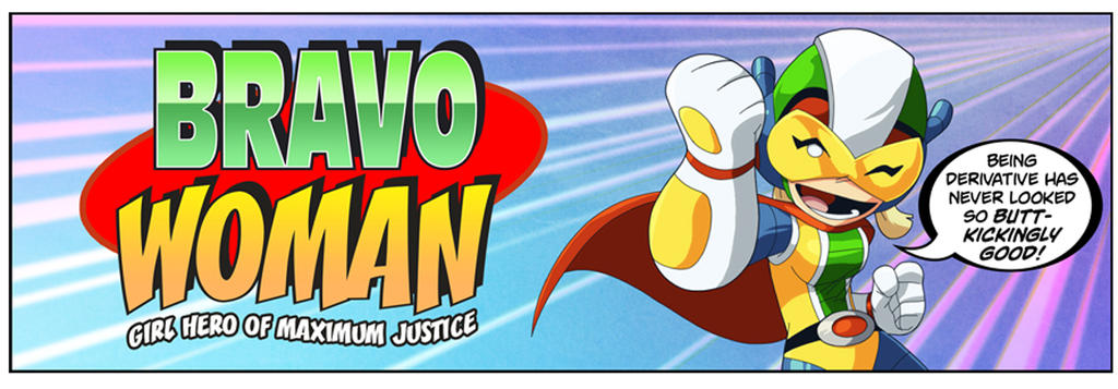
Spotlight: Bravoman: Super-Unequaled Hero of Excellence by Matt Moylan and Dax Gordine

 Okay that aside, Bravoman is the next chapter in my Spotlight list. It was a webcomic set up by Shiftylook, a studio set up to try and make good of some of Namco-Bandai's unused intellectual property. You see, Bravoman started out as a really difficult 1980s side-scrolling videogame. It got a very limited release outside of japan and outside of a couple of crossovers he never really showed up since. But as one of the launch titles for the Shiftylook campaign he was suddenly back in the spotlight!
As a comic it's a hilarious fourth-wall breaking affair with a truly wonderful set of characters. Its plotlines range from genuinely good to utterly bonkers, and it's a total hoot. Later it also gained itself a webtoon show with voices by Rob Paulsen and Dee Bradley Baker among others. It's quite fantastic and has an awesome theme tune.
GO--GO--BRAVO!!!
Spotlight: Last Stand Of The Wreckers by Nick Roche and James Roberts (and Guido Guidi)

It's no secret that I have a lot of love for Transformers. Whilst the films are mediocre and the TV shows usually good, the one part of the brand that really captured me and continues to amaze is the IDW comic series. They got off to a slow start in 2005 after the previous license-holders went down in a storm of bankrupcy, but after a few years they rebooted the series with a something of a year-long romp, before starting another series with a different author. Around that time an up-and-coming Irish artist and writer Nick Roche pitched in idea for a five-part miniseries. Last Stand Of The Wreckers was born.

Transformers is a brand with some thirty years of history. During that time many new iterations of the brand showed their faces, but the cast of the 1980s cartoon show would be the most endearing and the characters would always inspire those to come. The IDW continuity is specifically based on those characters so this comes across even stronger here. Y'see with transformers there's a very nasty habit of always having the spotlight on that particular group of characters. Part of IDW still falls prey to that. But Wreckers was different. It set out with a simple aim: to make the reader care about a series of new characters as much as they did the old, established ones. And then it set about one of the most brutal plotlines in transforming robot history. It is a story of courage, heroism, and good people dying in stupid, pointless ways.

Quite frankly it's bloody brilliant and even if you don't know Transformers you'll probably get a lot out of this story. The art is really expressive and the writing is so on-point and relatable you'd forget it was robots talking. And that's one of the true merits of Wreckers. It's not just good transformers. It's just good everything.

Spotlight: Danielle Corsetto and Girls with Slingshots
Girls with Slingshots is a webcomic. One of the best too. It ran for over ten years and ended this January. The strip was mostly daily and has amassed over 2000 pages in its duration, telling the story of Hazel Tellington, and her friends. It covers all kinds of topics and doesn't shy away from the more taboo issues of sex and sexuality either. It's a really good read.
It also proved of excellent assistance during my stead of working on the final project, as I decided against using my usual style in favour of something different. So I borrowed a couple of aspects from the girls with slingshots art style, as well as reminding me about different body types and shapes.
SPACE ROCKET GOODNESS

Pixel Party
Pixel Party 64 from Jonny Clementson on Vimeo.
So,,,controversy time!!
Once every few weeks we have a 'physical session' with John Kelly. We've dona a couple of vaguely interesting things there but it's mostly been really pointless as I've done all of this kind of thing before, and it feels like I could be putting that time to better use. And once the sessions shifted towards typography I decided to take the leap and do something different, instead putting the tricks learned during the aftereffects session with Sara to good use. With it being an animation course I figured you'd be fine with this. I mean, I hope you're fine with this. If not, well, oh dear.
Either way i wanted to put all my aftereffects lessons into something that would show off what I'd learned but unlike my main coursework animation work wouldn't require excessive artwork to create. So here I created some very basic Mario-homaging pixel art then put to use what I'd learned, and experimented a bit more on the way.
The way I look at this I think it was a far better use of my time than doing more typography work which quite frankly isn't terribly useful. Either way...enjoy!
...or get angry at me...whichever works!
Saturday 25 April 2015
Inspiration and Explanations: Unit Three
Feels a bit wierd writing about this one. With the last two units they've been finished for a long while. This one's still being made. On the plus side all the business with artists is already done.
Things were a bit different with this one. I found my key idea pretty early on. I was finding it hard to find something that captured modernist lifestyles and thoughts, so I was going to have to do something that treated things a bit closer to their face value rather than the deeper values. I wish it didn't have to be this way but I feel a level of contempt towards modernist art, and the more I delve into their beliefs and methods the more I get annoyed. So...face value it is.
I'd been exploring the same sort of ideas for a while, of showing the progression of art styles through some sort of medium. Some ideas were more tongue-in-cheek than others, and the sillier and angrier the ideas came, the less I cared for the project. But one day when I was out for a walk in the woods back home in Cumbria I came across the idea of something far simpler and almost pretty.
I decided to have the whole thing set in a room overlooking a garden, with a couple who decide to paint a bird in the garden. As it progresses other artists arrive and show them other styles to paint in. With each artist the bird changes to reflect the new style. That was the basic premise. The animation would start with Romanticism, then shift to Realism with an industrialist painter, then Modernism with a upstarty revolutionary, then Post-Modernism with an art critic, then Pop Art with a young hipster-type. Almost like Chinese Whispers, but with art. It's hardly a perfect idea but it's the best I can manage.
Research-wise I decided it would be best to approach each genre separately to get a feel for them before drawing the bird designs. The bird itself isn't a real design, rather something loosely based on a robin. I just wanted something fluffy and cute and fairly expressive. But so- onto the artists.
Romanticism
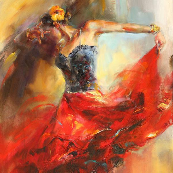

Romanticism-era art's key feature is that it tends to add extra flair and extravagance to the subject. Scenes get busier, landscapes more beautiful, people more attractive. For the romanticism bird I'll drastically enhance the colours and try to make it as pretty as possible. I'll use pencil crayons with some dashings of felt pen. The art here was done by Anna Razumovskaya, Albert Bierstadt, and Anne-Louis Girodet. The movement was popular throughout the 17th and 18th centuries. This was one of the most appealing art styles to me of the bunch as it serves to paint the subjects in a positive light, and allows plenty of room for symbolism and hidden meaning, whilst still providing something pleasant to look at for the viewer.
Realism
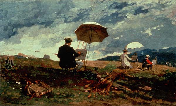


Realism is based around - you guessed it - making things look real. Popularised during industrial revolution-era Britain and rapidly spread around the world, it's aim was to pull away from the overly cheerful and distracting nature of romanticism towards something that painted the subject exactly how they are. This led to a movement of very technically-skilled artists as that was more important in realism than artistic license and less real interpretations. The art here was provided by Winslow Homer, Gustave Courbet, and James McNeill Whistler, who produced what is probably the movement's most famous piece: Whistler's Mother. For this bird I'd be using a duller palette and toning down the extravagance of the previous picture, focusing on the form more.
Modernism

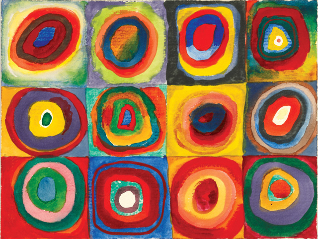
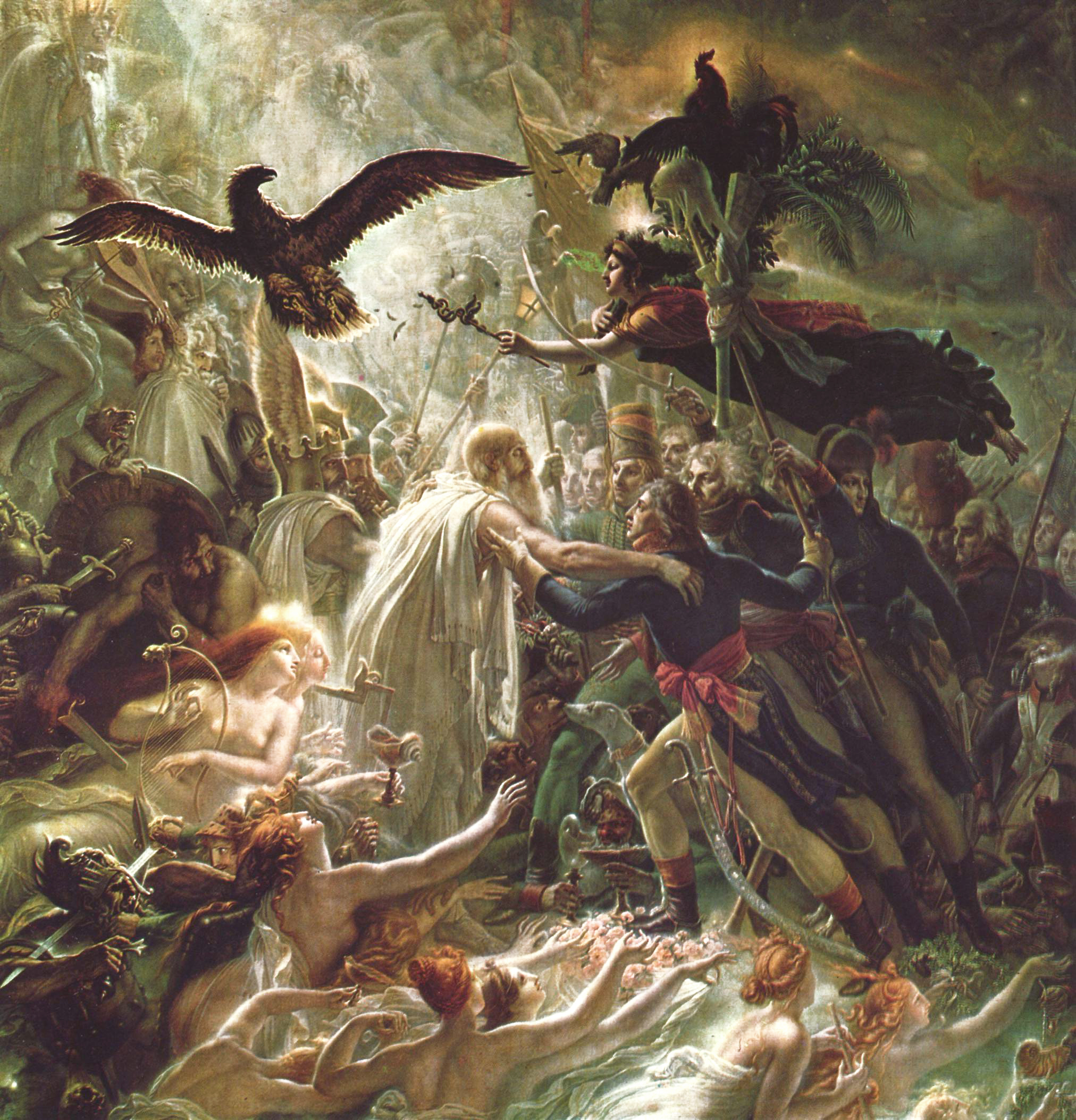
 Modernism. The big one really. Damn I'm going to have to write more about this one. So modernism sprung up a good few years after realism throw it's grubby boots into the door (then painted them in fine detail), and was a movement that objected to the beliefs that art should be judged by the technical talent of the painter rather than their artistic abilities. They proposed that inspiration and the message behind the painting is more important than the painting itself. My own views aside, the movement gained a lot of traction. As the movement grew, it began to garner itself a series of beliefs about how the world should be. They believed that they should forget 'the old ways' of doing things and approach things from a totally new angle. They brought in new fashions, new architecture, and a new way of living. Admittedly some of their proposed ideas didn't land with as much gusto as others. The modernist theory of how to eat in particular was not as well received. But minor failures aside, modernism really started a fire. A fire that kept burning for a long time. Some of the embers of that fire can still be seen today and many contemporary artists still hold their values with a strong level of esteem. The modernist movement spawned or encapsulated a variety of other more minor art movements as well. Dadaism was a well known offshoot of modernism that existed with it's own (sometimes bizarre) set of beliefs. Surrealism and Cubism also formed inside the modernist beliefs paving the way for some of the most well known artists around. The pictures here are from Edward McKnight Kauffer, Vasily Kandinsky, and Fernand Léger. I'd be playing the abstracty surreally card with the bird for this movement. It'll be a weird one.
Post-Modernism


 Now postmodernism is a peculiar movement. It really is. It began by applying the same approach modernism took to the art before it, except postmodernism applied it to modernism itself. The result is a movement that strives on picking apart the notion of art itself. It's a movement heavily based around critique and theory. Rather than modernism which can often be identified easily as a single movement, postmodernism exists in several strands, as there are so many approaches to the movement and beliefs. The movement also spawned minimalism, which aims to deconstruct an image into it's smallest, purest notions. The pictures come from Piet Mondrian, Francis Berry, and Pablo Picasso.
Pop Art
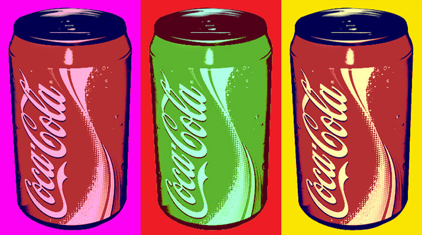
 Pop art is included here as more of a silly sign-off than anything else so I'll keep this one very brief. It shares similar beliefs as modernism and postmodernism and explores the notion of kitsch and the perpetual question of 'what is art?'. The pictures are from the style of Andy Warhol and Roy Lichtenstein. Interestingly pop art has become one of the most kitsch art styles of modern times, adorning a huge variety of items. Both Warhols' and Lichtensteins' works have been parodied and homaged so many times the style in general has become something cheap and excessively tacked-on.
So that concludes the various artists I'll be referencing in the bird part of the piece. And now for the rest. I'd already decided this one would be done in my typical black-and-white finelinery style, so rather than putting in the artist here, I'll say WATCH THIS SPACE and it'll lead the way into the first Artist Spotlight. Thanks for reading!
Things were a bit different with this one. I found my key idea pretty early on. I was finding it hard to find something that captured modernist lifestyles and thoughts, so I was going to have to do something that treated things a bit closer to their face value rather than the deeper values. I wish it didn't have to be this way but I feel a level of contempt towards modernist art, and the more I delve into their beliefs and methods the more I get annoyed. So...face value it is.
I'd been exploring the same sort of ideas for a while, of showing the progression of art styles through some sort of medium. Some ideas were more tongue-in-cheek than others, and the sillier and angrier the ideas came, the less I cared for the project. But one day when I was out for a walk in the woods back home in Cumbria I came across the idea of something far simpler and almost pretty.
I decided to have the whole thing set in a room overlooking a garden, with a couple who decide to paint a bird in the garden. As it progresses other artists arrive and show them other styles to paint in. With each artist the bird changes to reflect the new style. That was the basic premise. The animation would start with Romanticism, then shift to Realism with an industrialist painter, then Modernism with a upstarty revolutionary, then Post-Modernism with an art critic, then Pop Art with a young hipster-type. Almost like Chinese Whispers, but with art. It's hardly a perfect idea but it's the best I can manage.
Research-wise I decided it would be best to approach each genre separately to get a feel for them before drawing the bird designs. The bird itself isn't a real design, rather something loosely based on a robin. I just wanted something fluffy and cute and fairly expressive. But so- onto the artists.
Romanticism
Romanticism-era art's key feature is that it tends to add extra flair and extravagance to the subject. Scenes get busier, landscapes more beautiful, people more attractive. For the romanticism bird I'll drastically enhance the colours and try to make it as pretty as possible. I'll use pencil crayons with some dashings of felt pen. The art here was done by Anna Razumovskaya, Albert Bierstadt, and Anne-Louis Girodet. The movement was popular throughout the 17th and 18th centuries. This was one of the most appealing art styles to me of the bunch as it serves to paint the subjects in a positive light, and allows plenty of room for symbolism and hidden meaning, whilst still providing something pleasant to look at for the viewer.
Realism
Realism is based around - you guessed it - making things look real. Popularised during industrial revolution-era Britain and rapidly spread around the world, it's aim was to pull away from the overly cheerful and distracting nature of romanticism towards something that painted the subject exactly how they are. This led to a movement of very technically-skilled artists as that was more important in realism than artistic license and less real interpretations. The art here was provided by Winslow Homer, Gustave Courbet, and James McNeill Whistler, who produced what is probably the movement's most famous piece: Whistler's Mother. For this bird I'd be using a duller palette and toning down the extravagance of the previous picture, focusing on the form more.
Modernism
Post-Modernism
Pop Art
So that concludes the various artists I'll be referencing in the bird part of the piece. And now for the rest. I'd already decided this one would be done in my typical black-and-white finelinery style, so rather than putting in the artist here, I'll say WATCH THIS SPACE and it'll lead the way into the first Artist Spotlight. Thanks for reading!
Subscribe to:
Posts (Atom)