We had to write out the phrase I Am ................... where we had to fill in the dotted line with something that defined us. After a bit of thinking of ideas I came up with I am Too Tall. The whole idea came from that. Here is the type page I did during that first workshop.

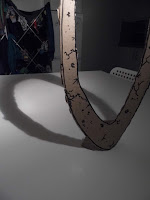
Three weeks later came the session where we had to develop our original idea. I was getting nowhere with this. Most people were just doing things bigger. But the Tracy came up with something really smart: trying to make this thing in real life. So I got some of the cardboard from the corner and put together all the letters I would need. It proved a little more problematic than expected. Firstly, the cardboard was incredibly flimsy. Plus they didn't have the smoothest ride home. Thankfully I solved this when I accidentally found a lump of wood from when we built my Ikea shelves. I now had a proper weighted stand. I also had to build a lighting rig using a kitchen roll stand, a washing basket, and a clip-on desk light. Things weren't that smooth. Sadly there was one problem I couldn't fix. The backdrop. So sadly you get a shot of yesterday's washing there. I don't think this worked as well as the original writing, but it was really fun to work on. I think typography and me have some making up to do.


No comments:
Post a Comment