
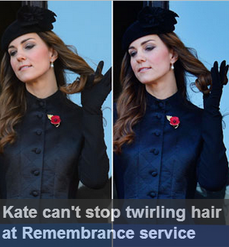
The main aspects I looked for in headlines were the big two of Sexism and Racism, the two standing stones of the plot of the animation. Each is the main plotline of one half of the animation, so I needed to look into both parts thoroughly. I took special attention to the way women were portrayed in terms of celebrity, especially the likes of Kate Middleton, who has been plagued by cameras since she arrived on the scene. Every move of hers is scrutinised by the media. It's got to be a hard way to live.
In terms of racism, The Daily Mail is loaded. For years they have cried to deport immigrants and are spawning wave after wave of hate. So this is where I decided I wanted to do something important.

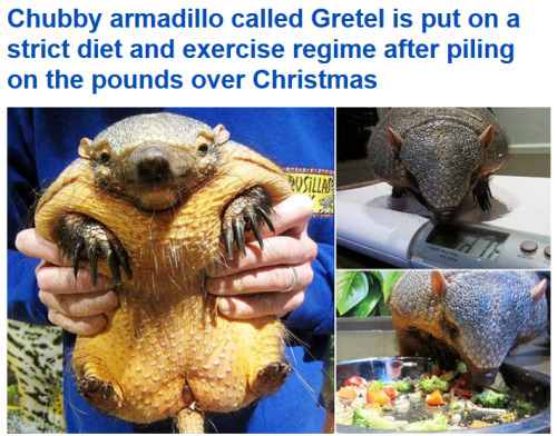
With the main plotlines formed I began to look for other stories to fill the background. Sillier ones. This was a fun research task. I found stories about giant crabs, steroid-ripped schoolchildren, injuries from falling poop. There were so many fun stories that fueled many of the background characters from the animation.
For the main characters I did a bit more research. I wanted them to look like actual young adults so I had to style them in that way. Gone are the usual standards in Jonny Draws People haircuts, as I had to research a bunch of new ones to make my characters look modern. I gained a few ideas from Google image searches and Pinterest but most of my best results came from Batgirl. As a comic that's set in Gotham hipster area Burnside, it contains a whole number of appearances and styles to try out on my characters. Both of the characters I ended up designing were heavily inspired from looks in Batgirl.
.jpg)
It also helped me flock the comic with more generic background characters too, as I couldn't have everyone in the animation be portrayed as bonkers Daily Mail caricatures. It helped me create a diverse and interesting range of people to sit around and be unimportant.


In the realm of less direct research I did quite a bit of research into styles. The basic idea that the animation could work came from the Transformers Robots In Disguise show, which uses 3D characters in 2D environments. I figured I could flip that arrangement around a bit.

The webcomic Dead Winter was accidently a massive inspiration (as I didn't realise how much it had inspired me until far later) The art style isn't too far removed from the animation style used in DMD and I ended up using the same Black, White, and Red colour scheme. Tonally it's not too far off either.
Another key reference for this project was Birds, my Unit 3 piece for last year. It provided a key starting point for the art and animation style. I wanted DMD to be a kind of stylistic sequel to it, being a similarly motivated and created story. The art style was initially borrowed from that before it was simplified for the animation itself. The two original character designs would fit right into Birds though. It led to the same eyes being used for this one, and if you've seen a few of my drawing styles you's realise how much of my styles spring from the eyes. They're nearly always the first thing I draw and tend to define the style of a picture.

Silent Hill 2 was a huge stylistic influence despite having never played it firsthand. The way it used fog to create atmosphere is really smart, especially given that it was originally done due to technical constraints to lower render distances. I had a similar need here, as I couldn't build anything very impressive in C4D so wanted to limit the amount you could see at any given time. I really like this effect,

No comments:
Post a Comment